The following is the fourth and final among a series of blog posts designed to capture the lessons learned during the creation of “Unrestricted: The Campaign to Sink the Japanese Merchant Fleet During World War II.” The aim of this series is to pass along these techniques for students and professors of digital history in general, and digital military history in particular. It is my hope that the material contained herein will aid new digital scholars in learning or honing their data creation and spatial analysis skills.
Part IV continues directly from Part III. This tutorial will teach you how to preform some advanced spatial analysis using QGIS’ statistics tools, the field calculator, graphic and spatial visualizations.
Getting Started:
This blog series will assume that the reader has set up QGIS, and possesses a basic knowledge of how the tool works. (If not, QGIS can be downloaded here. An introduction to QGIS can be found here.) For a basic rundown on GIS data types and other essentials useful for digital humanists see this excellent resource.
This blog will make use of the same four datasets from Part III.
*Note: This tutorial was generated using QGIS 3.10 in the spring of 2021. Future iterations of QGIS may contain a different interface, toolbar configuration, or other cosmetic changes. Nevertheless, the functionality of the tools and concepts of this tutorial will remain pertinent.
Step 1: Create (or Load Previous) Project
a. Create a new QGIS project. Launch QGIS.
b. Project -> New
c. Name the new project.
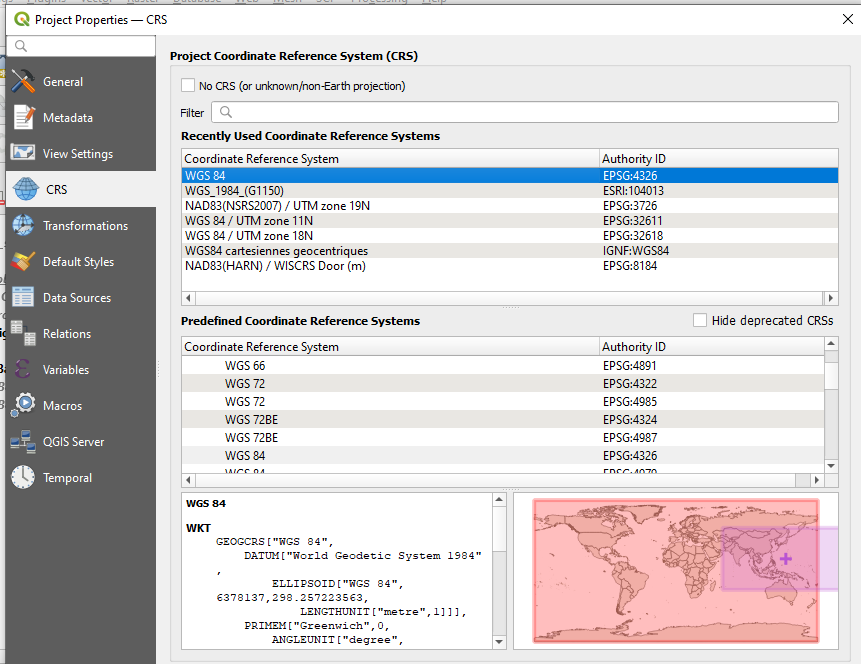
d. For the first part of this tutorial you will use WGS 84 ESPG: 4326 as the Coordinate Reference Systems (CRS) or Spatial Reference System (SRS). To set the CRS, go to Project -> Properties, select “CRS” on the left panel. WGS 84 should be the first choice. If you don’t see it, filter for “WGS 84” and it should populate. Select it and hit ok.
e. Add the boundary shapefile, Layer -> Add Layer -> Add Vector Layer
f. Browse to the location of the boundary shapefile, select the .shp file, select open
g. Select Add, then Close
*Note on Coordinate Reference Systems. Traditional maps are a 2d representation of a 3d reality. As such, compromises must be made in order to make maps legible. Coordinate Reference Systems are a means of doing so. They define “how the two-dimensional, projected map in your GIS relates to real places on the earth.” All CRS types make compromises due to the limitations inherent to their role. WGS 84 is the mostly widely used CRS available. It is the standard for the U.S. Defense Department and is used in GPS systems worldwide. However there are examples where it can be of limited use, particularly for regions nearer of the poles of the Earth. However, given the scale of this project it will be more than adequate.
f. Load the four datasets used in Part III if starting a new project.
Step 2: Calculating Basic Statistics.
You can run some further calculations on these sinkings by exporting your selected results to a new shapefile.
a. Export your selection spatial query as a new shapefile.
b. Right click on the new file and open its attribute table. Exam the data columns and see if you can observe any trends. If you organize the data by ascending date you will likely notice that a mere six sinking events occurred prior to 3 April 1945. This is because from April 1945 through to the end of the war the United States Army Air Corp waged a mining campaign called Operation Starvation.
Suppose that you wanted to learn move about the campaign within the context of the larger war effort against Japanese merchant shipping. How might you do so? The first means of doing so would be to generate some statistics from Operation Starvation and compare them to the larger war effort.
c. Apply date filters to the new mine shapefile and sinking data. You will need to isolate those sinking events which occurred on or after 3 April 1945 in order to generate some accurate statistics. Right click on the sinking data and apply the filter: “date” >= ‘1945-04-03’ AND “sinking_agent” != ‘Mine’ This will return only sinking events which occurred after our data of interest and those which were not sunk via mine.
For your mine shapefile apply the filter “date” >= ‘1945-04-03’ Both of your datasets should now only contain sinking events on or after 3 April 1945, the start of Operation Starvation, one with only mines and the other with all sinking agents other than mines.
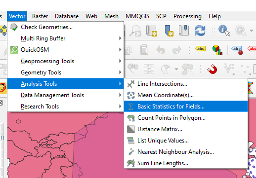
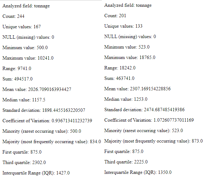
d. Calculate some basic statistics . Navigate to Vector > Analysis Tools > Basic Statistics for Fields. The Basic Statistics for Fields widow will appear. This tool will provide you some basic statistical information based upon your inputs.
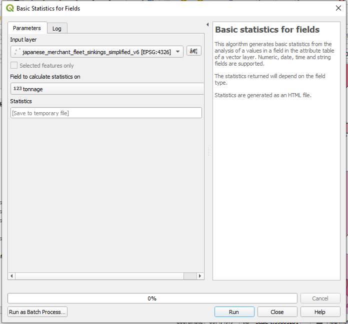
e. Choose your data input and parameters. Choose your sinkings shapefile from the input layer and chose tonnage from the “Field to calculate statistics on” dropdown menu.
Hit run.
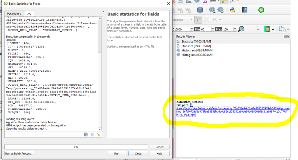
f. View results. A file path to a temporary file will appear. Click the link and view your results.
g. Repeat the process for your mines sinking shapefile.
h. Compare your results. Of the 445 total vessels sunk from 3 April 1945 until the end of the war were sent to the bottom as the result of mining campaign of Operation Starvation. And of the 958,258 total tons sunk during that period, 463,741 or 48.9% went sent to the bottom as a result of mines. You can also see that the average vessel sunk via mine was larger by both mean and average.
Step 3: Graphical Visualization or Analysis
QGIS also provides means of visualization statistical data spatially as well as graphically. Data plots are a useful means of contextualizing your data or discovering trends. To proceeded you will need to install the DataPlotly plugin.
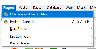
a. Install the DataPlotly plugin. Navigate to Plugins > Manage and Install Plugins.
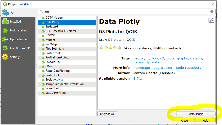
b. Search for the DataPlotly. Install the plugin
c. Remove any filers which may remain on your sinking data shapefile.
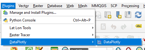
d. Launch the DataPlotly plugin. Navigate to Plugins > DataPlotly
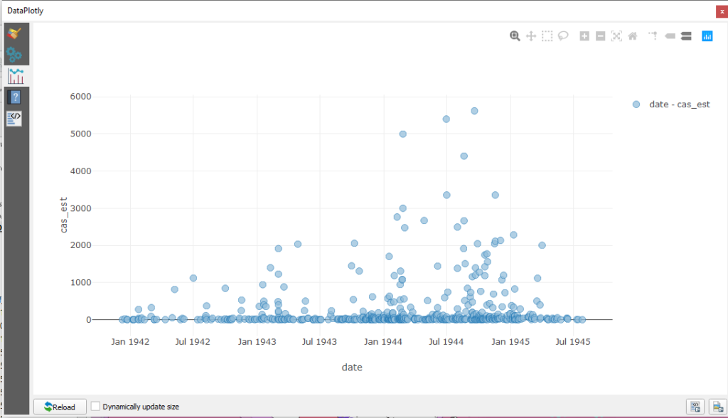
e. Data exploration. Now that DataPlotly is installed let us take a look as some features from the sinkings dataset. You may recall that it contains casualty estimates for a number of vessels. Plotting this data in DataPlotly could help to contextualize it or otherwise explore the dataset writ large. Since change over time an evergreen method of historical analysis, let us use a scatter plot to analyze the data.
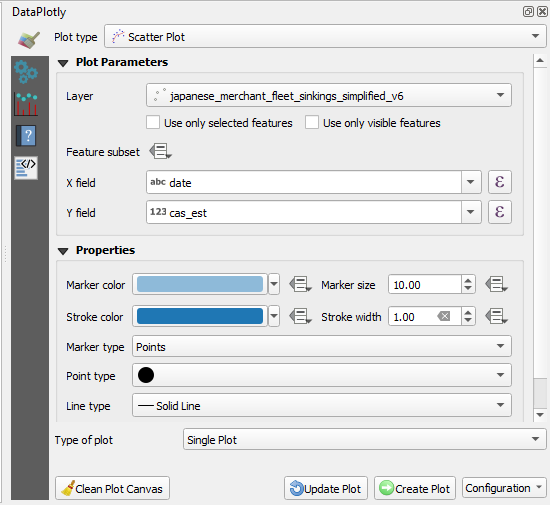
Click the paintbrush tab to the left. Select “Scatter Plot” from the Plot Type dropdown menu. Choose your sinking data from the layer dropdown menu. For the X field choose date. For the Y choose the casualty estimate field, cas_est.
Click Create Plot.
You will likely observe a steady uptick of mass casualty events beginning in August 1944 which continued through the end of the year. This could be an artifact on incomplete data. Or, it could be a manifestation of historical events worthy of further investigation.
Step 4: Spatial Visualizations . For the sake of argument…let us assume that it is the latter. Visual statistical information spatially by density. In addition to symbolizing data via discrete categorization QGIS will allow you to depict datasets via density heatmaps.
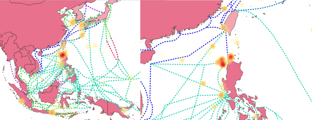
a. Navigate to the Symbology tab for your sinkings shapefile. From the top dropdown menu select Heatmap. Choose a color ramp from the down arrow button to the right of the Color Ramp dropdown. Choose a smaller radius, leave “Maximum value” as Automatic. From the weighted points choose cas_est. This will inform QGIS to generate the heatmap based upon the available casualty estimates. Other numeric values can also be used such as tonnage. Not selecting a value will default to generating its values upon spatial frequency.
You will need to adjust your color ramp before proceeding. Click on the color ramp bar and it should launch a “Select Color Ramp” window. Navigate to and click the down arrow next the “Color 1” dropdown menu. Select “Transparent” from the popup window. Selecting this will make the lowest value, which is 0, invisible. Choose a desirable rending quality and transparency
Click ok.
*Note: Working with heatmaps is as much of an art as a science. Tweaking with your inputs, particularly the maximum value setting can dramatically change the aesthetic result. Lowering the maximum value will create a map with more hotspots at the cost of reducing the visual weight of the most significant location. For more on the basics of heatmaps click here. For some more advanced topics see this video.

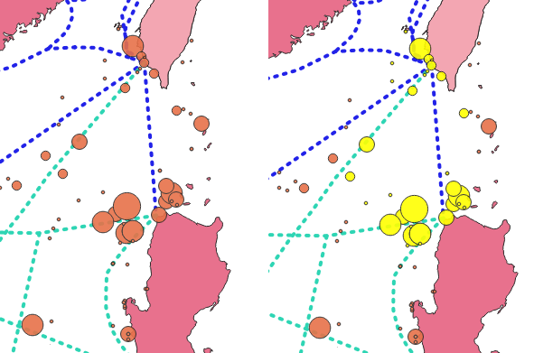
A heatmap of casualty estimates show a bright red orb north of the island of Luzon. If you zoom in slightly QGIS will re-render the map and break the single hotspot into several smaller locations.
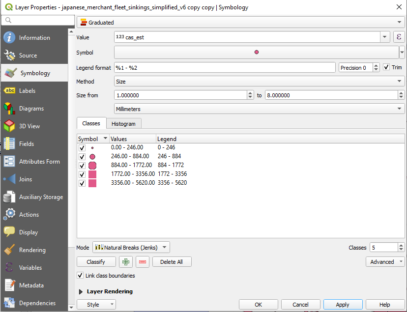
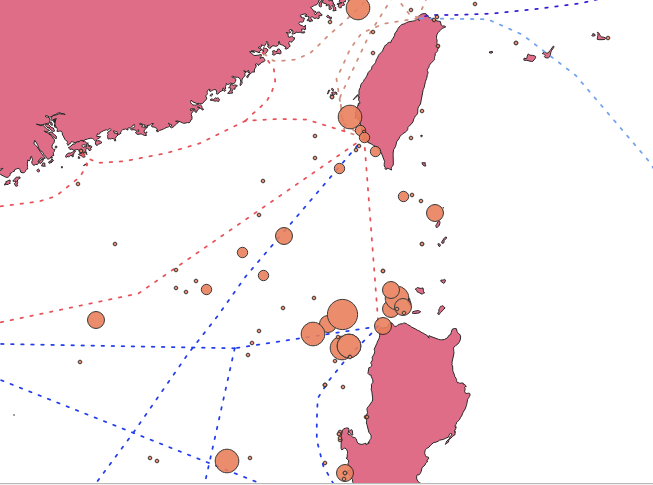
b. Visual statistical information spatially by size. You can also symbolize individual data points by scaling their size on attribute data. Navigate to the Symbology tab for the sinkings shapefile. Choose Graduated from the top dropdown menu. For value select cas_est. From method, choose “Size.” For mode choose “Natural Breaks (Jenks).”
Hit ok.
If you zoom back into area around the Luzon Strait you will likely observe a multitude of mass casualty events. Examining the sinkings shapefile metadata will also reveal all but four vessels were sunk in 1944 and the overwhelming majority of them went sent to the bottom from the summer through the fall of 1944.
c. Run further statistics. These events can be placed within a larger context by using the Basic Statistics for Fields tool that you used earlier. The tool will allow you to run only on the selected fields. By running some statistics on your selection and comparing them to the whole you can get a sense as to the magnitude of this mass casualty trend.

The selected accounted for only 45 vessels, or 7% of the 574 vessels for which casualty estimates exist. But their sinkings resulted in 31,632 of the 140,707 or 22% of the total casualties estimated. This level of maritime horror would be a worthy trend of investigation and the other attribute data (ship name, type, dates etc.) can provide opportunities for conventional research.
The accelerated rate of mass casualty sinkings off the coast of Luzon in the summer and fall of 1944 is largely attributable to a collapsing front to the east and attempted evacuation of Allied POWs and Japanese civilians out of, and reinforcement of Japanese military personnel into, the Philippine archipelago. During the run up to MacArthur’s invasion in October 1944, U.S. assets, particularly submarines sank scores of Japanese merchant vessels with inbound Japanese soldiers, outbound civilians, and Allied POWs.
Step 5: Using the Field Calculator
QGIS’ Field Calculator is a powerful tool which can be used to generate statistics and provide other functions which can aid in your analysis. It can be used to generate new data fields within existing datasets. For instance, suppose you wanted to know the extent of the Japanese shipping empire at the start and end of the war. QGIS’ Field Calculator can help to answer that question. To do so you will need to use the tool to generate the estimated lengths of the Japanese SLOCs.
a. Change Projection. For this feature you will need to re-project the Japanese_SLOC_training shapefile. While WGS84 is useful for most GIS tasks that a digital historian may need, it is unsuited for generating spatial statistics. To proceed you will need to change the source coordinate reference system (CRS) for your Japanese_SLOC_training shapefile. Right click on the shapefile, select properties. Navigate to the Source tab.
Set the source coordinate reference system to EPSG: 3857 – WGS 84/Pseudo-Mercator. The mercator projection is determined via degrees. As you did earlier with buffers, you will be able to convert the field calculator’s output into nautical miles (nm) with some simple arithmetic.
Hit ok.
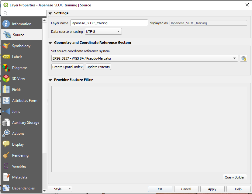
You will notice that the shapefile will “disappear.” Since the data has been re-projected it will move to a different area within QGIS’ viewing window. Right click on the file and “select zoom to layer” to be orientate your screen to the now re-projected data.
b. Create New Field. Open the attribute table of your Japanese_SLOC_training shapefile and navigate to the field calculator. It is located four icons from the right on the top of the attributes window. The Field Calculator window should appear.

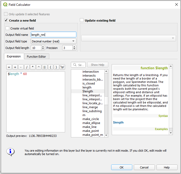
Click “Create a new field.” Give the new field a name in the “Output field name” box. Choose Decimal number (real) from the Output field type. Keep the rest of settings as their default.
The expression box is were you will instruct QGIS to determine the lengths of every Japanese SLOC feature in the shapefile. To do so, enter the following expression $length * 60 You can also input these values by first navigating through the center window and double clicking the $length selection, then the * button atop the expression field and typing 60.
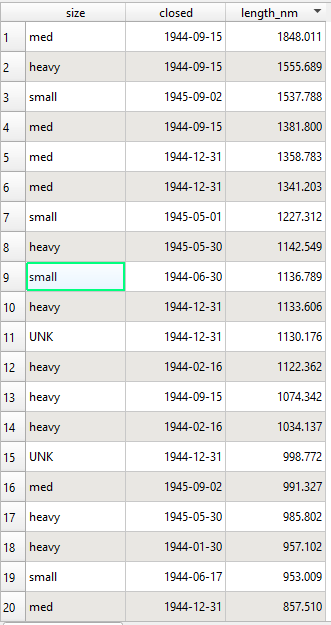
This expression will instruct QGIS to create a new field, generate a length statistic for every feature within the shapefile, and multiply every output by 60, thereby providing a nautical mile length for every feature.
Hit ok.
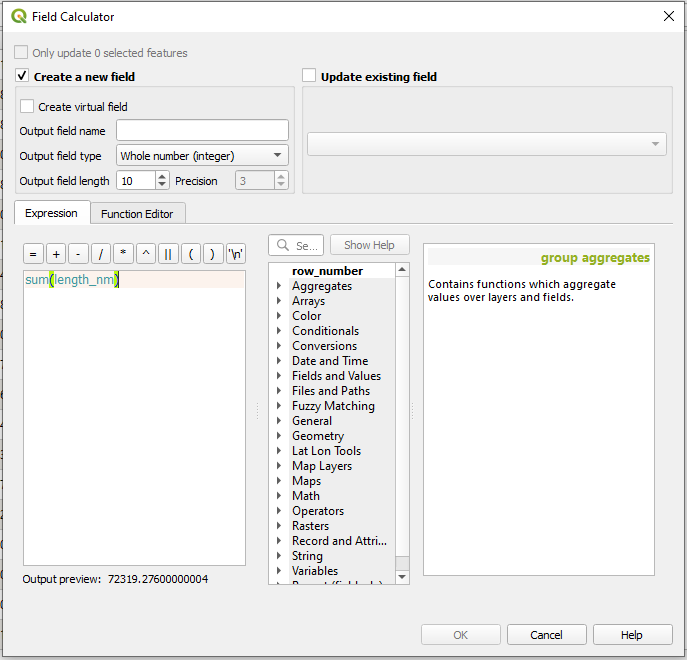
c. Calculate totals. Now that you’ve created some new historical data you can ask pose some questions related to it. What was the fullest extent of the Japanese shipping empire at the start of World War II? The field calculator can help to answer this question. In the expression window enter sum(length_nm)
If the expression is entered correctly it will automatically provide an answer. At start of the war, during the height of Japanese military expansion, the Japanese empire controlled a little over 72,319 nm of shipping across the Pacific.
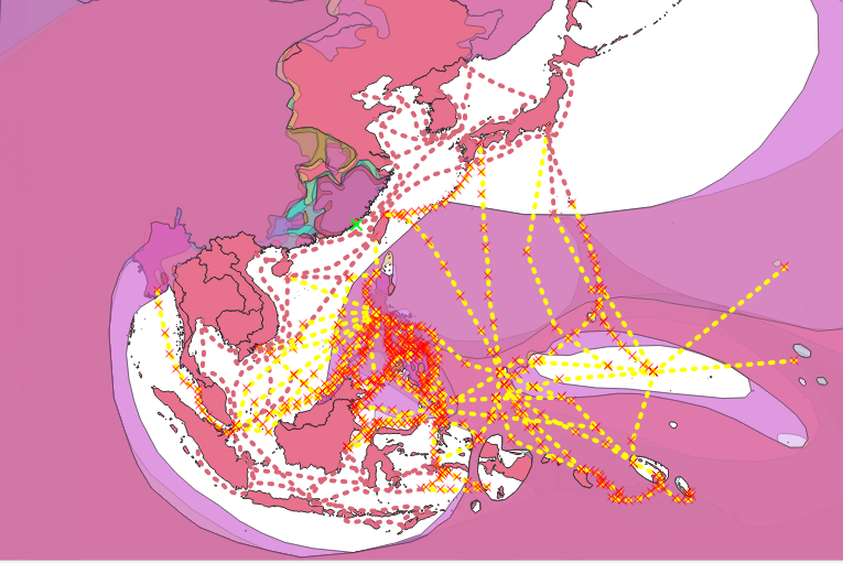
The Field Calculator can also be used on data which has been restricted via filters. Navigate to the shapefile’s filter function and enter the following expression “closed” = ‘1945/09/02’ This will limit the QGIS to displaying only those SLOCs which remained open on the eve of Japanese surrender. Repeat the same process from step 5c.
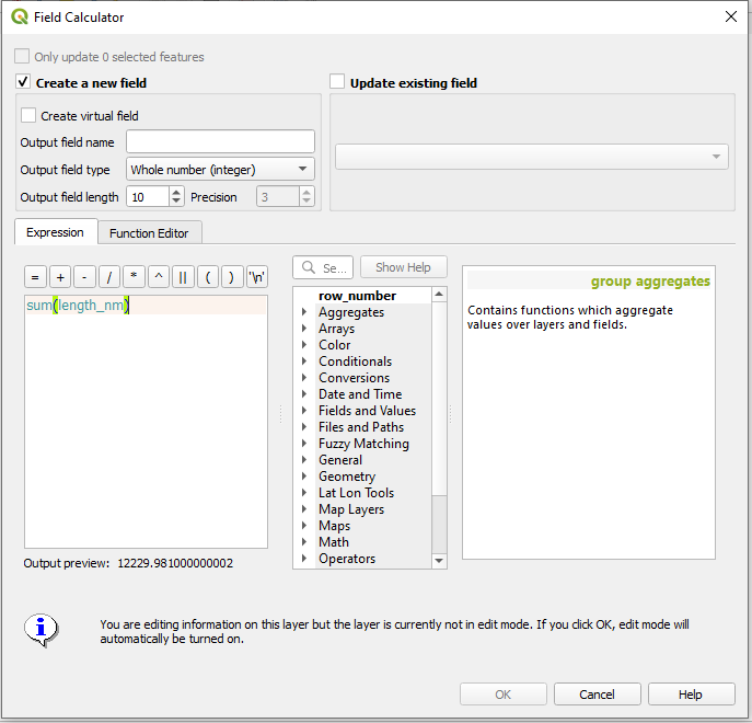
By the end of the war the Japanese empire maintained 12,229 nm of its original shipping network of 72,319 nm.
d. Update Shapefile. The Field Calculator can also be used to add qualitative data to existing shapefiles. To illustrate this function let us add some data to the SLOC shapefile.
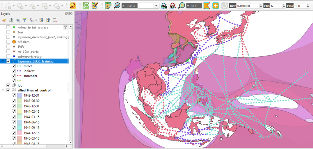
First remove any filters which may remain on your Allied zones of control shapefile. Preform a select by location to determine those SLOCs which intersect or overlap with the Allied line of control shapefile. This will identify those SLOCs which were directly interdicted by the Allied advance.
Consult part III if you need a refresher on select by location.
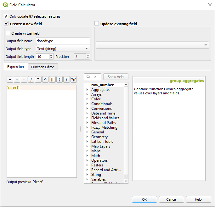
e. Create New Field and Populate Selected Features. Your select by location should return 87 features. These SLOCs are those which were directly cut by Allied occupation, or the isolation of Japanese shipping nodes or the continuous control of maritime space. With this knowledge in hand you can now attribute each feature by the manner in which it was interdicted.
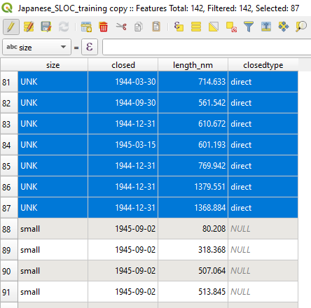
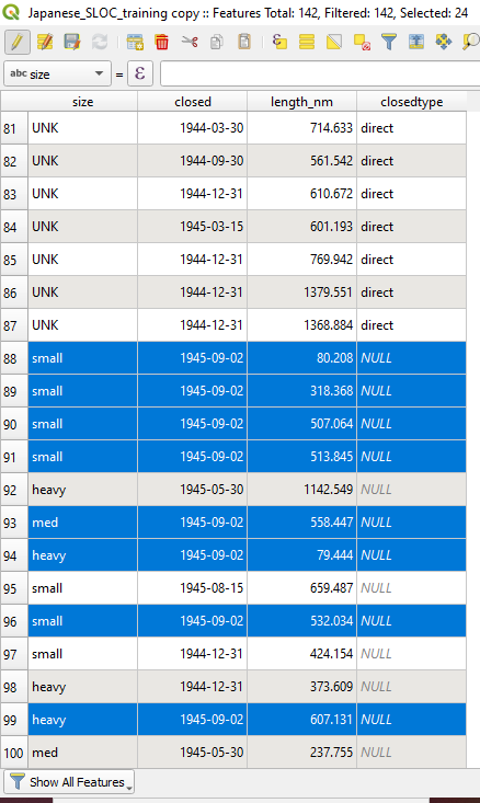
Navigate to the Field Calculator. Click the box which says “Only update 87 selected features.” Click Create a new field. Choose a name for the new field. Choose Text(string) and give it a generous field length, 10 should suffice. In the expression provide an attribute entry contained by single quotes, ‘direct’ for instance. This will instruct QGIS to create a new field and populate the 87 selected features with an attribute: direct.
Hit ok.
f. Continue attribution of new field by Select by Expression. You will likely notice that QGIS has now applied a ‘direct’ observation to 87 of the 142 features. Now, you will need to attribute the rest.
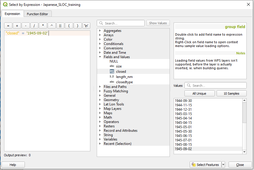
What about those SLOCs which were still active at the end of the war? You can select those using the “Select features using an expression” feature within the attribute window. Clicking it will open the Select by Expression window. In the expression box enter “closed” = ‘1945-09-02’ This will select only those SLOC features which were only closed upon the end of hostilities.
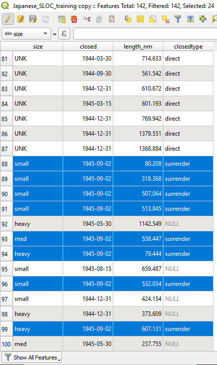
Hit select features, hit close. The expression should have selected 24 features.
g. Update attributes using field calculator. Now that you have identified those SLOCs which operated until the end of the war it is now time to attribute them. Reopen the Field Calculator. Click Only update 24 selected features. Click Update existing field. Choose closedtype from the dropdown menu. In the expression window enter a new field entry, ‘surrender’
Hit ok.

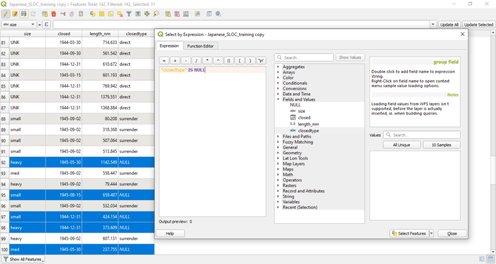
h. Select the remaining NULL rows using a Select by Expression. Now only those features which remain without a closedtype entry are those which were not directly interdicted by the Allies but did not remain open until the end of the war. Those features are currently listed as NULL. To attributed those features you can selected them via a Select by Expression using the expression “closetype” IS NULL The expression should select 31 features.
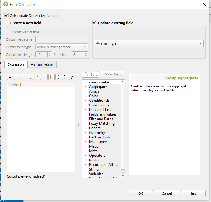
g. Complete field using Field Calculator. As you did with step 5g, finish attributing the new field using a new entry. ‘indirect’ should suffice.
Congratulations, you now have an original dataset derived some source material and improved with new spatial data and assessments.
Step 6: Network Analysis
QGIS also provides tools for users to preform network analysis. In a modern context, geospatial analysts working in military affairs use network analysis to aid in campaign planning, logistics, and targeting support. For digital digital military historians, network analysis can aid in answering similar questions about past military campaigns.
The SLOC data constitutes a network and can therefore be interrogated by QGIS’ network analysis tools. A word of caution, network analysis is a stickler for precision. If your network vertices are not perfectly snapped the tool will not identify possible routes even if they existed in reality. As such, for step six I would recommend that you download and load a prepared copy of the Japanese SLOC network, from here.
Also, if you do not have your file of Japanese occupied oil facilities you can download a copy here.
a. Load the necessary datasets into QGIS.
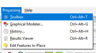
b. Navigate to Processing > Toolbox
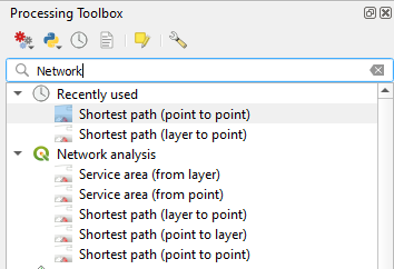
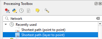
c. Search for Network in the search toolbar. Click on Shortest path (point to point). Point to point will tell QGIS to discover the shortest or fastest route on a network between two manually chosen points.
d. Select your Japanese SLOC shapefile from the “Vector layer representing network” dropdown menu. Choose your start and end points from the icon next to the “Start point” and “End point” windows. When you click on either icon, the Shortest Path window will close and your icon will turn into a crosshair. Select your point using the crosshair and the Shortest Path (Point to Point)window will reappear. Repeat the process for the other end. Keep the rest of the defaults.
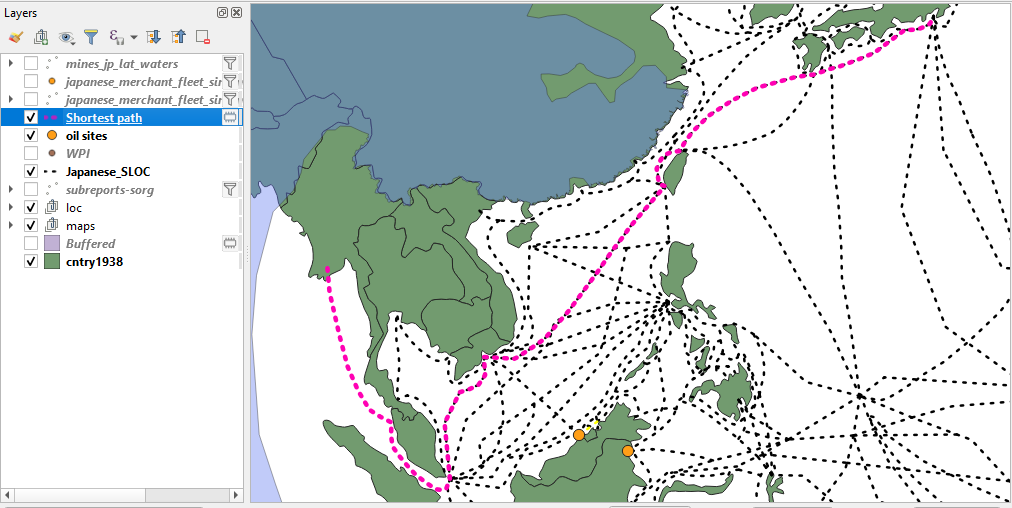
For this example we’ll choose the Ports of Rangoon and Tokyo, although any two points on the network will suffice.
Hit run.
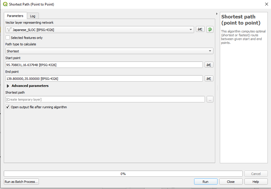
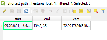
e. QGIS has auto determined the shortest route in your SLOC network between Rangoon and Tokyo. Right click on the newly created Shortest Path shapefile and open its attribute table. Note that QGIS created a temporary shapefile with three columns, a starting point, an end point (both decimal degrees), and a travel cost. The cost column displays the travel distance between the two points measured in degrees.
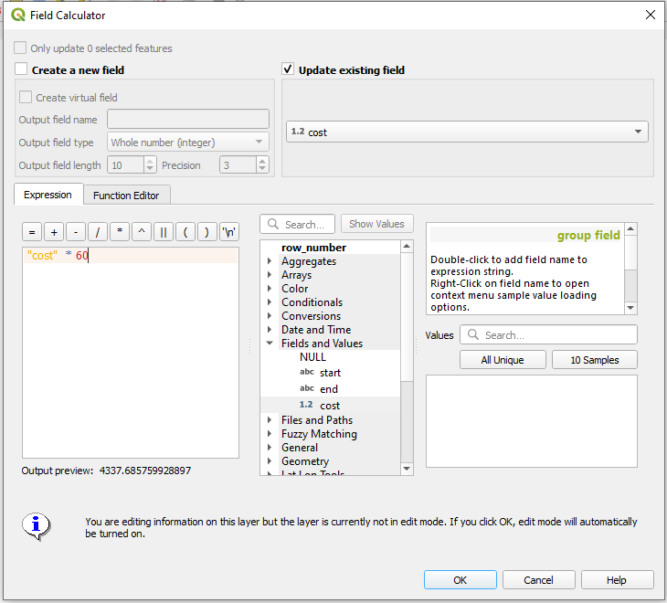
f. You can convert that fields value by using the field calculator. Open the calculator. Click on Update existing field. Choose cost from the dropdown menu. Enter “cost” * 60 into the expression window.
Hit ok.
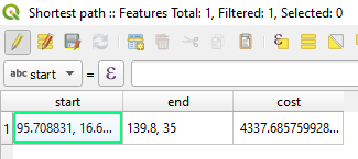
Your cost column is now converted to nautical miles. The shortest route between Rangoon and Tokyo in the SLOC network was a little over 4,337 nautical miles.
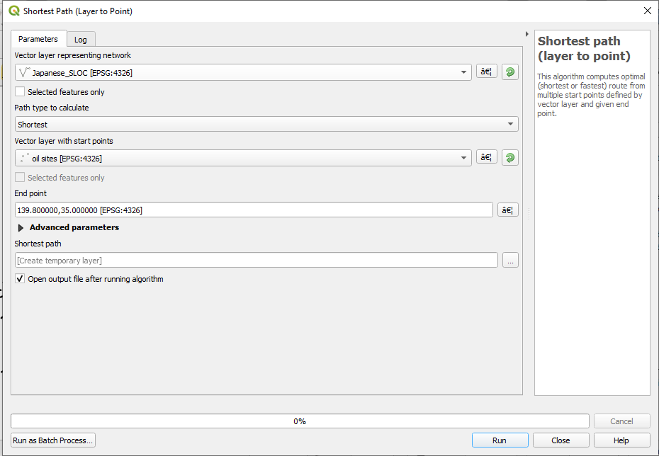
g. QGIS will also allow you to use layer data as one or both of your start and end points. Search again in the Processing Toolbox for Network. Click on “Shortest path (layer to point).
h. Select your Japanese SLOC shapefile from the “Vector layer representing network” dropdown menu. “From the vector later with start points” select your oil sites data set. And, as you did earlier, select the port of Tokyo using the coordinate grabber. Keep the rest of the defaults.
Hit run.
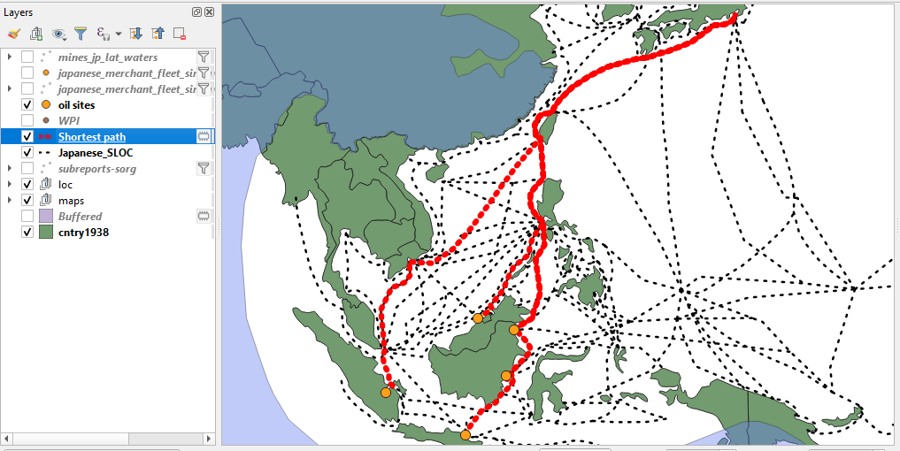
i. Using a select by expression you can create another set of estimates for comparative purposes. For instance, how was Japanese oil shipping impacted by the Allied advance into the Philippines?

First you will need to select those SLOCs which were closed after 15 Mar 1945. You can achieve this by setting a filter on your SLOC shapefile using the expression, “closed” > ‘1945-03-15’
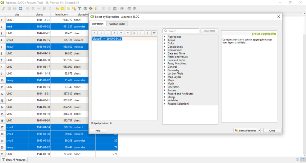

j. Open the Shortest Path (Layer to Point) tool. Use the same inputs as step 6h, although this time select the box next to “Selected features only.”
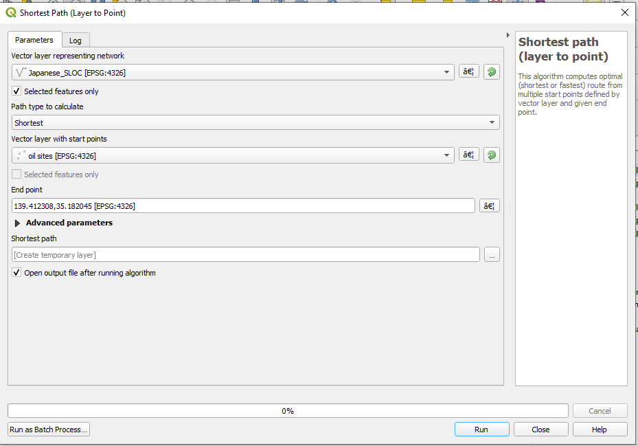
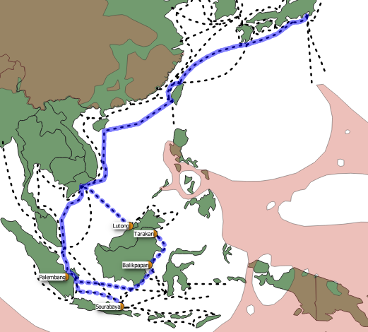
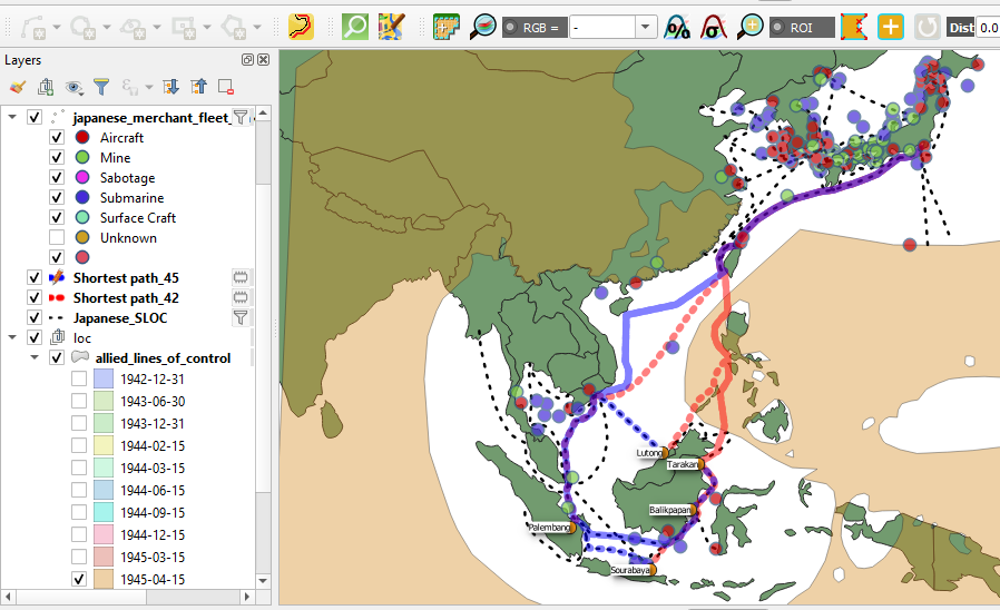
As you will likely observe the Japanese SLOC network was severely degraded in the early spring of 1945. Sites on the island of Borneo were significantly impacted. How might we measure the impact of this network degradation? One method would be to compare the travel costs of all five sites between the initial estimates and those from March 1945. This can be achieved using QGIS’s join function and the field calculator.
k. First you will want to convert the travel costs for your new estimates to nautical miles as you did with step 7f.
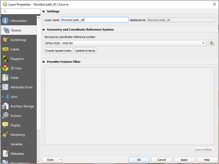
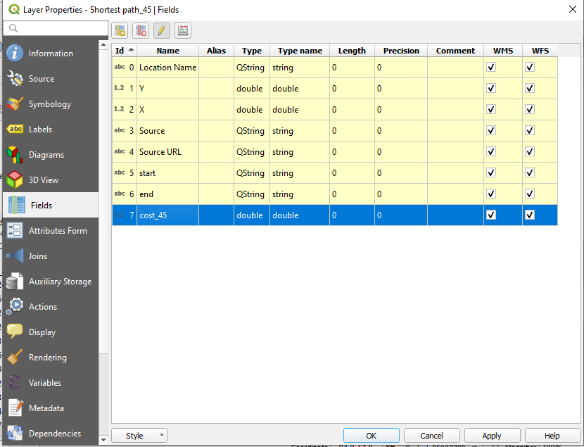
l. Next I would strongly recommend that you change the layer names for each Shortest Path shapefile. I would also recommend changing the names of each layer’s cost column. You’ll want to do this in order to differentiate them during later steps. You can change the layer name by opening the layer properties and navigating to the source tab. I would recommend applying a 42 or 45 suffix to either layer.
Similarly, you can change the field name by navigating to the fields tab and activating editing mode (by clicking the pencil icon).
Repeat the process for the other layer.
m. Time to join the data from one layer to another. Open the layer properties for your newly name Shortest path_42 layer and navigate to the Joins tab. the Add Vector Join window should appear. From the Join layer dropdown choose your newly named Shortest path_45 layer. For both the Join and Target field, select Location Name. Check the Joined Fields box and select “cost_45” from the list below. This will tell QGIS to only join that data which will be useful for you. Doing so will keep the output free from unnecessary redundancy. Check the box next to “Custom Field Name Prefix” and blank out the selection. This option is superfluous since you took the time to remain your field.
Hit ok.

n. Open the attribute field and observe that QGIS has applied the cost estimates from the 1942 estimate to the layer for the 1945 estimates. You will likely also observe several of the facilities endured significant blows to their connectivity to the port of Tokyo. QGIS’ field calculator can be used to preform some simple arithmetic to place these changes into context.

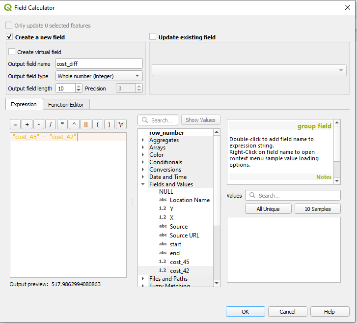
o. Open the Field Calculator. Check Create a new field. The the new field a name, “cost_diff” should suffice. Keep the rest of the defaults. In the expression window, enter the following expression “cost_45” – “cost_42” This will find the difference between the cost estimates from 1945 and 1942.
Hit ok.

p. Observe the cost difference provided by QGIS. The Allied invasion into the Philippines and related incursions into the South China Sea imposed a heavy cost upon Japanese shipping. In addition to lost tonnage and material, the Japanese empire lost vital routes between its occupied oil facilities in Indonesia and Malaysia and Japan. Sites on the eastern portion of Borneo and Java were especially impacted as their northerly routes were directly interdicted.
And with that, sadly Rebuilding a War must come to a close. I hope that this series of blogs as proven valuable to you in your practice of digital history. I would like to thank my colleagues at the Roy Rosenzweig Center for History and New Media for their assistance in copy editing and sanity checking these blogs. If you have any questions or comments please feel free to contact me at bbuck@gmu.edu. I am somewhat active on twitter @brandan_buck .
So long.
