Rebuilding a War, Part I: Map Georectification and Feature Digitization, Polygons.
The following is a series of blog posts designed to capture the lessons learned during the creation of “Unrestricted: The Campaign to Sink the Japanese Merchant Fleet During World War II.” The aim of this series is to pass along these techniques for students and professors of digital history in general, and digital military history in particular.
The first blog in this series concerns map georectification and the digitization of the polygon features contained therein. While there are a number of excellent tutorials on both of these processes they often, in my humble opinion, focus on mere “buttonology.” This series intends to serve both as a means of learning the mechanics of these techniques while also illustrating how to think through complex digitization problem. It is my hope that the materials in this series will aid new digital historians in their own endeavors and spare them the headaches that I have endured during my work.
Getting Started:
This blog series will assume that the reader has set up QGIS, and possesses a basic knowledge of how the tool works. (If not, QGIS can be downloaded here. An introduction to QGIS can be found here.) For a basic rundown on GIS data types and other essentials useful for digital humanists see this excellent resource.
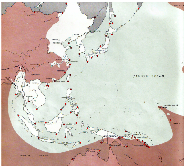
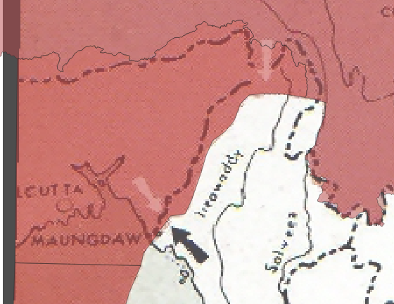
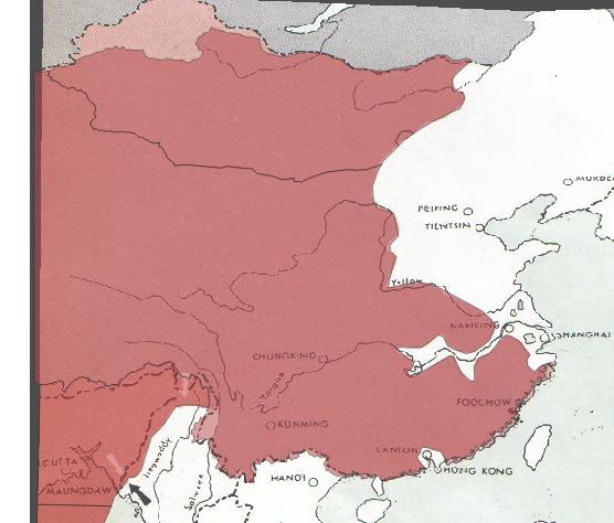
The maps which you will digitize are from The Atlas of the World Battle Fronts in Semimonthly Phases to August 15 1945 and you will be rectifying and digitizing a map from the atlas’ Pacific campaign series which depicts the state of the campaign on February 15th 1944.
You will also need a base layer with which to rectify our map. Given the scale of this project a simple shapefile of international boundaries, either from the present or the period. Either will suffice although the current shapefile, while anachronistic, contains more accurate geometries. The landmarks which you will use you consist of shoreline features and other international boundaries defined by rivers and other natural landmarks which have remained largely unchanged and are accurate enough for our purposes.
*Note: This tutorial was generated using QGIS 3.10 in the spring of 2021. Future iterations of QGIS may contain a different interface, toolbar configuration, or other cosmetic changes. Nevertheless, the functionality of the tools and concepts of this tutorial will remain pertinent.
Step 1: Create Project
a. Create a new QGIS project.Launch QGIS.
b. Project -> New
c. Name the new project.
d. For this tutorial you will always use WGS 84 ESPG: 4326 as the Coordinate Reference Systems (CRS) or Spatial Reference System (SRS). To set the CRS, go to Project -> Properties, select “CRS” on the left panel. WGS 84 should be the first choice. If you don’t see it, filter for “WGS 84” and it should populate. Select it and hit ok.
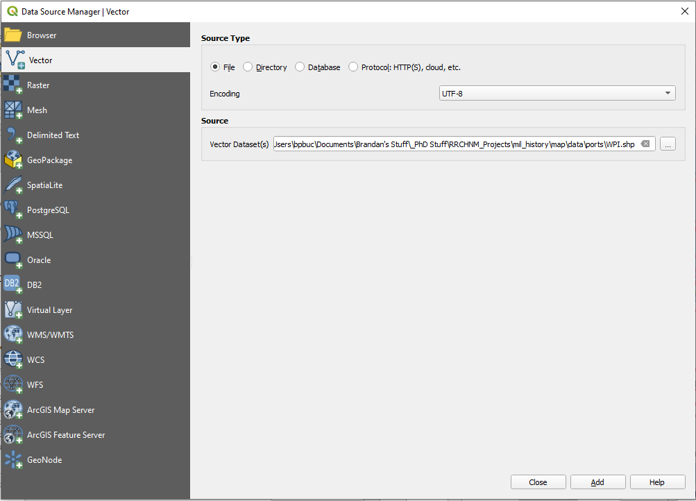
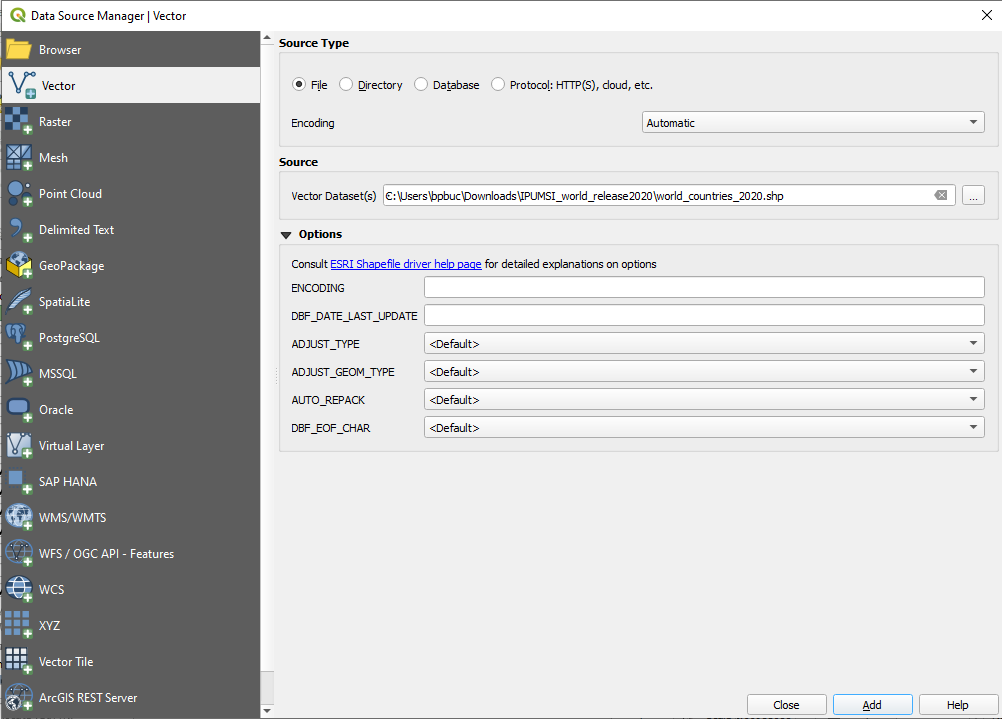
e. Add the boundary shapefile, Layer -> Add Layer -> Add Vector Layer
f. Browse to the location of the boundary shapefile, select the .shp file, select open
g. Select Add, then Close
h. Save the project
*Note on Coordinate Reference Systems. Despite the musings from some corners of the internet…the Earth is not flat. Traditional maps are a 2d representation of a 3d reality. As such, compromises must be made in order to make maps legible. Coordinate Reference Systems are a means of doing so. They define “how the two-dimensional, projected map in your GIS relates to real places on the earth.” All CRS types make compromises due to the limitations inherent to their role. WGS 84 is the mostly widely used CRS available. It is the standard for the U.S. Defense Department and is used in GPS systems worldwide. However there are examples where it can be of limited use, particularly for regions nearer of the poles of the Earth. However, given the scale of this project it will be more than adequate.

Georectify the map. The purpose of georectification is to apply geographic data to a “dumb image” thereby making it a file which can be used in a number of Geographic Information Systems (GIS) tools. This can be achieve this through a combination of QGIS’ reference tool, patience, and science! Since our goals here are to digitize historical information on a global scale our accuracy needs will only need to be good enough to accomplish said goal. You’re digitizing a war not fighting one, best not let the perfect be the enemy of the good.
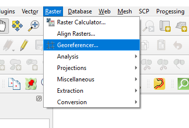
Step 2: Launch QGIS’ Georeferencer Tool, Raster -> Georeferencer
a. Open the map-to-be-rectified, File -> Open Raster, navigate to the file, select it and click open. The window should look like the one below.
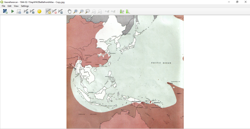
In order to complete this process you will need to manually associate points on the image to those from the base layer. Technically the process only requires four points. However, since the ultimate goal of this exercise is to digitize the crimson portion of the map which depicts the extend on the Allied advance during that period, you will need enough to ensure reasonable accuracy.
b. To start, click “Add Point”
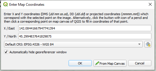
c. You will be automatically prompted to select a point on the image to rectify. Select a point on the image and you will be prompted with a window entitled “Enter Map Coordinates.” Select “Map from Canvas” at the bottom.
d. The Georeferencer will close automatically, use the cursor to select the corresponding point on the base layer. The “Enter Map Coordinates” window will reappear with the the X and Y boxes filled in.
Hit ok.
Congratulations, you’ve completed the first step on a long and tedious journey. Now would be a good time to fire up a podcast…if you haven’t already. Repeat this process until a satisfactory number of points have been created.
QGIS allows users to save the georeference points. Save them early and often. Georeferencer has been known to crash on occasion. Obsessive compulsive saving will likely save you the headache of repeating work in the event of a crash.
e. For this trial, 60 points were generated due to the map’s scale and complexity. Special attention was placed upon regions of the map which will demand greater accuracy for the purposes of digitization. Examples of such are Bougainville and Guadalcanal.
Note on points: Technically, only a minimum of four points are required, how the minimum is usually insufficient for a quality rectification. Unfortunately there is no hard and fast rule on how many it is necessary as that number is highly project dependent. Factors which can impact the the necessary number of points can be image size, detail, and scan quality. For this project a high number was necessary due to the maps relatively low resolution, the manner in which it was scanned, and its scale.
The Geospatial Historian provides some solid rules to live by.
f. Now that our points are generated it is time to process the image. Click the gear icon at the top of the Georeferencer panel, it will launch a window entitled “Transformation Settings.” Choose the settings selected in the image below. Check “Save GCP points” and select the output location for output tif. Also select “Load in QGIS When Done.”
Finally…hit ok.
g. Time to check your work. You should see an image in the QGIS viewer pane and the item should appear to the left in the QGIS layers menu. Click and drag the new georectified image and drag it above the base layer (the borders shapefile). Right click on the image and select properties. Navigate to “Transparency” and crank the “Global Opacity” down to a level with which you are comfortable.
Hit ok.
f. Now that the map is semi-transparent, use pan, zoom in, and zoom out to check your work. The map’s edges will likely look warped. That is that is normal and indeed expected. However the features of the map should roughly align with our base layer. If significant distortions are noted you may have further work to do. Thankfully since you scrupulously saved your points (you did didn’t you?) you can complete further rectification by adding, deleting, or moving existing points in the Georeference tool.
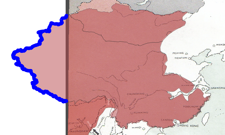
You’ll likely notice that the image isn’t “perfect.” The map was not constructed to the same detail as our base layer. As such certain features, like inlets, small islands and other minor features will not align exactly. And, if you’re an astute observer you’ll likely notice that the map’s depiction of the Mongolian-Soviet/Russian border differs from our base layer as well. Despite these deficiencies the georectified layer is “good enough” to provide the data you need to digitize.
Digitizing Features on the Map.
But wait! There’s more! This would be a good time to start another podcast if needed…this may take a while.
Now that the map is georectified it is time to digitize portions of interest. For the purpose of this tutorial you are interested in the crimson portion of the map which signify the extent of the Allied advance in the Pacific theatre as of 15 February 1944. This feature, which spans a large part of the Pacific poses a special digitization problem as the area depicted covers open ocean, adheres to international borders in some regions and bisects them in others. Similarly, the area you are going to digitized is often bounded by shorelines, rivers, and other obstructions.
You could simply digitize this entire area free hand. However to do so would take a prohibitively long time and likely not be as accurate as one would like.
Instead you will use a suite of QGIS’ tools to digitize certain portions by “harvesting” the existing geometries within our base layer map. You will then combine those efforts with a traditional freehand digitization.
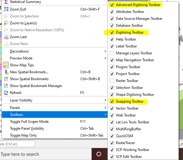
Step 1: Ensure that the “Advanced Digitizing Toolbar,” “Digitizing Toolbar,” and “Snapping Toolbar” are active.
a. Navigate to View -> Toolbars and ensure that the three tools are checked. The Toolbar menu should look similar to the image below:
Step 2: Create a Polygon Shapefile. Navigate to Layer -> Create Layer -> New Shapefile Layer
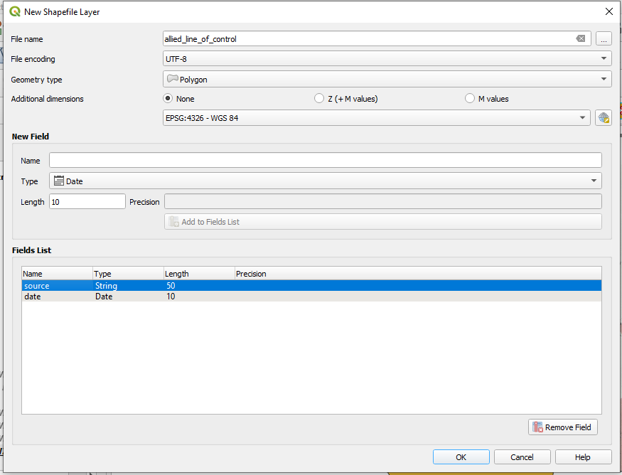
a. Give the shapefile a name and choose a file path from the “…” button. Choose “Polygon” from the Geometry type dropdown menu and make sure “ESPG: 4326 – WGS 84” is selected. The bottom half of the window is for creating fields within the new shapefile. For this shapefile you’re going to use a simple schema, one column for the date of the map and another for the source’s name.
Hit ok.
Step 3, The “Easy Part.” I would recommend doing this in chucks and saving often. QGIS can be finicky. Losing a digitization project while on the leg can be disheartening. Also, the scale of this digitization means that you’ll have to zoom and pan frequently. Switching between these functions and the digitization tool can lead to a loss of work. You’re going to start with the portions of the map which can be easy digitized freehand using QGIS’ Digitization Tool. Let’s start in the South Pacific since the areas in question do not coincide with any international borders or shorelines.
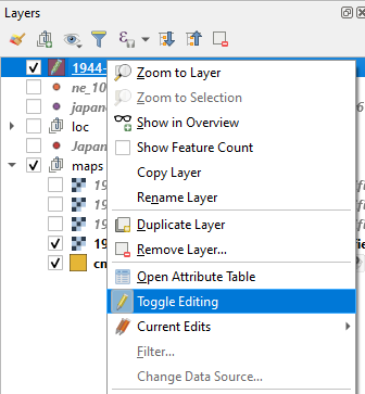
a, Right click on the shapefile in the QGIS layers window, select “Toggle Editing.”
b. Navigate to the Digitization Toolbar, find and click the icon for “Add Polygon Feature”
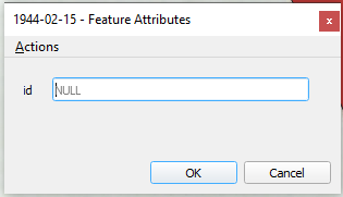
c. The mouse icon should transform into a crosshair. Now it is time to lay the first point by clicking on the image and repeat the process until the desire chuck has been highlighted in the a red polygon. When satisfied with the work right click to complete the feature. You will be immediately prompted with a “Feature Attributes” window. Click ok.
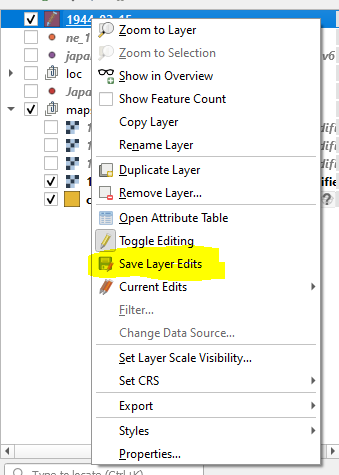
d. Congratulations…you’ve only just begun. Now would be a good time to save your progress. Again right click on the shapefile in the in the QGIS layers window and select “Save Layer Edits.” Do this often.
Now it is time to continue digitizing the portions in the South Pacific. From here you are going to make use of QGIS’ snapping tool. The snapping tool allows you to digitize, in part, by using the geometries of existing features. That is a fancy way of say “tracing without overlapping.”
e. Again click on “Add Polygon Feature.” Also click on the magnet icon on the snapping toolbar.
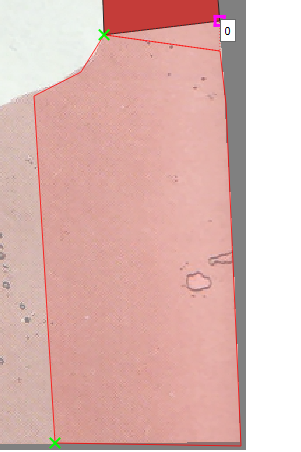
f. Hover the crosshair over the desired vertex and you’ll notice that it will be outlined with a pink box. Click on that box and then turn off the snapping tool. The digitization tool is now “anchored” and you can proceeded with digitizing the rest of the feature to include the edges of the image.
To complete the feature activate the Snapping tool, hover over the desired vertex, click the pink box, turn off the Snapping tool, and right click. You should again be prompted by the “Add Polygon Feature.” Click ok.
You may notice that there is a ring on the map which is not yet reflected in our digitization. The island hopping campaign conducted by the Allies left many such bypassed locations. You’ll need to reflect in our shapefile.
Thankfully, there is a solution!
g. Navigate to that portion of the map, it would be best to zoom in a little. Then navigate to the “Advanced digitization Toolbar” and select “Add Right.” The cursor should have once again transformed into a crosshair icon.

f. Trace around the bypassed area on the map with a sufficient number of points and right click when you are completed. You should have added a ring to the shapefile feature.
Now would be a good time to save the layer edits and the project.
g. Now it is time to fly solo…don’t worry I’ll be here when you get back! Repeat the processes outlined above to digitize the rest of the Allied advance in the South Pacific. You’ll want to stop somewhere south of Indian shoreline west of Rangoon, Burma.
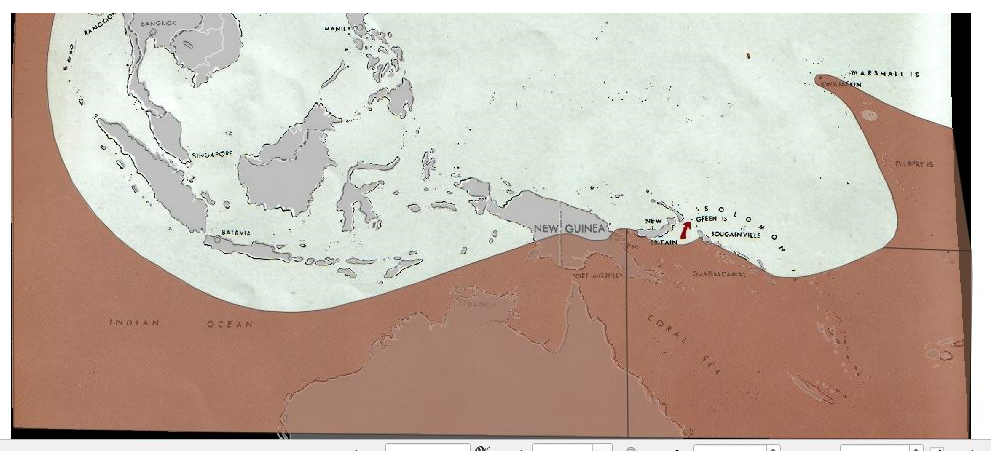
Step 4, The Not-So-Easy Part, part 1. Great you’re still here! Now examine rest of the map. You may noticed that the remaining portions of the map to be digitized are heavily aligned with China’s maritime boundary, its riverine boundary with Vichy Indochina and Mongolia’s northern boundary with the USSR. Rather than digitize these elements freehand we are going to “harvest” them from the existing boundary shapefile. For this I am going to use a shapefile of current political boundaries. Despite being anachronistic, the features we are drawing on, China’s coastline, the Mongolian-Russian Border, and the China-Vietnam border are largely the same as they were in 1944 and current boundary data is more accurate than is what is available in historic shapefiles.
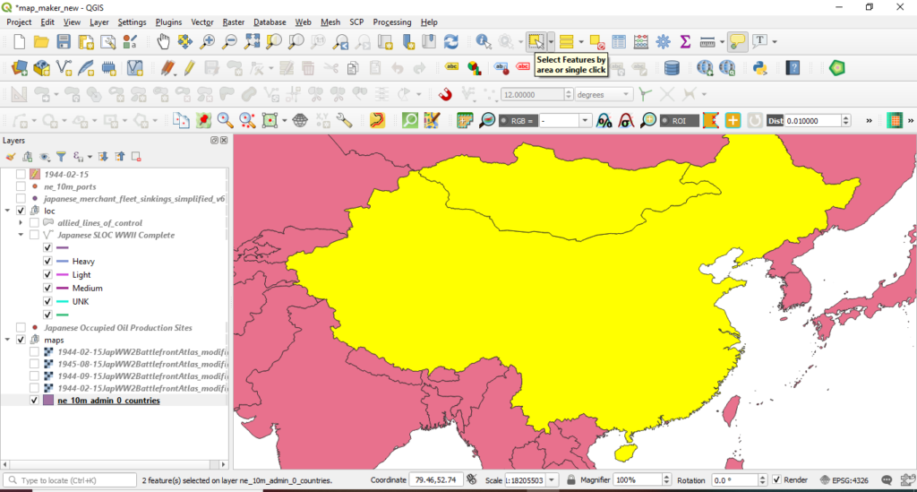
a. Highlight the base layer in the QGIS layers menu. Navigate to the “Attributes Toolbar” and select “Select Features by area or single click,” Click and drag so Mongolia and China are selected.
b. Right click on the base layer, select Export -> Save Features As
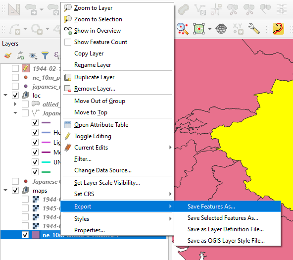
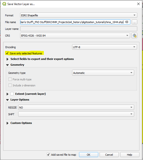
c. A window entitled “Save Vector Layer as…” should appear. Navigate to a desired file path using the “…” button and name the soon-to-be new shapefile. Ensure that “Save only selected features” and “Add saved file to map” are checked.
Hit ok.
d. You should now have a brand new China and Mongolia added to the map.
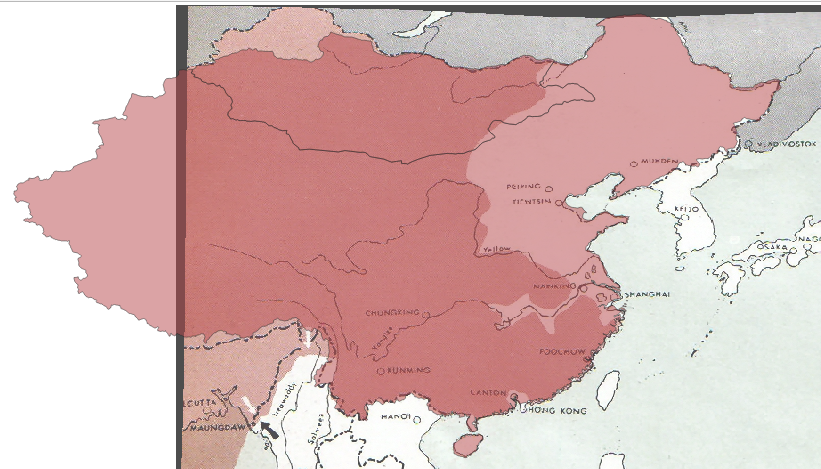
Step 5 The Not-So-Easy Part, China-India-Burma Theatre.
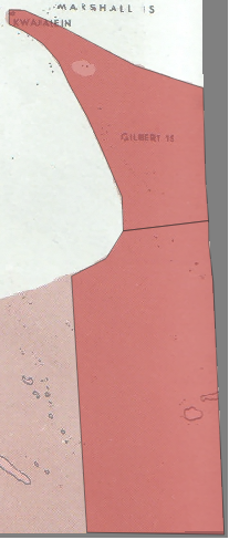
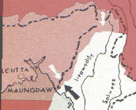
Our next step will be to digitize the portion between the South Pacific section you digitized manually earlier and our exported China shapefile. Zoom in on the China-India-Burma theatre portion of the map. Notice how the front deviates from the Chinese border? In order to recreate that, you’ll need to delete that portion from our new Mongolia-China shapefile.
a. Zoom in to that portion of the map. Navigate to the Advanced Digitization Toolbar and select “Split Features”

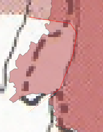
b. Click on a portion of the area of interest immediately outside the area to be deleted and then click along the front line and then right click on a portion immediately outside the area to be deleted. QGIS will split that portion off of our exported Mongolia-China shapefile.
c. How select the split portion and delete it.
d. Now you’re going to digitize the rest of the China-India-Burma theatre. Navigate to the digitization toolbar and select create new feature. Then navigate to the Snapping Toolbar turn on the “Enable Snapping” and “Enable Tracing”
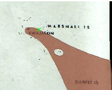
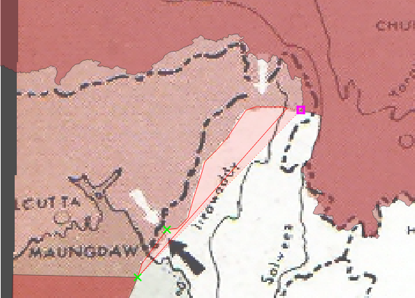
e. As you did earlier start use the snapping tool to begin the new feature on the vertex of the South Pacific portion you digitized earlier. This time choose the eastern vertex. Turn off the snapping tool and digitize by hand the frontline between the existing shapefile and the exported Mongolia-China shapefile. Now, navigate back to the “Snapping Toolbar” and reactivate “Enable Snapping” and turn on “Enable Tracing.”
As before the snapping tool will allow you to align the new vertex with an existing one. Click on the pink box which will appear and trace the icon over the Chinese border. The Enable Tracing function will “hook” the cursor to this feature. Trace until the edge of the map, again click on the pink box which appears and trace down to the other side of the South Pacific shapefile that you created earlier. Click on the pink box which will appear and then right click. You should once again be prompted with the “Feature Attributes” window.
Click ok.
Take a deep breath.

Step 6, The Not-So-Easy Part, Southern and Eastern China.
Now it is time to complete this odyssey by digitizing the portions of the map in China. Unlike the South Pacific section you will remove existing sections of our exported Mongolia-China shapefile.
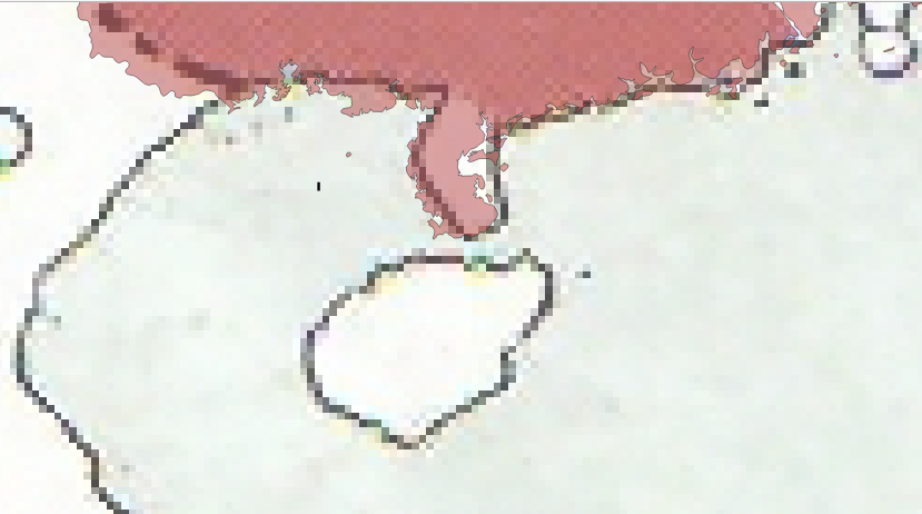
a. Start with the island of Hainan and the neighboring peninsula. Activate the Vertex tool from the the “Digitization Toolbar.” Drag and select the vertices which compromise the island of Hainan and delete them.
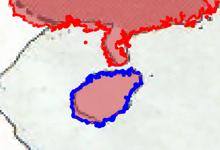
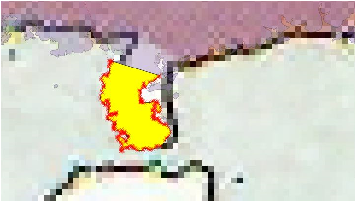
b. Use “Split Features” to remove the Leizhou Peninsula.
c. Repeat the process for the area around Canton/Hong Kong
c. Repeat splitting process for the areas around Nanking, Shanghai and Yangtze river.
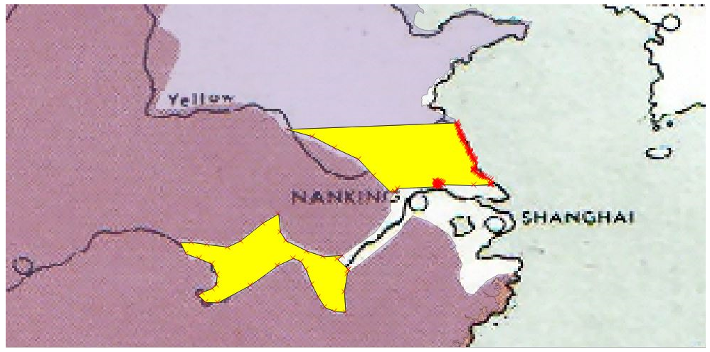
d. Now it is time to remove the expanse of Japanese occupied Eastern China. As with your earlier efforts this will best preformed in chunks.
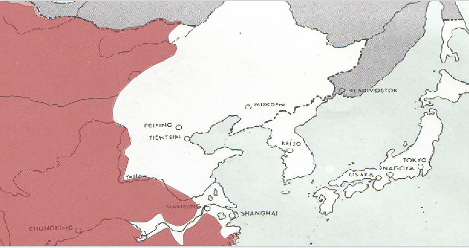
e. Delete the vertices which extend beyond the bounds of our map.
Note you may have to clean up small portions with the Vertices tool. You may also need to use the “Check Validity” tool to clean up any errors which you may encounter and prevent you from proceeding.
Step 7, The Not-So-Easy Part…the Dissolve.
Almost there…I promise. Now you’ll need to dissolve the individual features within the original shapefile which covers the South Pacific and the China-India-Burma theatre and merge that with the exported Mongolia-China shapefile.
a. Select the created shapefile from the Layers menu. Select all four portions of the shapefile. Navigate to the Advanced Digitization Toolbar and select “Merge Selected Feature.” A window titled “Merge Feature Attributes” will appear.
Click ok.
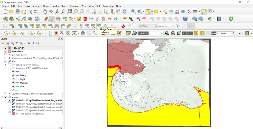
b. Repeat the same process for the exported China shapefile.
Step 8, The Not-So-Easy Part…the Merge.
Now it is time to merge the shapefile that you created with the exported Mongolia-China shapefile. First you are going to delete a bunch of superfluous metadata from the exported Mongolia-China shapefile. This is modern data it will only clutter up our final product.
a. Navigate to the Mongolia-China shapefile in the Layers menu. Right click, select properties and navigate to fields.
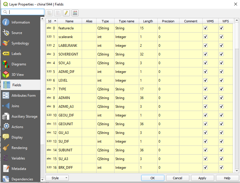
b. Ensure that editing mode is on by clicking the pencil icon. Highlight all the columns and hit “Delete Fields.” Go ahead and save your layer edits.
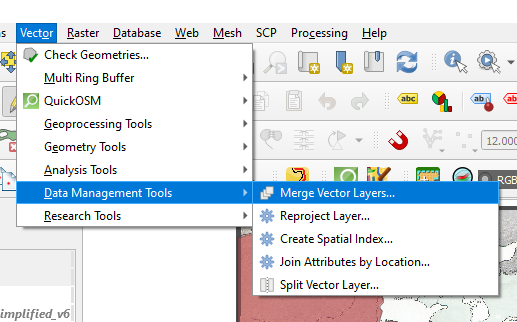
c. Navigate to Vector -> Data Management Tools -> Merge Vector Layers
d. The Merge Vector Layers window will appear. Set the Project CRS to ESPGL 4326 – WGS 84. Choose an output file by clicking the “…” icon by the “Merged” panel. Select the shapefiles by clicking the “…” icon by the Input layers panel. Select the export China-Mongolia shapefile and the one that you created from scratch.
Hit ok.
Let the science happen.
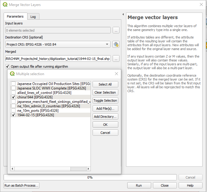
e. Step 9, The Not-So-Easy Part…Clean up.
Second to last step I swear! While our two shapefiles are now combined the new shapefile will likely contain multiple superfluous features. Most of these are likely an assortment of random islands and inlets which were not swept up and deleted during the earlier processes.
a. Navigate to the new shapefile in the layers panel and toggling editing. As before, select both features, navigate to the Advanced Digitization Toolbar and “Merge Selected Features.”
b. Navigate to the new and newly merged shapefile. Select the feature from the main window.
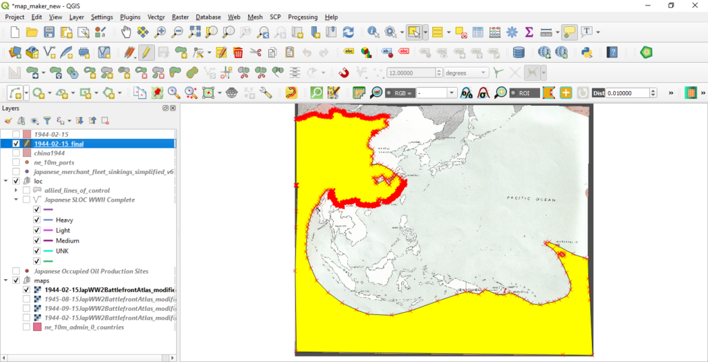
c. Right click on the shapefile in the layer window. Select “Open Attribute Table.” And select “Invert Selection”
d. This will select the random geometries which were not swept up during your earlier work.
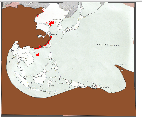
e. Hit “Delete selected features.”

f. Navigate to the layer properties menu as you did before and delete the existing fields.
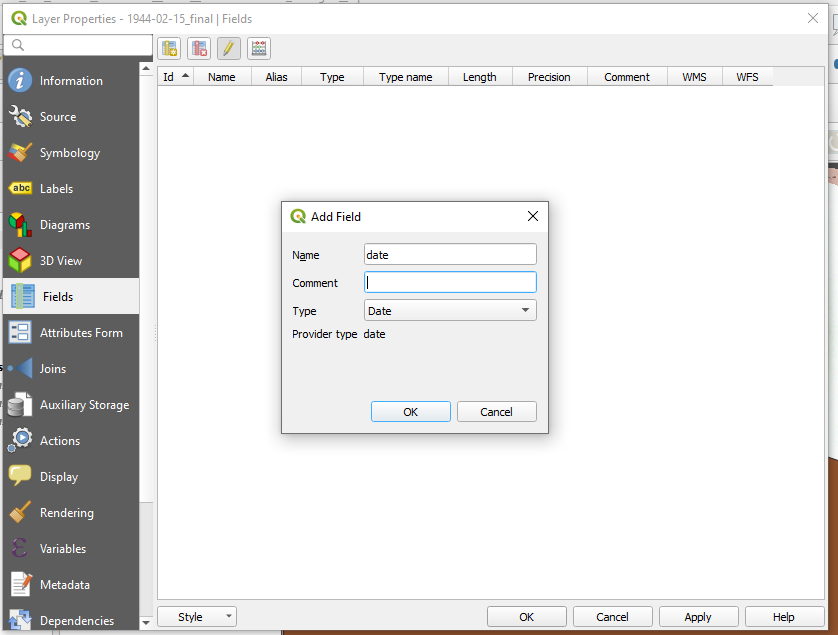
g. Add a new field by clicking the “Add Field Icon. The Add Field window will appear. Name it “date” and select Date from the type dropdown menu.
Hit ok.
And then hit ok to close the Layer Properties Menu
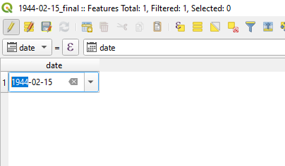
h. Open the attributes layer for the new shapefile. And enter a date into the field, 1944-02-15. Save your layer edits, toggle editing, and save your project.
And with that, you’re done!
Rebuilding a War, Part II: Map Georectification and Feature Digitization, Lines & Points.
The following is the second among a series of blog posts designed to capture the lessons learned during the creation of “Unrestricted: The Campaign to Sink the Japanese Merchant Fleet During World War II.” The aim of this series is to pass along these techniques for students and professors of digital history in general, and digital military history in particular.
The second blog in this series concerns the digitization of line and point features. This lesson will teach you how to digitize a sea lines of communication (SLOC) using QGIS’ digitization and snapping tools. This blog will also teach you how to use utilize contemporary spatial data for the digitization of historic information. Additionally, you will learn how to combine information from multiple sources into a single dataset. This blog will also cover proper data attribution and reinforce the georectification skills learned in part I. Finally, you will learn how to create a point dataset using a CSV file.
Getting Started:
This blog series will assume that the reader has set up QGIS, and possesses a basic knowledge of how the tool works. (If not, QGIS can be downloaded here. An introduction to QGIS can be found here.) For a basic rundown on GIS data types and other essentials useful for digital humanists see this excellent resource.
The maps which you will digitize are from The Reports of General MacArthur. Also, this tutorial will make use of material from “Choke Hold: The Attack on Japanese Oil in World War II” and contemporary port data, the World Port Index (WPI) made available from the National Geospatial-Intelligence Agency.
You will also need a base layer with which to rectify our map. Given the scale of this project a simple shapefile of international boundaries, either from the present or the period. Either will suffice although the current shapefile, while anachronistic, contains more accurate geometries. The landmarks which you will use you consist of shoreline features and other international boundaries defined by rivers and other natural landmarks which have remained largely unchanged and are accurate enough for our purposes.
*Note: This tutorial was generated using QGIS 3.10 in the spring of 2021. Future iterations of QGIS may contain a different interface, toolbar configuration, or other cosmetic changes. Nevertheless, the functionality of the tools and concepts of this tutorial will remain pertinent.
Step 1: Create (or Load Previous) Project
a. Create a new QGIS project. Launch QGIS.
b. Project -> New
c. Name the new project.
d. For this tutorial you will always use WGS 84 ESPG: 4326 as the Coordinate Reference Systems (CRS) or Spatial Reference System (SRS). To set the CRS, go to Project -> Properties, select “CRS” on the left panel. WGS 84 should be the first choice. If you don’t see it, filter for “WGS 84” and it should populate. Select it and hit ok.
e. Add the boundary shapefile, Layer -> Add Layer -> Add Vector Layer
f. Browse to the location of the boundary shapefile, select the .shp file, select open
g. Select Add, then Close
h. Save the project
*Note on Coordinate Reference Systems. Traditional maps are a 2d representation of a 3d reality. As such, compromises must be made in order to make maps legible. Coordinate Reference Systems are a means of doing so. They define “how the two-dimensional, projected map in your GIS relates to real places on the earth.” All CRS types make compromises due to the limitations inherent to their role. WGS 84 is the mostly widely used CRS available. It is the standard for the U.S. Defense Department and is used in GPS systems worldwide. However there are examples where it can be of limited use, particularly for regions nearer of the poles of the Earth. However, given the scale of this project it will be more than adequate.


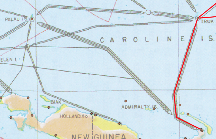
Georectify the map. As with part I, this blog will require the georectification of historic maps for the purpose of feature digitization. This tutorial will first make use of a map from the MacArthur report entitled, “Enemy Shipping Routes Destroyed during the New Guinea Campaign.”
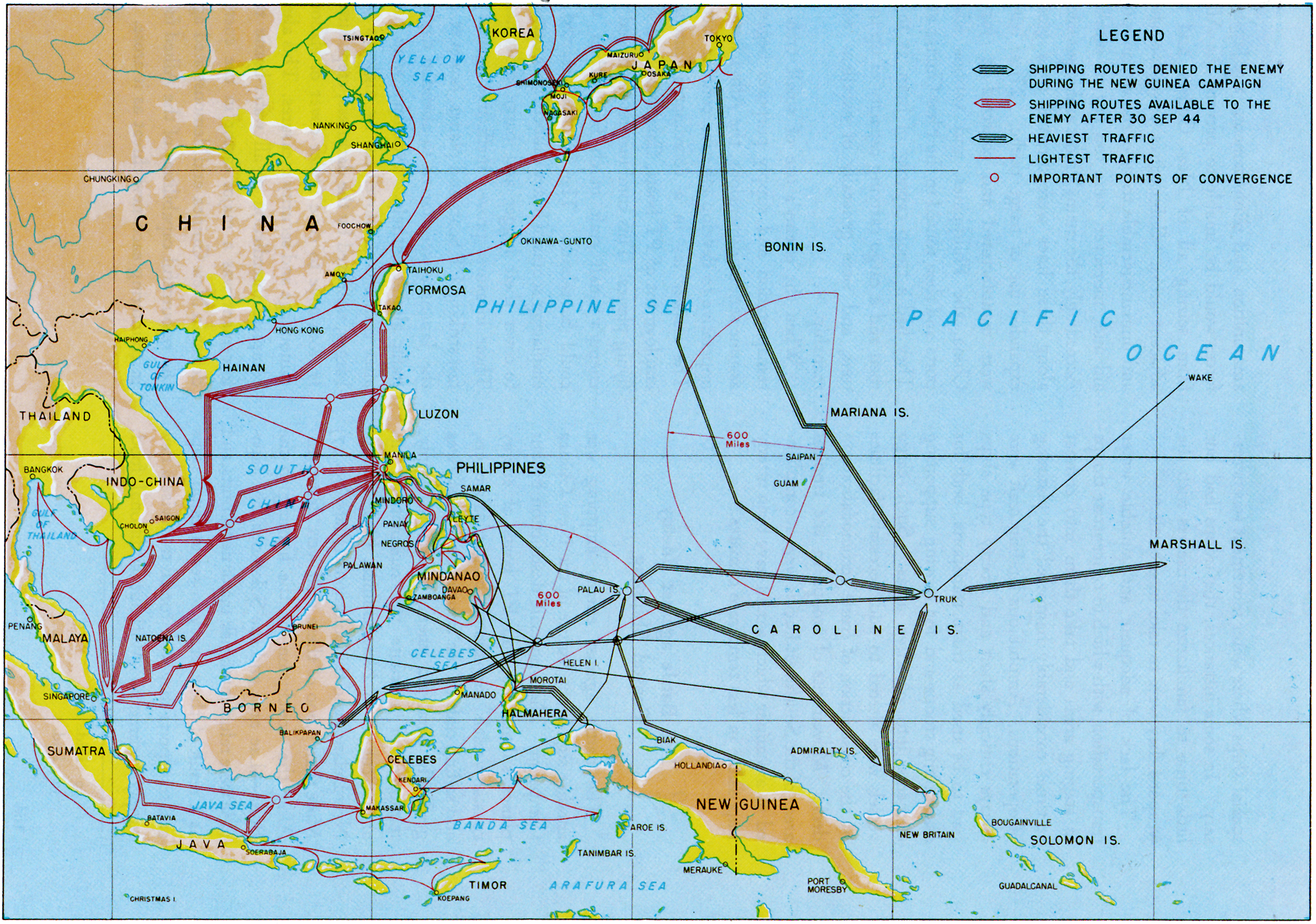
To proceed with this tutorial, georectify the map using your boundary base layer. If you need a refresher on georectification, please consult part I. No worries, I’ll wait for you!
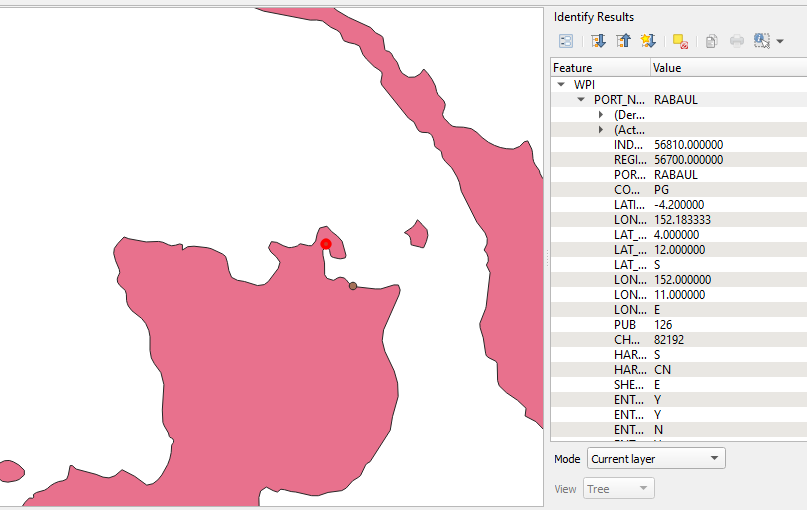
For portions of the map in the central Pacific such as Truk and Wake Island, the WPI data can serve to aid in georectification.
*Note: Strictly speaking using contemporary data for projects such as this may be anachronistic. However, significant features such as ports, particularly major ones, may still yield useful spatial data for historians. For instance, the composition of the Rabaul Port may have changed significantly since World War II, but its location has not. So, despite WPI being a modern dataset, it can still yield valuable spatial data.
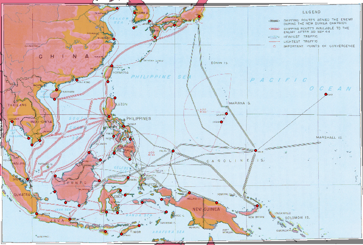
Digitizing Features on the Map.
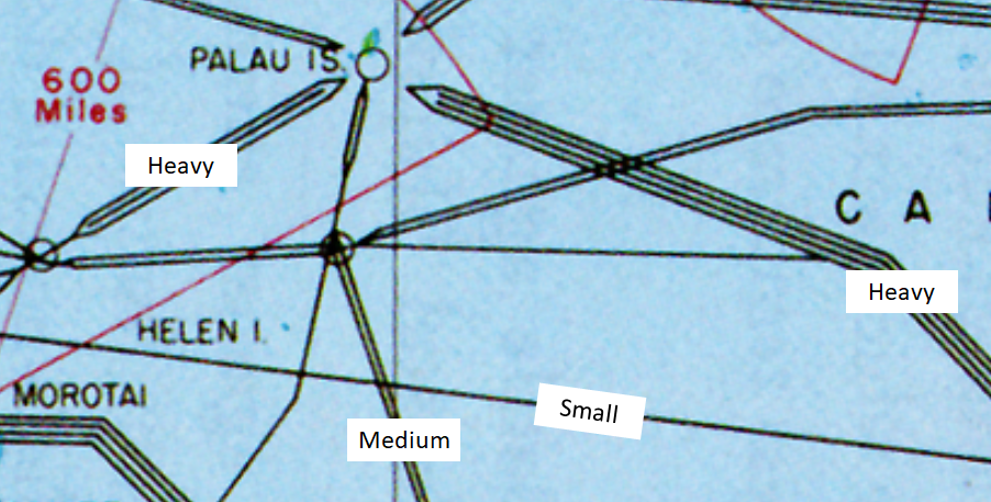
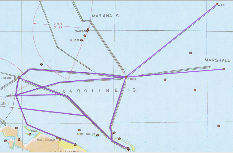
As with part I your goal here is to turn the analog information from the map into digital information in the form of a shapefile. The map depicts the location, traffic level, and date of interdiction for the Japanese empire’s shipping network during World War II. Each lane is weighted according to its relative level of traffic. For this tutorial simple three tier system will suffice, small, medium and heavy. Small for SLOCs depicted by one line, medium for two lines, and heavy with those symbolized by three or four lines.
The SLOCs are also colorized according to their operating status as of 30 September 1944, black for closed, red for open. Set this information aside for now. Interdiction dates will be addressed during the next installment of this blog.
Step 1: Load WPI shapefile into the project.
a. Navigate to Add Layer -> Add Vector Layer
b. Use the “…” button to navigate to the file location where you saved your copy of the WPI shapefile
Hit Add
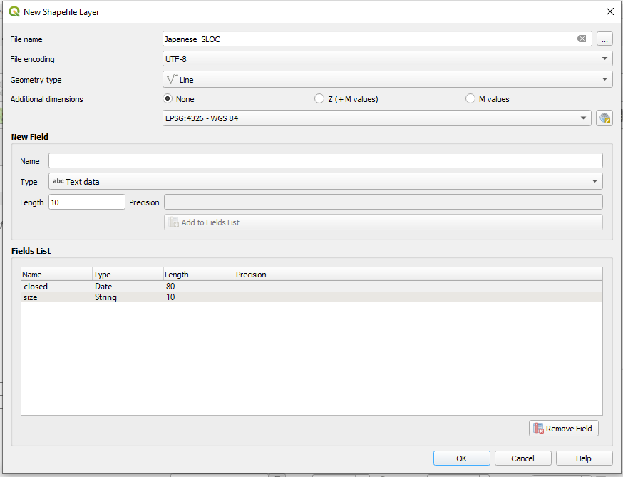
Step 2: Create a Line Shapefile. Navigate to Layer -> Create Layer -> New Shapefile Layer
a. Give the shapefile a name and choose a file path from the “…” button. Choose “Line” from the Geometry type dropdown menu and make sure “ESPG: 4326 – WGS 84” is selected.
The bottom half of the window is for creating fields within the new shapefile. For this digitization project our goal will be to capture information from the map and reflect it within the shapefile’s attributes. To do so we will need two columns, one for the size of the sea lane and another for when it was interdicted by the Allies. Select “Date” from the “Type” dropdown menu for the date column. Click “Add to Fields List.” Next, select “Text Data” for the size field. A field length of 10 should suffice.
Note: Proper attribution will allow you greater flexibility in your analysis and map creation in QGIS. It will also afford you opportunities to create interactive maps in programs such as R Studio.
Hit ok.
Step 2: Begin digitization. As with part I I would recommend starting in the South Pacific where the Japanese SLOCs were simplest. Throughout this digitization process your goal will be to replicate the complexity of the SLOCs depicted on the map. To achieve this you will use the snapping tool to anchor your lines to major points of convergence and harbors. Using the snapping tool combined with the contemporary WPI dataset will speed the digitization process along while making for a cleaner dataset.
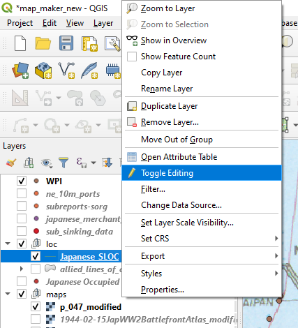
a. Right click on the line shapefile in the QGIS layers window, select “Toggle Editing.”
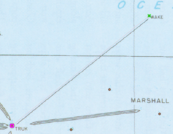
b. Navigate to the Digitization Toolbar, find and click the icon for “Add Line Feature” and the Snapping Tool. Click on the contemporary port facility over the island of Wake, click and then right click on the port facility over the Truk Atoll (known now as Chuuk Lagoon).
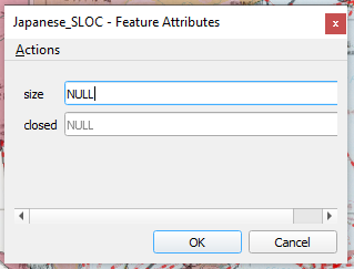
c. The “Feature Attributes” window will appear. Note that the SLOC depicted is symbolized on our rectified map by a single line. This is the smallest of the possible sizes.
Hit ok.
c. Congratulations, you’ve made your first line feature! Next, digitize the heavy SLOC between Truk and the Marshall Islands. The map depicts a general shipping lane between a discreet point, Truk Atoll and a collection of islands, the Marshalls. For an anchor point, the current port facility of Kwajalein in the Kwajalein Atoll will serve as a suitable terminus.
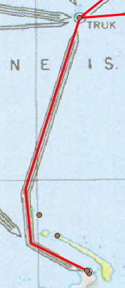
d. Next, digitize the SLOC south from Truk to New Britain. Be sure to use the snapping tool to anchor your first point to Truk, drop two vertices along the path of the SLOC, turn on the snapping tool and anchor the terminus of the SLOC to the port of Rabaul.
e. Next, connect the port of Rabaul to the Palau Islands. Start the new SLOC on the vertex that is northwest of Rabaul. As before, use the snapping tool to hook it onto the existing vertex. Digitize this SLOC while paying attention to not only the lane’s geography but also its overlaps with other lanes. Place vertices at the locations where this SLOC intersects with others. Doing so will allow you to more efficiently build the rest of the shipping network while maintaining a greater degree of accuracy. Between our starting point and the end point, the Palau islands this new SLOC should have four vertices.

f. Time to fly solo again! Complete the rest of the shipping network between the Palau Islands south to the island of Biak and southeast to New Guinea. As you do be sure to digitize with the overall network in mind, applying vertices where SLOCs overlap. Also, be sure to properly attribute the SLOC sizes as you go. This is not the kind of tedious work that you want to do later.
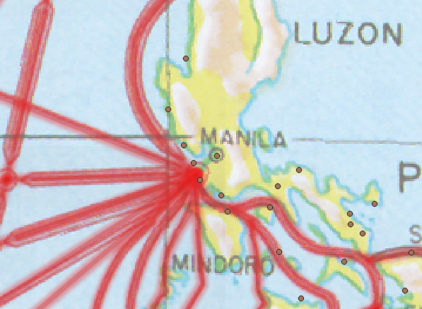
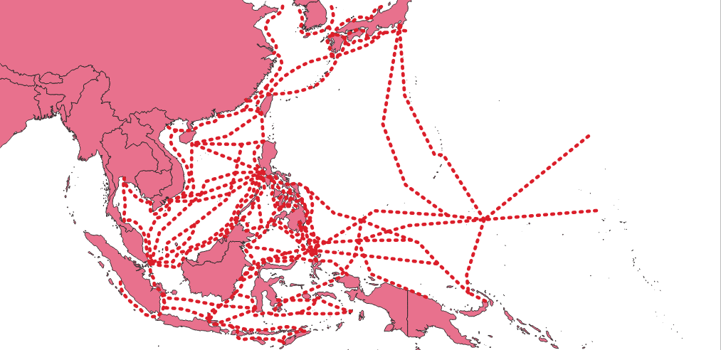
g. Now that you have the hand of the basics it is time to digitize the rest of the map. Apply the same principles as before to the rest of the network. For major shipping hubs which are located in the vicinity of numerous port facilities, pick a single point of convergence and use it to snap your points to. See the examples below.
Step 3: Additional Georectification, Digitization, and Deconfliction
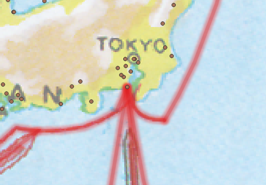
You may notice that the SLOCs on the edges of the Pacific theatre are cut off, particularly around northern China and Korea. The Reports of General MacArthur contains another map of Japanese shipping lanes with has valuable geographic and temporal data. It contains several prominent SLOCs which do not appear on the map that you georectified earlier. This map, “Changes in Shipping Routes” contains routes which should be reflected in our new dataset.
a. Georectify the new map. Since the portions of interested are localized to the Yellow Sea, Sea of Japan, around the Port of Rabaul, and the Bay of Bengal, you can limit your georectification points to those locations. For good measure it would also be a good idea to rectify Palau, Saipan, and the Truk Atoll.
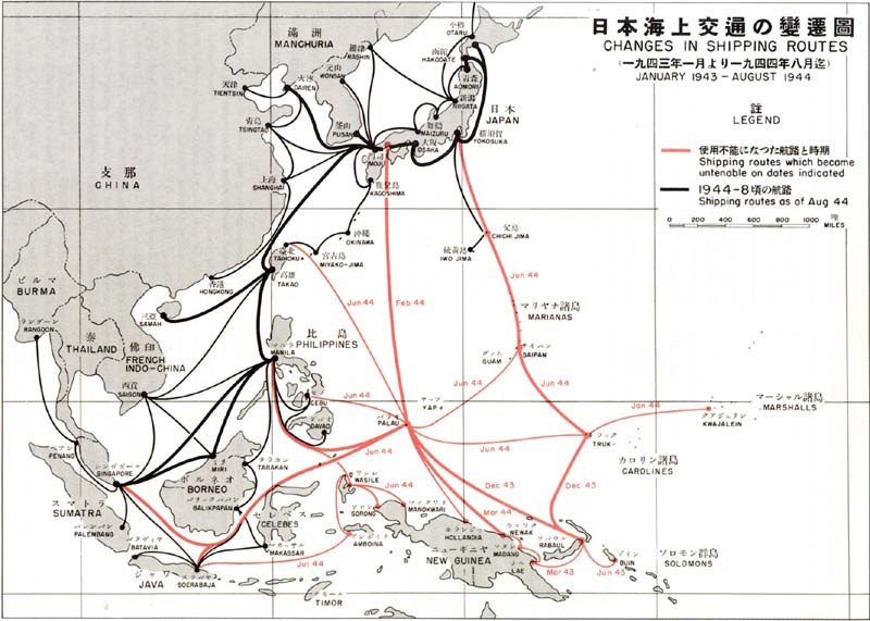
b. Digitize additional features. This is one of those moments when GIS becomes an art rather than a science. There are significant differences between these two maps. Some of these differences are merely aesthetic. See the example below.
However the “Changes in Shipping Routes” map depicts several main arteries not shown in the earlier campaign maps. Examples include a SLOC between Truk and the Japanese home islands, and a route between Taiwan and Palau. Additionally, this map depicts smaller routes between Japan, Korea and northern China. Lastly, the new map depicts SLOCS around New Britain and the Solomon Islands. Digitize these new features while deconflicting the routes to the best of your judgement.
Also, it is not entirely clear this this map’s SLOCs are symbolized by traffic size. For the “size” column in your shapefile mark these new features as “UNK.”
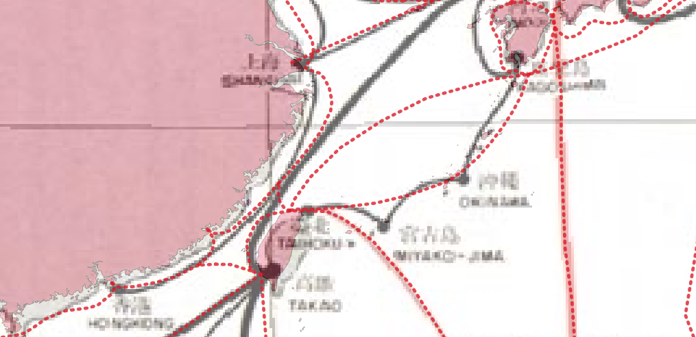
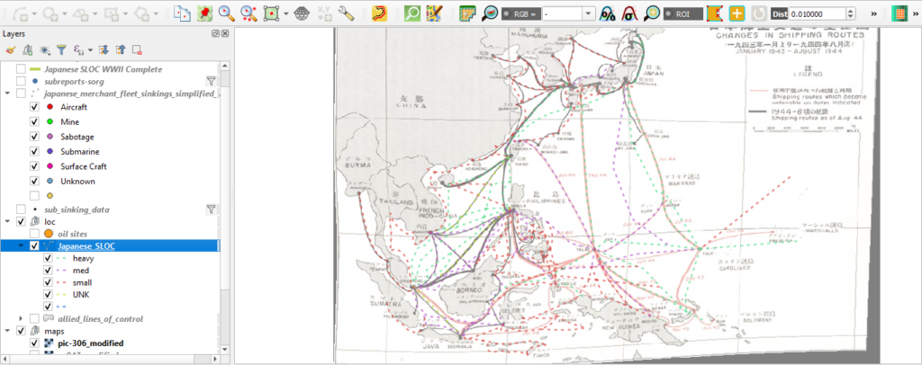
Upon completion, your results may look similar to those below.

Symbolize Your Data: Since you properly attributed all of the features (you did keep up with that right?) you can now symbolize the SLOCs by the size of their traffic.
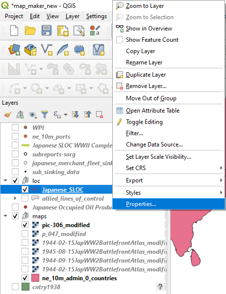
a. Right click on your line shapefile and navigate to “Properties.”
b. Choose “Categorized” from the dropdown menu
c. Choose “size” from the “Value” dropdown menu
d. Choose a symbol from the “Symbol” dropdown menu.
e. Hit classify.
Hit ok.
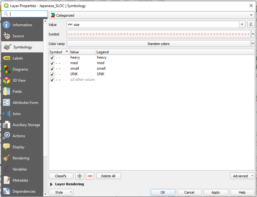
Your SLOCs are now symbolized according to their traffic size. You can also now turn off different SLOCs according to their size. This feature will prove invaluable in your analysis and visualization of the dataset, both of which will be covered in part III.
Digitization via CSV File:
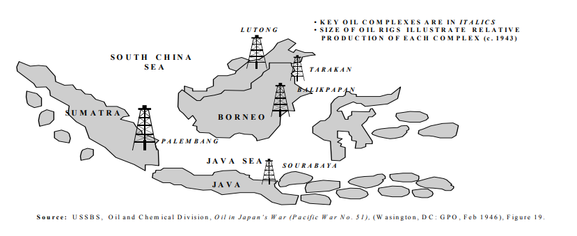
Now it is time to learn another trick of the trade, creating a dataset from scratch via a CSV file. To add some complexity to your map you are going to digitize the location of major Japanese held oil production facilities in the Netherlands East Indies. The source of this information will be from an Air University thesis entitled, Chokehold: The Attack on Japanese Oil During World War II by Stephen L. Wolborsky.
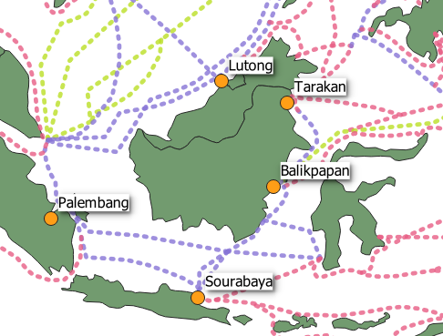
Scroll to page 18 and you will see a map which depicts five oil production sites. Palembang on the island of Sumatra, Lutong, Tarakan, and Balikpapan on the island of Borneo, and finally, Sourabaya on the island of Java.
Step 1: Create a new CSV file
Step 2: Attribute the CSV.
a. Create the following column headings: “Location Name,” “Y,” “X,” “Source,” “Source URL.”
b. Populate the Source fields with “CHOKE HOLD: THE ATTACK ON JAPANESE OIL IN WORLD WAR II”
c. Populate the Source URL fields with “www.dtic.mil/dtic/tr/fulltext/u2/a425684.pdf”
d. Populate “Lutong,” “Tarakan,” “Balikpapan” and, “Sourabaya” in the Location Name column,
Step 3: Gather the spatial data. The X column will be for each facilities’ “easting” or longitudinal coordinate, and the Y column will be for each facilities’ “northing” or latitudinal coordinate. To find the spatial data for these locations you’ll consult the fount of all knowledge: Google.
Our goal here is to merely represent these locations on a map. As such, locational information down to the city level will suffice.
a. A simple Google search on the first location will turn up the city of Lutong in the state of Sarawak, Malaysia.
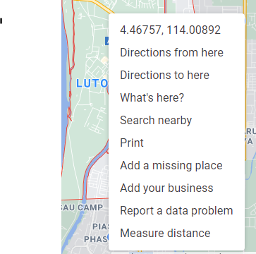
b. If you right click over “Lutong” Google will provide the spatial coordinates in the form of decimal degrees. 114.00892 is the X coordinate, 4.46757 is the Y coordinate.
c. Click on the coordinates to copy them to your clipboard.
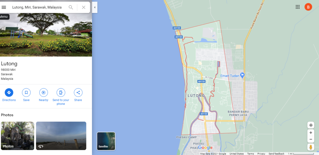
d. Enter 114.00892 into the X column on the Lutong row, enter 4.46757 into the Y column on the Lutong row.
e. One down, four to go. Complete your open-source investigation until all five locations have their Y and X columns completed. Save your CSV when completed.
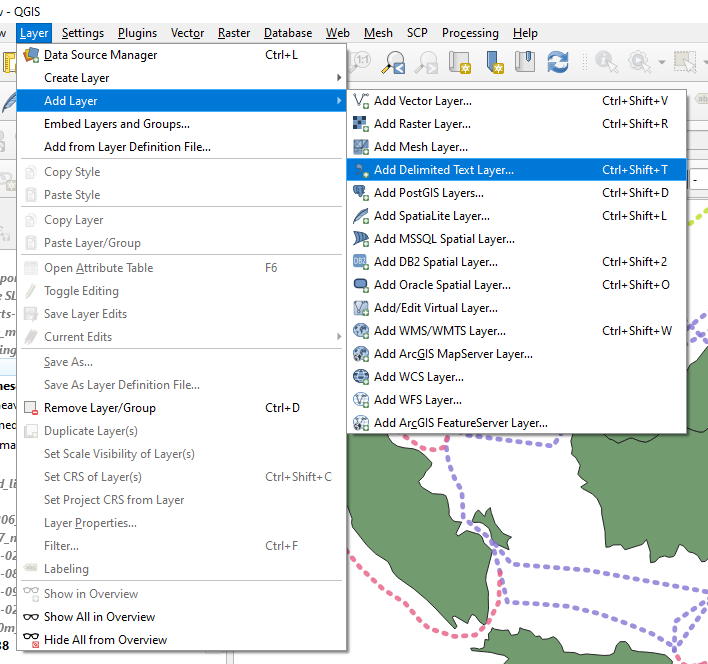
f. Add the CSV to your map. Navigate to Layer -> Add Delimited Text Layer
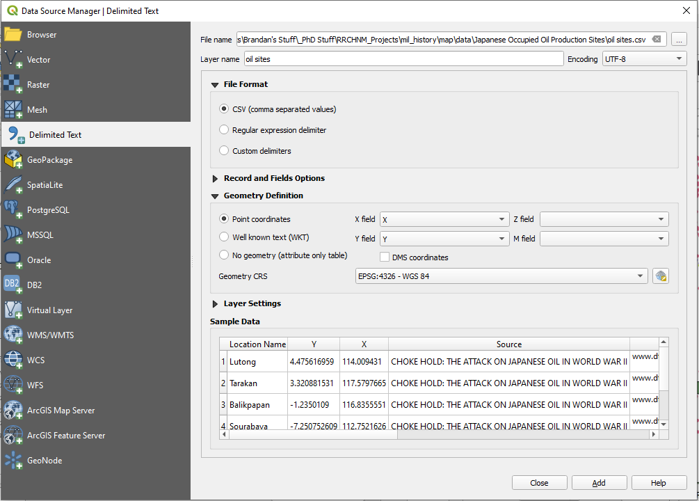
g. Navigate to your CSV file using the “…” button. Ensure that “CSV (comma separated values)” is checked. Make sure that “DMS coordinates” is unchecked. QGIS should auto detect the correct coordinate columns. If not, the “X Field” is X and the “Y Field” is Y. Ensure that the “Geometry CRS” shows as “ESPG: 4326 – WGS 84.”
Hit Add
Wrap Up:
You may be wondering, “whatever happened to that ‘Closed’ column?” Good question! You may have also noticed that both maps that you rectified had temporal information within them. You’ve got a sharp eye! The SLOC maps within the The Reports of General MacArthur contained dates which indicated when certain SLOCs were cut off by Allied military action. However, as we will discover in part III, their estimates are not as precise as the analysis that you can make using other datasets.
For that information you’re going to need to dig deeper. In part III you’ll complete this SLOC dataset using sinking data from Japanese Naval and Merchant Shipping Losses During World War II by All Causes and the Submarine Operations Research Group (SORG). The information in each of the maps you work with today can be improved upon using sinking and operational data.
Rebuilding a War Part III: Basic Analysis
The following is the third among a series of blog posts designed to capture the lessons learned during the creation of “Unrestricted: The Campaign to Sink the Japanese Merchant Fleet During World War II.” The aim of this series is to pass along these techniques for students and professors of digital history in general, and digital military history in particular.
The third blog in this series concerns the analysis of spatial data within QGIS. This tutorial will teach you how to perform basic spatial analysis using QGIS’ symbolization tools, query, filter and selection tools.
Getting Started:
This blog series will assume that the reader has set up QGIS, and possesses a basic knowledge of how the tool works. (If not, QGIS can be downloaded here. An introduction to QGIS can be found here.) For a basic rundown on GIS data types and other essentials useful for digital humanists see this excellent resource.
This blog will make use of four datasets.
The first is a dataset of Japanese merchant vessels sunk by the Allies derived from the Japanese Naval and Merchant Shipping Losses During World War II by All Causes. This dataset contains information on all Japanese merchant fleet vessels sunk by the Allies over 500 tons. The dataset was built in 1947 by a joint Army-Navy panel from wartime records confirmed by a multitude of intelligence sources. However, it does contain some spatial errors, typos, and other anomalies. You can learn more about the data and its history by visiting the navy.mil website. A simplified, cleaned, and QGIS ready version can be found here.
Next is the Submarine Operations Research Group (SORG). Unlike the other data, it contains other information besides sinkings. It contains a litany of operational details related to U.S. submarine attacks during the war. It also contains sinking information for vessels under 500 tons. Due to its operational origins, SORG data has some accuracy issues, particularly on the result of individual submarine attacks. The number of sinkings were greatly overestimated due to the fog of war and absence of intelligence confirmation available at the time. For more on the dataset’s history and composition visit the Historic Navy Ships Association web site. A QGIS ready version of this dataset can be found here.
Next are Japanese Sea Lines of Communication digitized from the Reports of General MacArthur, Vol 1 (as outlined in Part II). A digitized version of that dataset can be found here.
The last dataset is one which depicts Allied zones of control digitized from Atlas of the World Battle Fronts in Semimonthly Phases to August 15 1945. That dataset can be located here.
You will also need a base layer to orientate yourself. Given the scale of this project a simple shapefile of international boundaries, either from the present or the period. Either will suffice for this blog as it only concerns analysis and not the construction of period maps.
*Note: This tutorial was generated using QGIS 3.10 in the spring of 2021. Future iterations of QGIS may contain a different interface, toolbar configuration, or other cosmetic changes. Nevertheless, the functionality of the tools and concepts of this tutorial will remain pertinent.
Step 1: Create (or Load Previous) Project
a. Create a new QGIS project. Launch QGIS.
b. Project -> New
c. Name the new project.
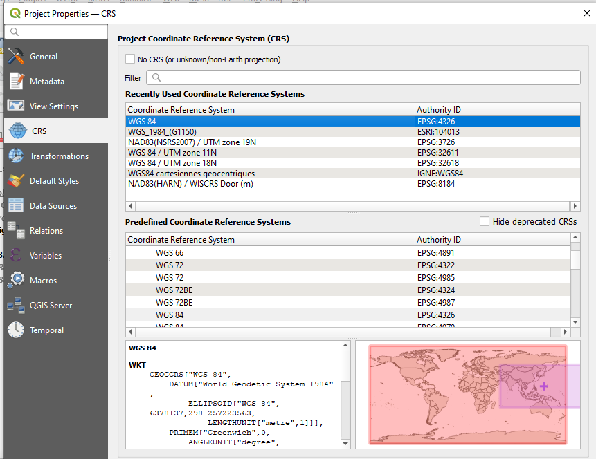
d. For the first part of this tutorial you will use WGS 84 ESPG: 4326 as the Coordinate Reference Systems (CRS) or Spatial Reference System (SRS). To set the CRS, go to Project -> Properties, select “CRS” on the left panel. WGS 84 should be the first choice. If you don’t see it, filter for “WGS 84” and it should populate. Select it and hit ok.
e. Add the boundary shapefile, Layer -> Add Layer -> Add Vector Layer
f. Browse to the location of the boundary shapefile, select the .shp file, select open
g. Select Add, then Close
*Note on Coordinate Reference Systems. Traditional maps are a 2d representation of a 3d reality. As such, compromises must be made in order to make maps legible. Coordinate Reference Systems are a means of doing so. They define “how the two-dimensional, projected map in your GIS relates to real places on the earth.” All CRS types make compromises due to the limitations inherent to their role. WGS 84 is the mostly widely used CRS available. It is the standard for the U.S. Defense Department and is used in GPS systems worldwide. However there are examples where it can be of limited use, particularly for regions nearer of the poles of the Earth. However, given the scale of this project it will be more than adequate.
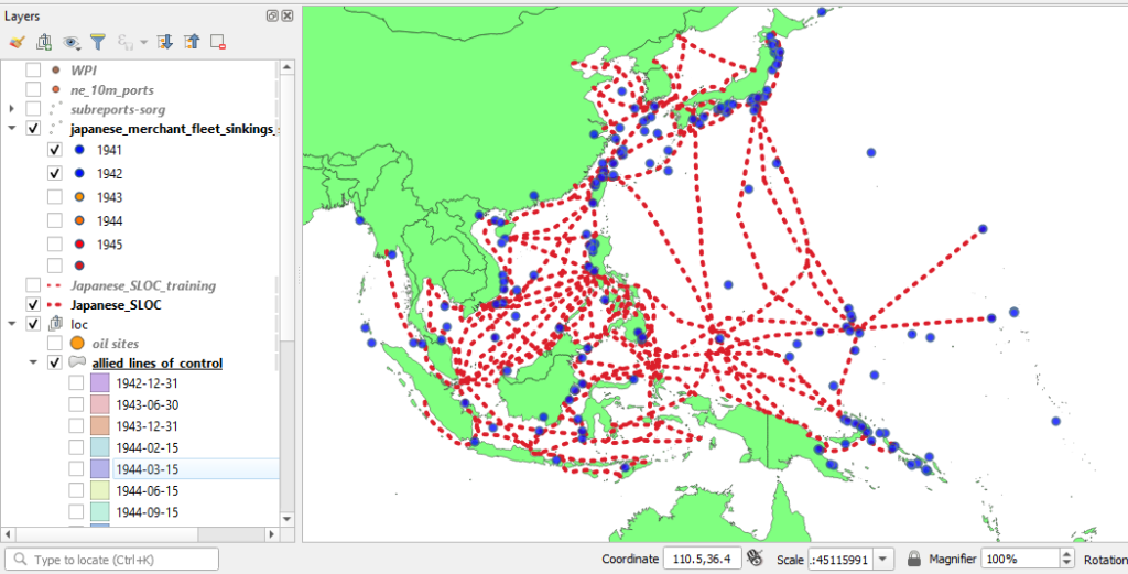
h. Add the “Japanese_SLOC_training,” “japanese_merchant_fleet_sinkings_simplified_v6,” “subreports-sorg,” and “allied_lines_of_control” datasets by repeating e through g.
Step 2: Familiarize Yourself with the Data
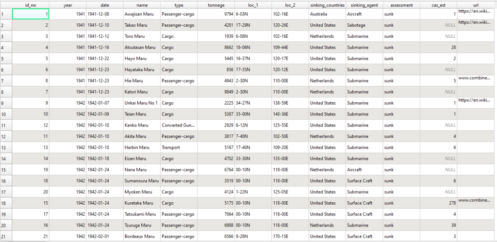
a. Right click on japanese_merchant_fleet_sinkings_simplified_v6 (here after referred to as sinkings data) in your layers panel and select “open attributes panel.”
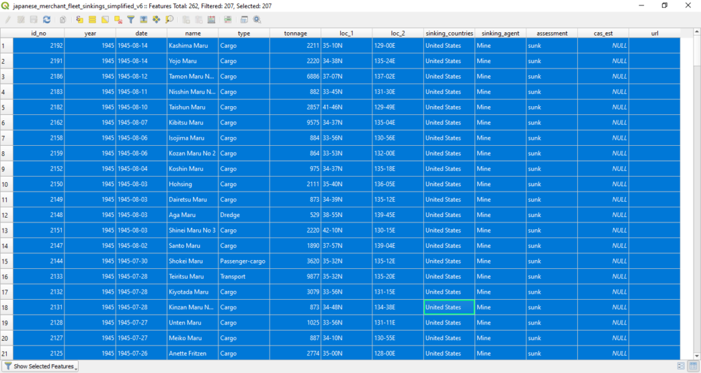
A window which depicts the file’s attribute data should open. The dataset is comprised of 2,192 Japanese merchant vessels (those over 500 tons) sunk by the Allies during the course of the war. The columns represent different aspects of each sinking event. “id_no” is a simple numerical identifier for the sunk vessel ordered chronologically. “year” is the year that the vessel was sunk. “date” the date that the vessel was sunk, arranged YYYY-MM-DD. “name” is the name of the vessel. “type” is the vessel’s type. “tonnage” is the approximate tonnage of the vessel sunk. “loc_1” and “loc_2” are the locational information for the sinking, northing and easting respectively. “sinking_countries” is the primary Allied nation which was responsible for the sinking event. “sinking_agent” is the primary means of the vessel’s sinking, Aircraft, Sabotage, Submarine, Surface Craft, or Mines. “cas_est” contains casualty estimates not present in the original dataset. These estimates were gathered primarily from sources such as combinedfleet.com and other heritage websites. “url” directs to the websites where those estimates were gathered. You may observe that not every casualty estimate has a corresponding URL field. This aspect of the dataset is an on going endeavor.
Once you are comfortable with the dataset, close the attribute panel
Japanese Naval and Merchant Shipping Losses – WWII (navy.mil).
b. Right click on subreports-sorg in your layers panel and select “open attributes panel.”
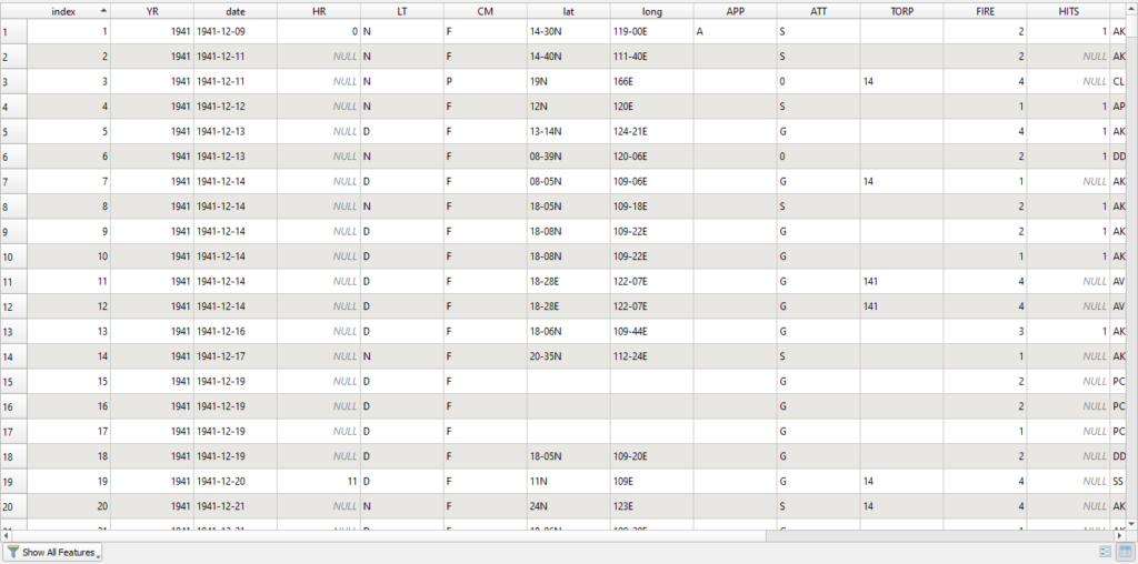
A window which depicts the file’s attribute data should open. The Submarine Operations Research Group data set host 6,168 rows which contain a variety operational information.
From the HNSA website:
“Data entries in the SORG spreadsheet are: date (month/day/year), hour, light condition, operational command (headquarters), latitude, longitude, type of approach and attack, torpedo model, torpedoes fired, hits, target type, result, estimated target tonnage, submarine hull number, and patrol number. “
Once you are comfortable with the dataset, close the attribute panel
c. Right click on “allied_lines_of_control” shapefile in your layers panel and select “open attributes panel.”
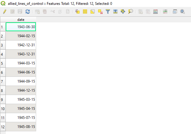
A window which depicts the file’s attribute data should open. This shapefile contains only one column, a date field which depicts the date of the extent of the Allied advance on that date as reflected from maps within The Atlas of the World Battle Fronts in Semimonthly Phases to August 15 1945.
Once you are comfortable with the dataset, close the attribute panel
d. Right click on “Japanese_SLOC_training” shapefile in your layers panel and select “open attributes panel.”
A window which depicts the file’s attribute data should open. This shapefile contains only one column, a String field which contains the traffic size of each SLOC as noted in the Reports of General MacArthur, Vol 1.
Once you are comfortable with the dataset, close the attribute panel
Step 3: Proximity Analysis:
Now that you are familiarized with the datasets it is time to learn how to analyze them in QGIS. To begin you will resume your work with the Japanese SLOCs from Part II. To recap, your goal here will be to use the sinking datasets to determine when each SLOC was successfully interdicted by the Allies. A properly attributed SLOC layer will afford you greater flexibility when making maps in QGIS and can serve as a means of creating dynamic maps in programs such as RStudio.
Before you begin, assume that you know nothing about World War II in the Pacific theater. How could you use QGIS’ tools to determine the course of events in the Pacific using these datasets? To get the broad strokes of the campaign you can use QGIS’ symbolization tool.
a. Right click on your sinkings data shapefile in your layers panel and select “properties.”
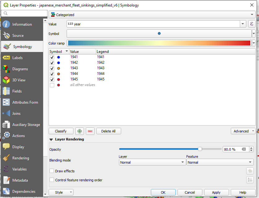
c. Symbolize Data by Year: Navigate to symbology. From the dropdown menu on the top, choose “Categorized.” From the Value dropdown choose “Year.” From the Symbol dropdown menu choose a symbol. Next to the Color Ramp dropdown menu, click on the small arrow iron , choose a color ramp. I would recommend one with discrete colors such as “Spectral.” You can invert the color ramp if you so choose by selecting “invert color ramp.” Hit classify at the bottom of the window. Since this is a dense dataset it may be helpful to make the icons slightly transparent. Select “Layer Rendering” at the bottom of the window. It will open a submenu. Dial the Opacity down to about 80%. You can also adjust each categorized dot manually by clicking on its icon under the “Symbol” column*. You can also adjust all the categorized symbols by clicking on the “Symbol” dropdown menu.
*Note, if you have issues with color differentiation you can adjust your symbolization by shape instead. For an in depth look at QGIS’ symbology function, click here.
After you have adjusted the symbology to your liking and have sufficiently categorized the data by year, hit ok.
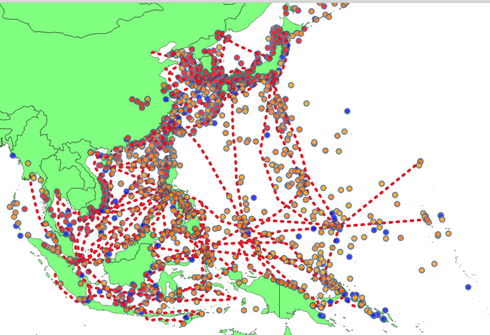
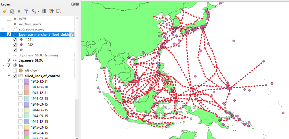
You will likely notice that the red and dark orange circles are orientated to the west and north. This is because the Allies advanced from the south through New Guinea and into the Philippines (General MacArthur) and from the east (Admiral Nimitz). QGIS’ symbology function has also afforded you the ability to turn your data off and on by category, and in this case here, by year.
d. Filter By Year: Now that you have a rough idea of the course of the campaign you can now isolate portions of the data into more discrete chunks. You can also symbolize your data by sinking agent to gain a more textured understanding of the campaign in order to complete your analysis. Categorizing your data by this column and afford a better sense of the events of the campaign and the its components.
In order to do so you’ll need to isolate your data for the first year of the campaign, 1942 (plus December 1941). To to so, you will make use of QGIS’ filter function. Filter will allow you to apply SQL expressions to shapefiles in order to limit the data displayed.
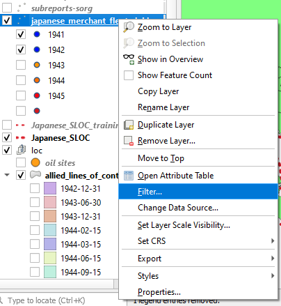
Right click on your sinkings data navigate to and click “Filter.”
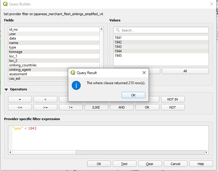
A window titled “Query Builder” will appear. In the “Fields” pane double click year, in the operators double click the greater than sign “>” Next, under “Values” click all. All of the year values should populate in the Values window. Double click 1943.
You should have an expression which reads: “year” < 1943 This will tell QGIS to only display those vessels which were sunk prior to 1943. Hit Test. You should be prompted with a window which says “The where clause returned 210 row(s).”
Hit ok on the Query Result window.
Hit ok on the Query Builder window.
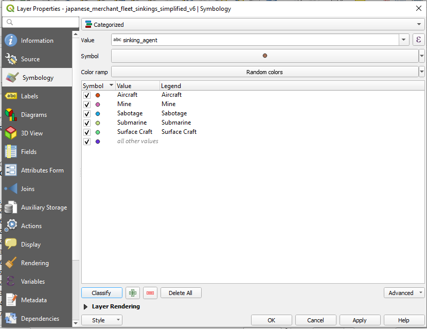
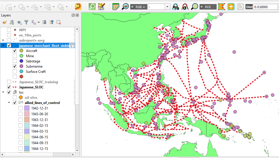
e. Symbolize Data by Sinking Agent: Now that you have a more manageable amount of data you can now symbolize your sinking events by sinking agent. To do so, simply repeat the same processes from from Step 3c instead choose “sinking_agent” in the “Value” dropdown menu.
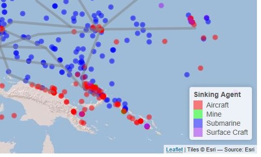
As with your “year” symbolization you can toggle your sinking agent categories using your Layers window. You may notice that there are relatively few vessels which were sunk via mines, sabotage, or surface craft. This phase of the campaign was dominated by submarines and aircraft as MacArthur’s army crawled up the South Pacific and Allied submarines attacked strategic targets well behind Japanese lines. You may also notice that those vessels sunk by Allied aircraft were situated the edges of the Japanese perimeter, particularly in the South Pacific.
f. Compare Sinking Data Points to Allied Zone of Control Shapefile: Since you have have a shapefile which depicts the Allied advance across the Pacific it can also be used to determine when particular Japanese SLOCs were interdicted. To do so, you will compare the spatial footprints of your sinking data, and allied_lines_of_control shapefiles in order to bracket the approximate dates when various Japanese SLOCs were interdicted. These dates which then be added to your Japanese_SLOC_training shapefile.
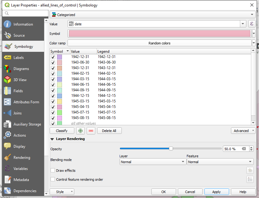
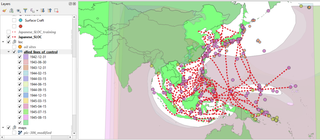
As with your sinking data, your Allied zone of control shapefile can be symbolized according to category. As you did with Step 3c, symbolize your Allied zone of control shapefile by selecting date from the “Value” drop down menu. You will also want to pick an opacity level around 50% as the features overlaps within this shapefile.
Take a minute to toggle through your different categories chronologically. As mentioned earlier, you will likely notice that the Allies advanced from the south and east. And, indeed the first substantive advances were made by MacArthur in 1943. If you compare the overlap between your SLOC shapefile and the first three categories of your allied_lines_of_control shapefile it is apparent that at some point between the start of the war and 31 December 1943 the Allies successfully interdicted their first three SLOCs, highlighted below.
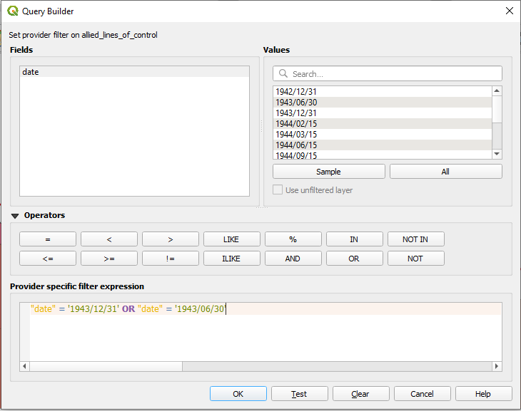
You can double check our working using QGIS’ ‘Select by Location’ tool. First, you will need to place a Filter on your allied_lines_of_control shapefile in order to isolate the early phases of the campaign. Right click on the shapefile and select filter and enter the following expression: “date” = ‘1943/12/31’ OR “date” = ‘1943/06/30’ This will isolate only those two phases of the campaign from the shapefile.
Hit ok.
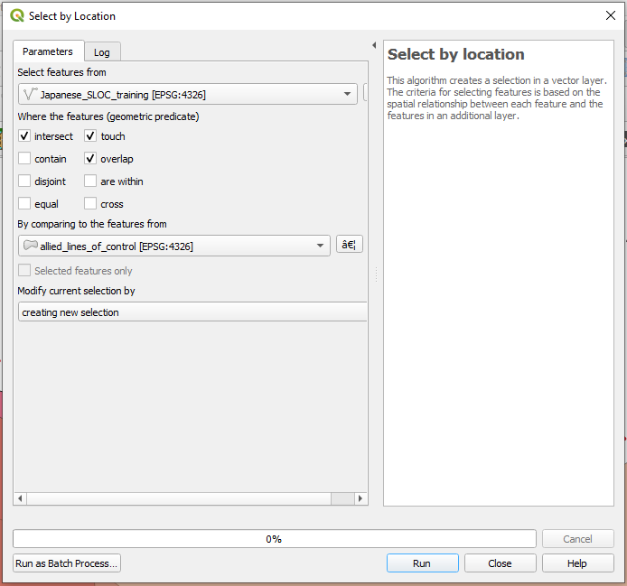
Next, navigate to Vector > Research Tools > Select by Location. The Select by Location window will appear.
From the “Select feature from” dropdown window select your Japanese SLOC shapefile. Next, from the selections under the “Where the features (geometric predicate)” check intersect, touch, overlap. Finally, from the dropdown “By comparing to the features from” choose your Allied zones of control shapefile. This will tell QGIS to find those SLOCs which overlap with the Allied zone of control on 30 Jun 1943 or 31 Dec 1943.
Hit run.
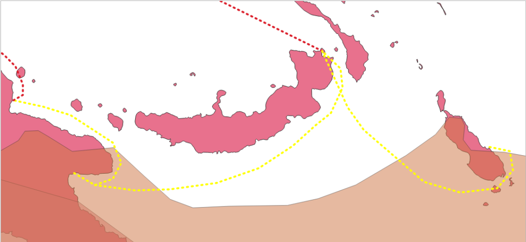
g. Compare the identified SLOCs with your sinking data. Now that you’ve identified three SLOCs of interest it is time to refine the timeline of their interdiction. It is safe to assume that these were cut at some point between the start of the war and 31 December 1943 as the shipping nodes which comprised them were occupied by that date. With that knowledge in mind, you will now use QGIS’ Selection tool to determine more refined estimates.
First you will want to remove any filters you have placed upon either of your sinking datasets. Now that you have a spatially refined search area you should open up your temporal search, otherwise you may come up with an incorrect estimate.
Next, navigate to the “Select Features Tool.” Click on the down arrow tab next to the icon and select “Select Features by Polygon.”
You will use this tool to identify the sinking events from both datasets with the immediate proximity of each of the three SLOCs in question. To do so, each of your sinking datasets will have to be selected in your Layers window. Pick one, highlight in your layers window. Next trace the general area around one of these SLOCs by left clicking vertices and then right click to close the selection polygon.
Repeat the process for the other dataset.
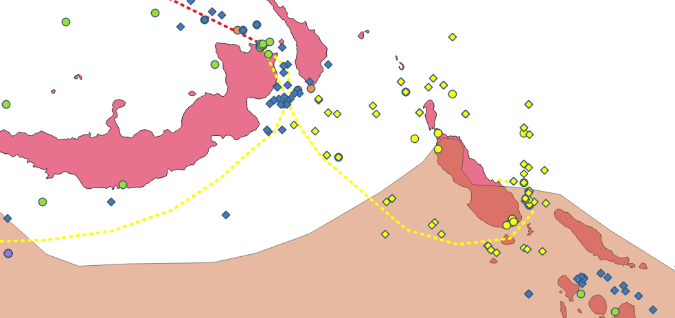
Now it is time to investigate your selection results. Right click the sinking data shapefile in your Layer window and right click and select “Open Attribute Table.” At bottom of the attribute table window choose “Show Selected Features” from the menu located on the lower left. This will only show you the 18 returns selected from your selection performed earlier. QGIS allows you to sort the attributes by clicking on the data headings. Hitting the date feature will allow you to arrange the data by date in either ascending or descending order.
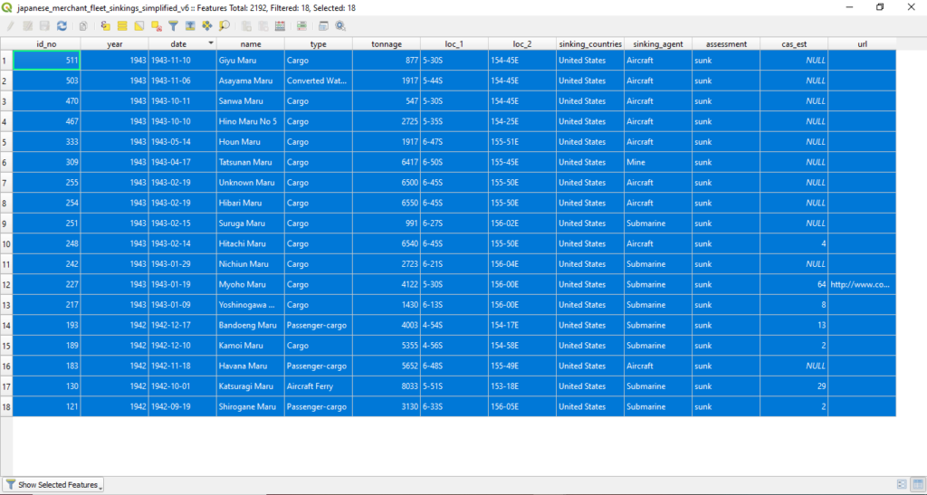
The final vessel sunk by the Allies in this eastern most SLOC was the a cargo vessel Giyu Maru on 10 November 1943. You can isolate this single event by creating a new selection by clicking on the “1” icon all the way to the left. To check your work you can click “Zoom map to the selected rows”

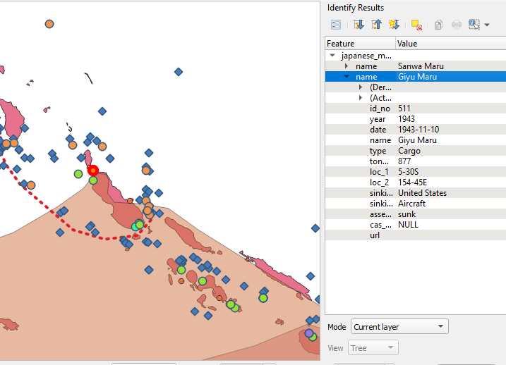
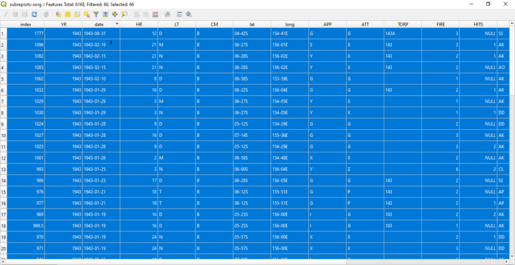
Repeat the same process for the SORG dataset. The final record in the same area is from 19 Feb 1943. This means that the SLOC was likely closed on 10 November 1943 with the final sinking recorded in the sinkings data dataset.
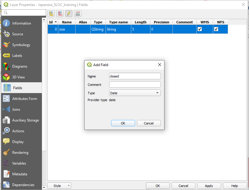
Now that you have identified an interdiction date you can add a new column to your Japanese_SLOC_training shapefile. To do so, right click on the file in your Layers panel and select “Properties.” When the Layer Properties window appears select “Fields” from the panel on the left. Click the “Add Field” button. The Add Field window will appear. Choose name for the new field and select “Date” from the dropdown menu.
Hit ok and hit ok.
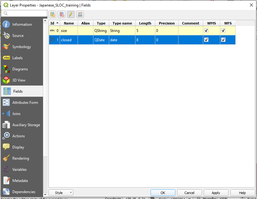
Now that you have added a new field to the shapefile you can now populate it with a closed date. Right click on your Japanese_SLOC_training shapefile in the Layers panel and select toggle editing. Ensure that the SLOC is selected and enter 1943-11-10 in the new column. Be sure to save your edits!

Your first batch of SLOCs should look similar to the the images below. Three SLOCs with two interdiction dates, 1943-11-10 and 1943-08-30.
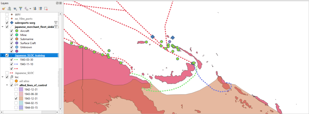
Now that you’ve got the hang of it is time to fly solo again! Using the techniques you learned above determine the rest of the interdiction dates for the Japanese SLOC network. By the end of your analysis you will likely have a few left over. Not to worry! A number of Japanese SLOCs were not interdicted by direct occupation or encirclement, but rather Allied air pressure and network collapse. A little over a 1/3 of Japanese shipping was interdicted in this fashion. See the South China Sea Raid as such an example.
To determine these interdiction dates you can use the filter function and selection tool to bracket estimates.
Finally, you’ll likely notice that some SLOCs remained active until the end of the war. The Allies sank vessels around the Japanese home islands, the Yellow Sea, the Gulf of Thailand, and the Java Sea until the end of hostilities on 15 August 1945. For these attribute them as 1945-09-02, the official end surrender of the Japanese empire.

Step 4: Buffers and Select By Location:
a. Buffers on Polygons. One basic function of QGIS is the buffer creation tool. The tool allows you to create spatial buffers around existing shapefiles. The buffer can then be used to pose spatial queries predicated upon particular historic questions. In a modern context, spatial buffers can be used to pose a number of questions related to military affairs. Examples include determining coverage of air-defense systems, range and potential impact areas of indirect weapons, building models of blast areas, etc. Similar queries can be posed for historic military activity.
A simple question might be, what percentage of U.S. mine attacks occurred in Japanese coastal waters?
To answer it you will first have to create a buffer around your the Japan feature within your borders shapefile.
But there is a slight problem…
The Japanese spatial feature in current shapefiles is apocryphal. And the feature within the “cntry1938” shapefile, while it does include a unified and occupied Korea, it does it include the Kuril Islands and the southern portion of Sakhalin as part of Japan. So, in order to accurately answer this question you’ll need to build your own (reasonably) accurate representation of Japan circa World War II.
Or you could just skip ahead and download a copy here. Either or, I won’t judge.
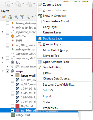
b. Create a duplicate of your contemporary borders shapefile by right clicking on it and creating a duplicate.
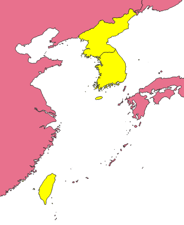
c. First you will need to harvest the geometries from modern North and South Korea as well as Taiwan (formerly known as Formosa). Highlight the copy in your Layers panel and select these three entities while holding down the ctrl key in order to select them all. Right click on the copy and export them as a new shapefile.
d. Remove excess territory. The modern political borders of these three entities are not exactly the same as they were when part of the Japanese state during World War II. You can use period maps such as this Rand McNally example from 1930 to check your work. For instance the Kinmen Islands are currently part of the Republic of China(Taiwan) but were not controlled by the former Japanese empire. You’ll need to remove these features from your new export.
Right click on your Korea / Taiwan export and toggle editing. Navigate to your Advanced Digitizing Toolbar and click the Delete Part tool. Now click on the Kinmen Islands.

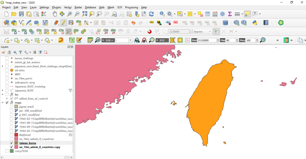
Be sure to save your edits!
e. Harvest geometries of the Kuril Islands and the southern portion of Sakhalin. You will need to perform a similar task for these territories currently administered by the Russian Federation. Select Russia from your contemporary borders shapefile and export it as new shapefile.
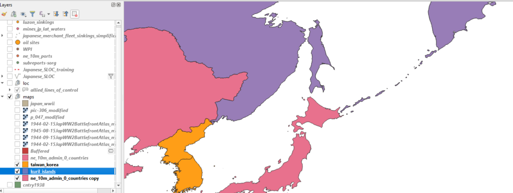
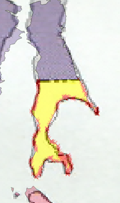
f. Right click on new Russia shapefile and toggle editing. Navigate to your Advanced Digitizing Toolbar* and its Split Feature tool. Use one of the period maps that you rectified from part I to serve as a guide for splitting the current island of Sakhalin. Click on the Split Feature tool, click on one side of the island and right click on the other along the border seen in your rectified image.
*Note: If you need a refresher on the Advanced Digitization Toolbar, revisit Part I.
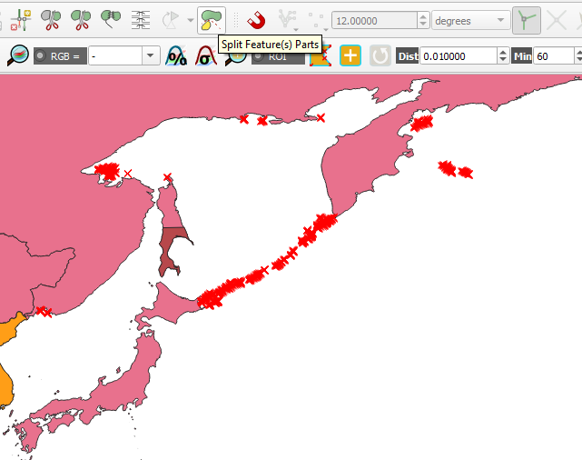
g. Next, use the Split Feature(s) Parts to isolate Kuril Islands. This tool will remove all the isolated entities in the shapefile into discrete features.
f. Use the Selection Tool to select all of the Kuril Islands and the southern portion of Sakhalin. Invert the select and delete all of the excess geometries. You should now have 19 features within this shapefile.
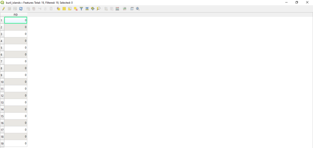
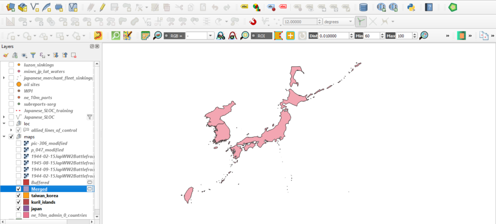
h. Merge the separate layers. As you did earlier with the Koreas and Taiwan, export a Japan shapefile from your contemporary boundaries shapefile. You should now have three shapefiles, one depicting contemporary North and South Korea and Taiwan, one with current Russian territories formerly governed by Japan and the current Japanese home islands.
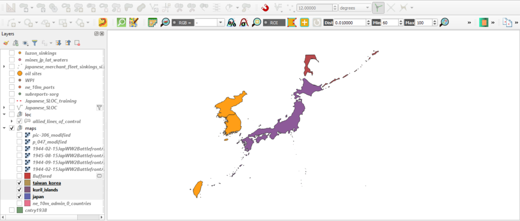
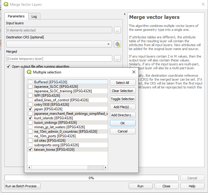
Now you will need to merge these layers. Navigate to Vector > Data Management Tools > Merge Vector Layers.
The Merge Vector Layers window should appear. Under “Input Layers” select your thee inputs.
Hit ok.
Hit run.
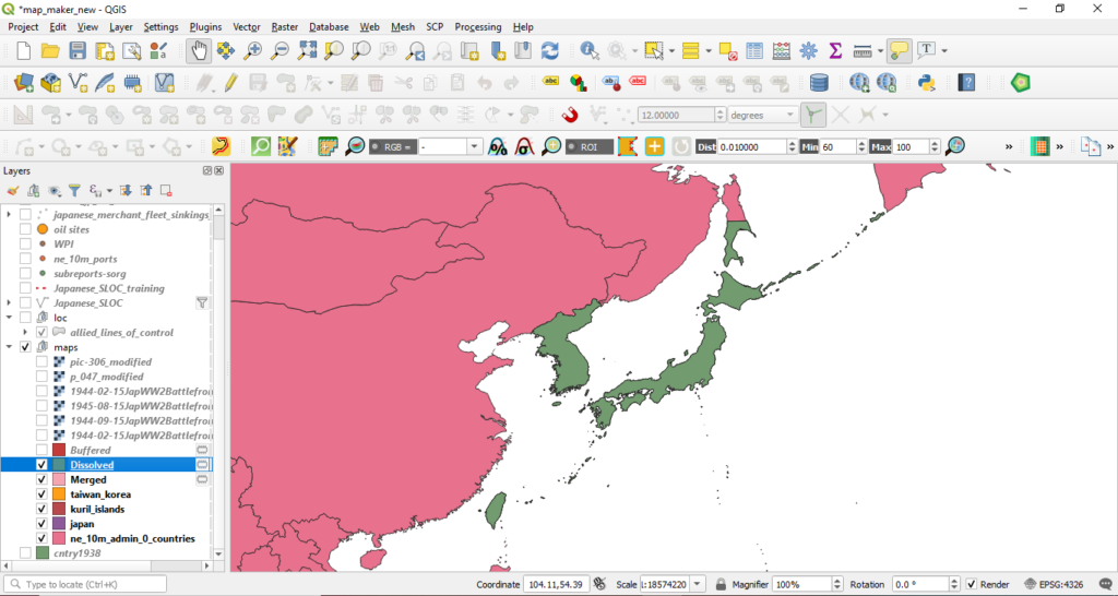
i. Dissolve the anachronistic boundaries. Now you will need to remove the boundary between the modern Koreas. Navigate to Vector > Geoprocessing Tools > Dissolve. Choose the “Merged” shapefile from the Input dropdown.
Hit Run.
You know have a shapefile which depicts Japan’s political boundaries circa WWII. The new Dissolved is only a temporary file. You will want to export it as a permanent file.
Have you saved recently?
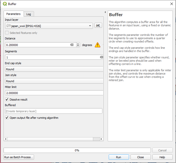
j. Create a buffer for your new Japan shapefile. First, navigate to Vector > Geoprocessing Tools > Buffer. When the Buffer window appears, choose your new Japan country shapefile from the Input dropdown menu. For the Distance input you will need to do some simple conversion. QGIS’ Buffer tool uses distance units based upon the coordinate reference system in use. Since WGS84 is determined using degrees, QGIS will only allow you to use degrees to create buffers.
Nautical miles are the most common measurement unit used for measuring distance over water. Coastal waters are usually defined as maritime territory within 12 nautical miles land. Since QGIS will only you to use degrees, you’ll need to determine the degrees equivalent to 12 nautical miles.
There are 60 nautical miles within 1 degree. Therefore, 0.2 degrees is equal to 12 nautical miles.
Enter 0.20 in the “Distance” bar. Enter 1 into the segment bar. Keep the rest of the entries as their defaults.
Click run.

You should now have a temporary shapefile entitled “Buffered” which depicts a 12 nautical mile ring around the entirety of your created Japan WWII shapefile.
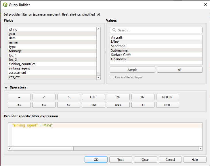
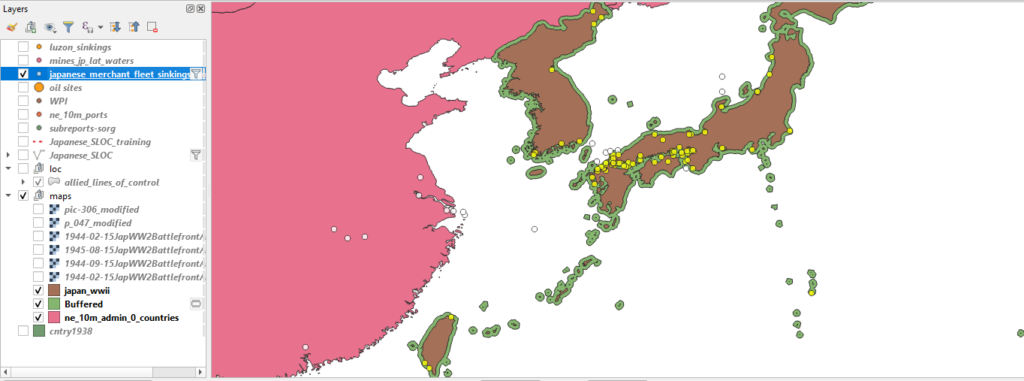
k. Set a filter within your sinkings shapefile to select out only vessels which were sunk with mines. To start your spatial query you will need to set a filter on your sinkings shapefile. Since your historical question focuses on the effectiveness of the Allied mining campaign you will need to isolate those vessels sunk via mine in the sinkings data shapefile.
l. Perform the Select by Location. Navigate to Vector > Research Tools > Select by Location. The Select by Location window will appear. For the “Select features from” dropdown menu, select your sinkings shapefile. From the “Where the features (geometric predicate)” check intersect, touch, and are within. From the “By comparing to the features from” drop down menu choose “Buffered.”
Hit Run.
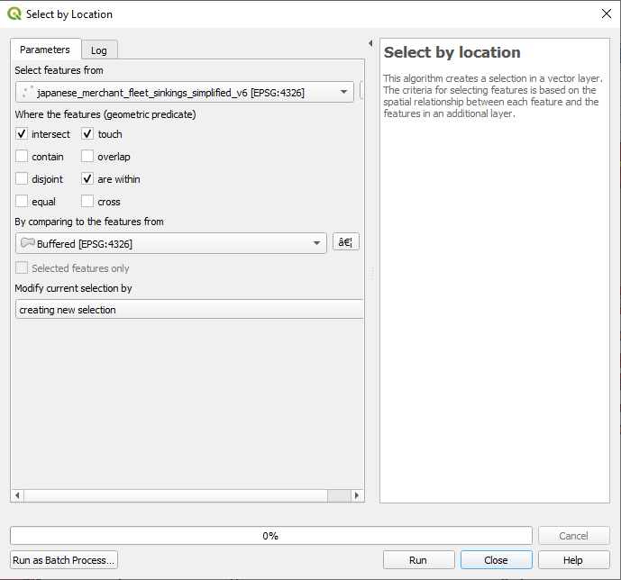
You should receive a return of 207 of 267 features. Roughly 77% of all Japanese merchant vessels sunk by mines were sunk within the coastal waters of the Japanese home islands and its colonies in Taiwan and Korea.
Rebuilding a War Part IV: Advanced Analysis
The following is the fourth and final among a series of blog posts designed to capture the lessons learned during the creation of “Unrestricted: The Campaign to Sink the Japanese Merchant Fleet During World War II.” The aim of this series is to pass along these techniques for students and professors of digital history in general, and digital military history in particular. It is my hope that the material contained herein will aid new digital scholars in learning or honing their data creation and spatial analysis skills.
Part IV continues directly from Part III. This tutorial will teach you how to preform some advanced spatial analysis using QGIS’ statistics tools, the field calculator, graphic and spatial visualizations.
Getting Started:
This blog series will assume that the reader has set up QGIS, and possesses a basic knowledge of how the tool works. (If not, QGIS can be downloaded here. An introduction to QGIS can be found here.) For a basic rundown on GIS data types and other essentials useful for digital humanists see this excellent resource.
This blog will make use of the same four datasets from Part III.
*Note: This tutorial was generated using QGIS 3.10 in the spring of 2021. Future iterations of QGIS may contain a different interface, toolbar configuration, or other cosmetic changes. Nevertheless, the functionality of the tools and concepts of this tutorial will remain pertinent.
Step 1: Create (or Load Previous) Project
a. Create a new QGIS project. Launch QGIS.
b. Project -> New
c. Name the new project.
d. For the first part of this tutorial you will use WGS 84 ESPG: 4326 as the Coordinate Reference Systems (CRS) or Spatial Reference System (SRS). To set the CRS, go to Project -> Properties, select “CRS” on the left panel. WGS 84 should be the first choice. If you don’t see it, filter for “WGS 84” and it should populate. Select it and hit ok.

e. Add the boundary shapefile, Layer -> Add Layer -> Add Vector Layer
f. Browse to the location of the boundary shapefile, select the .shp file, select open
g. Select Add, then Close
*Note on Coordinate Reference Systems. Traditional maps are a 2d representation of a 3d reality. As such, compromises must be made in order to make maps legible. Coordinate Reference Systems are a means of doing so. They define “how the two-dimensional, projected map in your GIS relates to real places on the earth.” All CRS types make compromises due to the limitations inherent to their role. WGS 84 is the mostly widely used CRS available. It is the standard for the U.S. Defense Department and is used in GPS systems worldwide. However there are examples where it can be of limited use, particularly for regions nearer of the poles of the Earth. However, given the scale of this project it will be more than adequate.
f. Load the four datasets used in Part III if starting a new project.
Step 2: Calculating Basic Statistics.
You can run some further calculations on these sinkings by exporting your selected results to a new shapefile.
a. Export your selection spatial query as a new shapefile.
b. Right click on the new file and open its attribute table. Exam the data columns and see if you can observe any trends. If you organize the data by ascending date you will likely notice that a mere six sinking events occurred prior to 3 April 1945. This is because from April 1945 through to the end of the war the United States Army Air Corp waged a mining campaign called Operation Starvation.
Suppose that you wanted to learn move about the campaign within the context of the larger war effort against Japanese merchant shipping. How might you do so? The first means of doing so would be to generate some statistics from Operation Starvation and compare them to the larger war effort.
c. Apply date filters to the new mine shapefile and sinking data. You will need to isolate those sinking events which occurred on or after 3 April 1945 in order to generate some accurate statistics. Right click on the sinking data and apply the filter: “date” >= ‘1945-04-03’ AND “sinking_agent” != ‘Mine’ This will return only sinking events which occurred after our data of interest and those which were not sunk via mine.
For your mine shapefile apply the filter “date” >= ‘1945-04-03’ Both of your datasets should now only contain sinking events on or after 3 April 1945, the start of Operation Starvation, one with only mines and the other with all sinking agents other than mines.
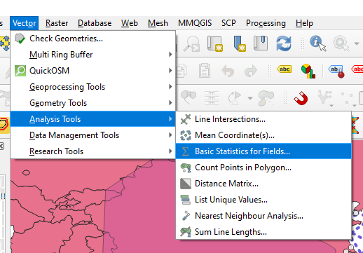
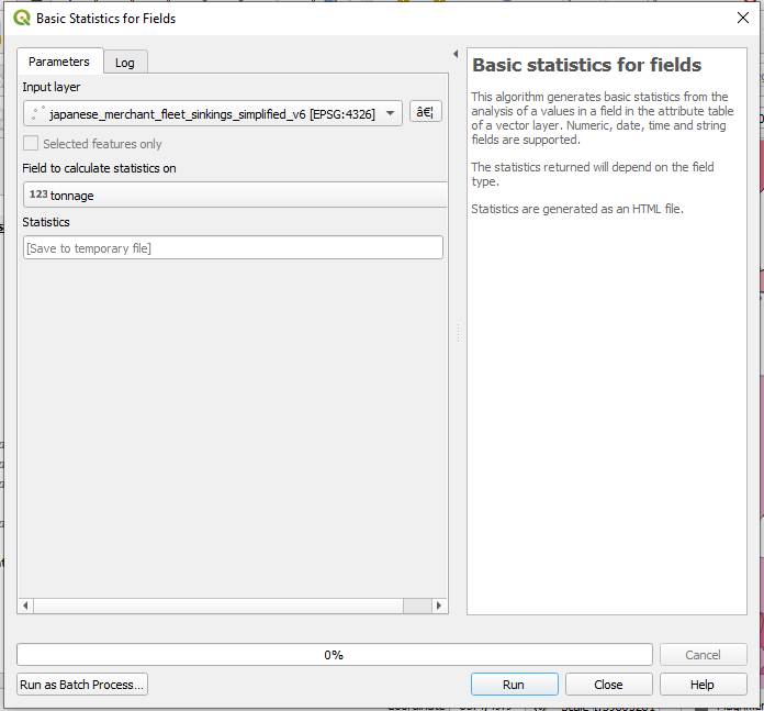
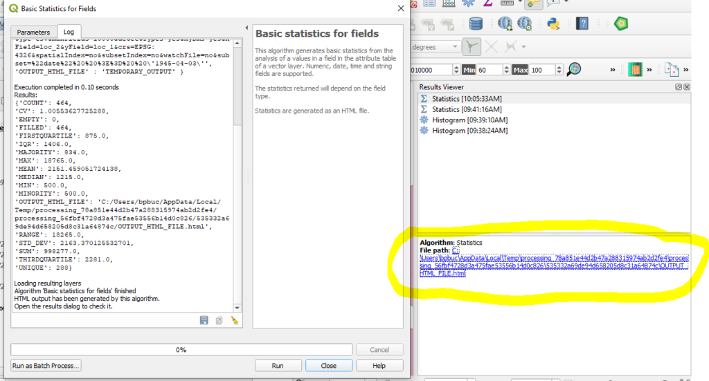
d. Calculate some basic statistics . Navigate to Vector > Analysis Tools > Basic Statistics for Fields. The Basic Statistics for Fields widow will appear. This tool will provide you some basic statistical information based upon your inputs.
e. Choose your data input and parameters. Choose your sinkings shapefile from the input layer and chose tonnage from the “Field to calculate statistics on” dropdown menu.
Hit run.
f. View results. A file path to a temporary file will appear. Click the link and view your results.
g. Repeat the process for your mines sinking shapefile.
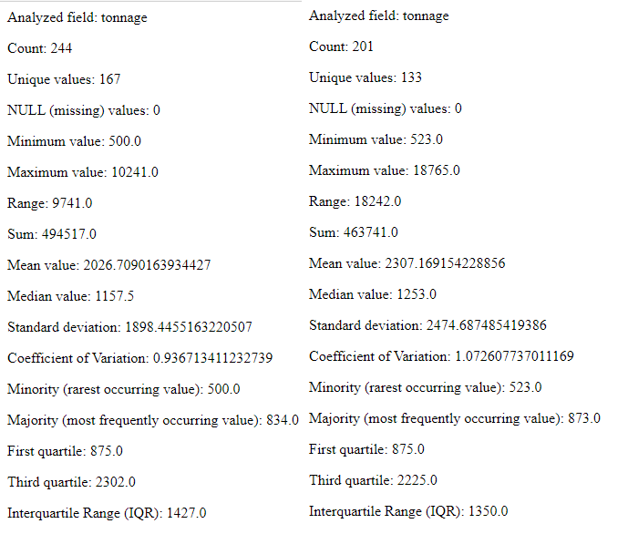
h. Compare your results. Of the 445 total vessels sunk from 3 April 1945 until the end of the war were sent to the bottom as the result of mining campaign of Operation Starvation. And of the 958,258 total tons sunk during that period, 463,741 or 48.9% went sent to the bottom as a result of mines. You can also see that the average vessel sunk via mine was larger by both mean and average.
Step 3: Graphical Visualization or Analysis
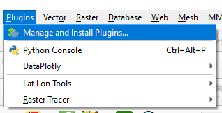
QGIS also provides means of visualization statistical data spatially as well as graphically. Data plots are a useful means of contextualizing your data or discovering trends. To proceeded you will need to install the DataPlotly plugin.
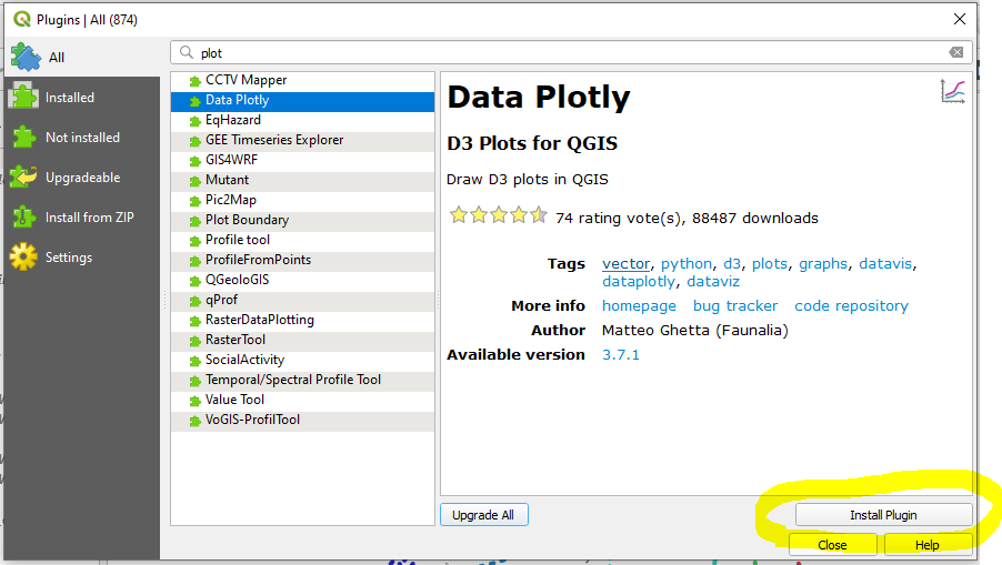
a. Install the DataPlotly plugin. Navigate to Plugins > Manage and Install Plugins.
b. Search for the DataPlotly. Install the plugin
c. Remove any filers which may remain on your sinking data shapefile.
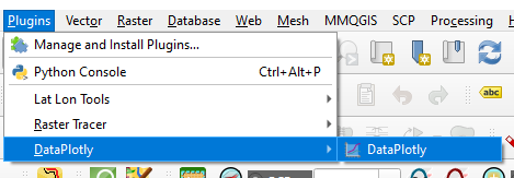
d. Launch the DataPlotly plugin. Navigate to Plugins > DataPlotly
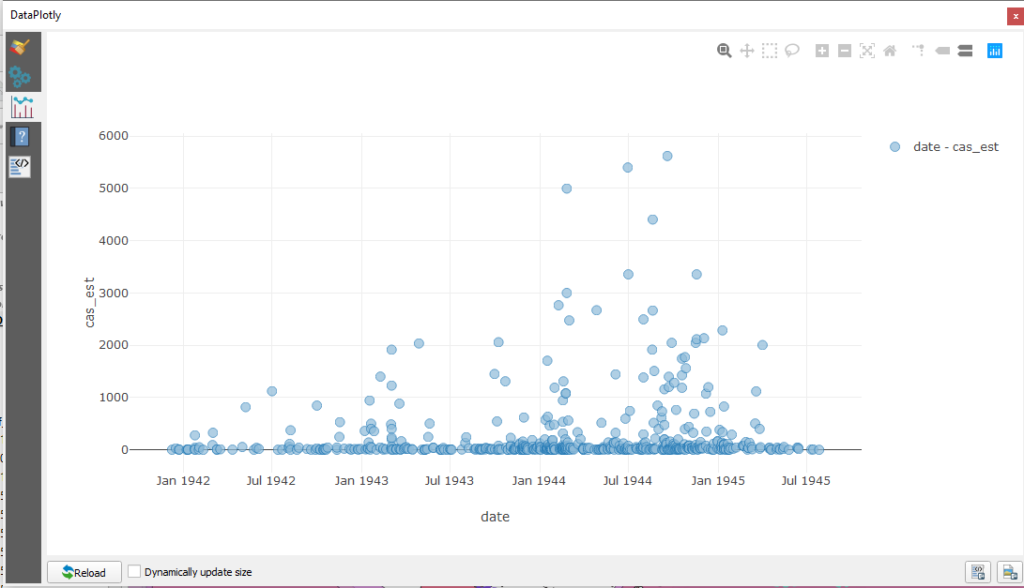
e. Data exploration. Now that DataPlotly is installed let us take a look as some features from the sinkings dataset. You may recall that it contains casualty estimates for a number of vessels. Plotting this data in DataPlotly could help to contextualize it or otherwise explore the dataset writ large. Since change over time an evergreen method of historical analysis, let us use a scatter plot to analyze the data.
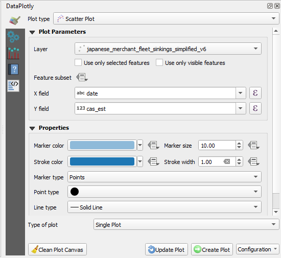
Click the paintbrush tab to the left. Select “Scatter Plot” from the Plot Type dropdown menu. Choose your sinking data from the layer dropdown menu. For the X field choose date. For the Y choose the casualty estimate field, cas_est.
Click Create Plot.
You will likely observe a steady uptick of mass casualty events beginning in August 1944 which continued through the end of the year. This could be an artifact on incomplete data. Or, it could be a manifestation of historical events worthy of further investigation.
Step 4: Spatial Visualizations . For the sake of argument…let us assume that it is the latter. Visual statistical information spatially by density. In addition to symbolizing data via discrete categorization QGIS will allow you to depict datasets via density heatmaps.
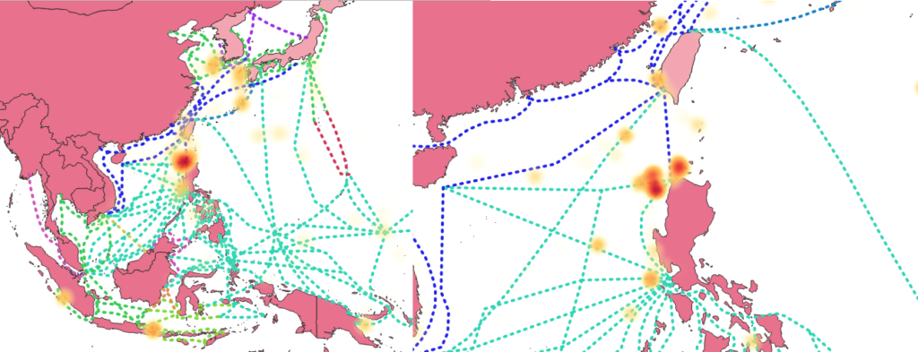
a. Navigate to the Symbology tab for your sinkings shapefile. From the top dropdown menu select Heatmap. Choose a color ramp from the down arrow button to the right of the Color Ramp dropdown. Choose a smaller radius, leave “Maximum value” as Automatic. From the weighted points choose cas_est. This will inform QGIS to generate the heatmap based upon the available casualty estimates. Other numeric values can also be used such as tonnage. Not selecting a value will default to generating its values upon spatial frequency.
You will need to adjust your color ramp before proceeding. Click on the color ramp bar and it should launch a “Select Color Ramp” window. Navigate to and click the down arrow next the “Color 1” dropdown menu. Select “Transparent” from the popup window. Selecting this will make the lowest value, which is 0, invisible. Choose a desirable rending quality and transparency
Click ok.
*Note: Working with heatmaps is as much of an art as a science. Tweaking with your inputs, particularly the maximum value setting can dramatically change the aesthetic result. Lowering the maximum value will create a map with more hotspots at the cost of reducing the visual weight of the most significant location. For more on the basics of heatmaps click here. For some more advanced topics see this video.

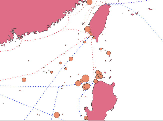
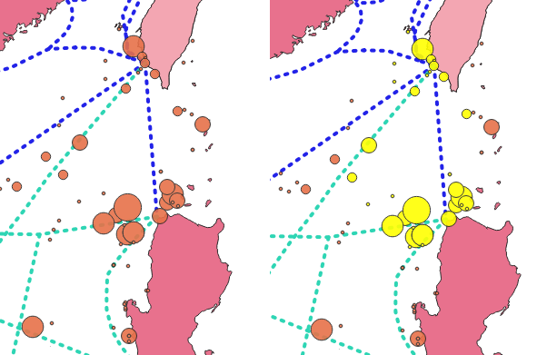
A heatmap of casualty estimates show a bright red orb north of the island of Luzon. If you zoom in slightly QGIS will re-render the map and break the single hotspot into several smaller locations.
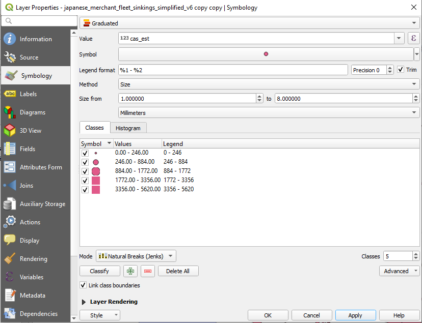
b. Visual statistical information spatially by size. You can also symbolize individual data points by scaling their size on attribute data. Navigate to the Symbology tab for the sinkings shapefile. Choose Graduated from the top dropdown menu. For value select cas_est. From method, choose “Size.” For mode choose “Natural Breaks (Jenks).”
Hit ok.
If you zoom back into area around the Luzon Strait you will likely observe a multitude of mass casualty events. Examining the sinkings shapefile metadata will also reveal all but four vessels were sunk in 1944 and the overwhelming majority of them went sent to the bottom from the summer through the fall of 1944.
c. Run further statistics. These events can be placed within a larger context by using the Basic Statistics for Fields tool that you used earlier. The tool will allow you to run only on the selected fields. By running some statistics on your selection and comparing them to the whole you can get a sense as to the magnitude of this mass casualty trend.

The selected accounted for only 45 vessels, or 7% of the 574 vessels for which casualty estimates exist. But their sinkings resulted in 31,632 of the 140,707 or 22% of the total casualties estimated. This level of maritime horror would be a worthy trend of investigation and the other attribute data (ship name, type, dates etc.) can provide opportunities for conventional research.
The accelerated rate of mass casualty sinkings off the coast of Luzon in the summer and fall of 1944 is largely attributable to a collapsing front to the east and attempted evacuation of Allied POWs and Japanese civilians out of, and reinforcement of Japanese military personnel into, the Philippine archipelago. During the run up to MacArthur’s invasion in October 1944, U.S. assets, particularly submarines sank scores of Japanese merchant vessels with inbound Japanese soldiers, outbound civilians, and Allied POWs.
Step 5: Using the Field Calculator
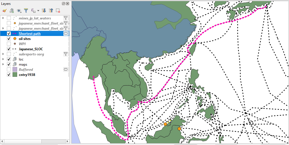
QGIS’ Field Calculator is a powerful tool which can be used to generate statistics and provide other functions which can aid in your analysis. It can be used to generate new data fields within existing datasets. For instance, suppose you wanted to know the extent of the Japanese shipping empire at the start and end of the war. QGIS’ Field Calculator can help to answer that question. To do so you will need to use the tool to generate the estimated lengths of the Japanese SLOCs.
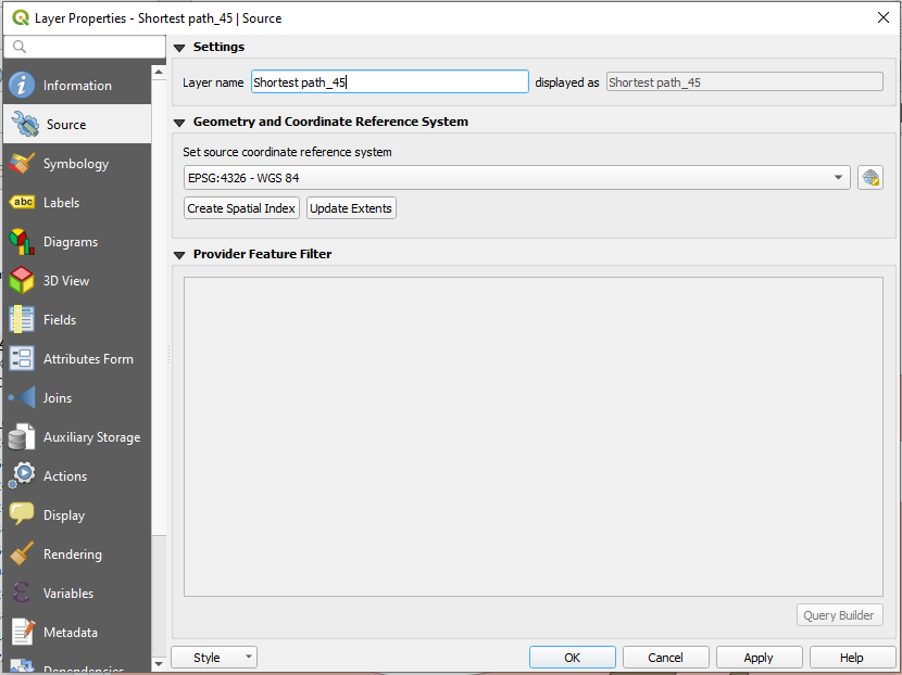
a. Change Projection. For this feature you will need to re-project the Japanese_SLOC_training shapefile. While WGS84 is useful for most GIS tasks that a digital historian may need, it is unsuited for generating spatial statistics. To proceed you will need to change the source coordinate reference system (CRS) for your Japanese_SLOC_training shapefile. Right click on the shapefile, select properties. Navigate to the Source tab.
Set the source coordinate reference system to EPSG: 3857 – WGS 84/Pseudo-Mercator. The mercator projection is determined via degrees. As you did earlier with buffers, you will be able to convert the field calculator’s output into nautical miles (nm) with some simple arithmetic.
Hit ok.
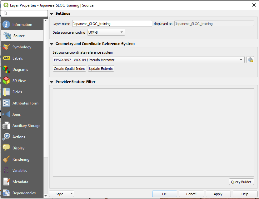
You will notice that the shapefile will “disappear.” Since the data has been re-projected it will move to a different area within QGIS’ viewing window. Right click on the file and “select zoom to layer” to be orientate your screen to the now re-projected data.
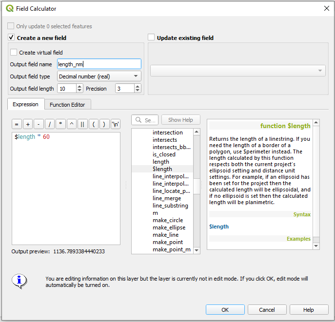
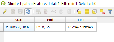
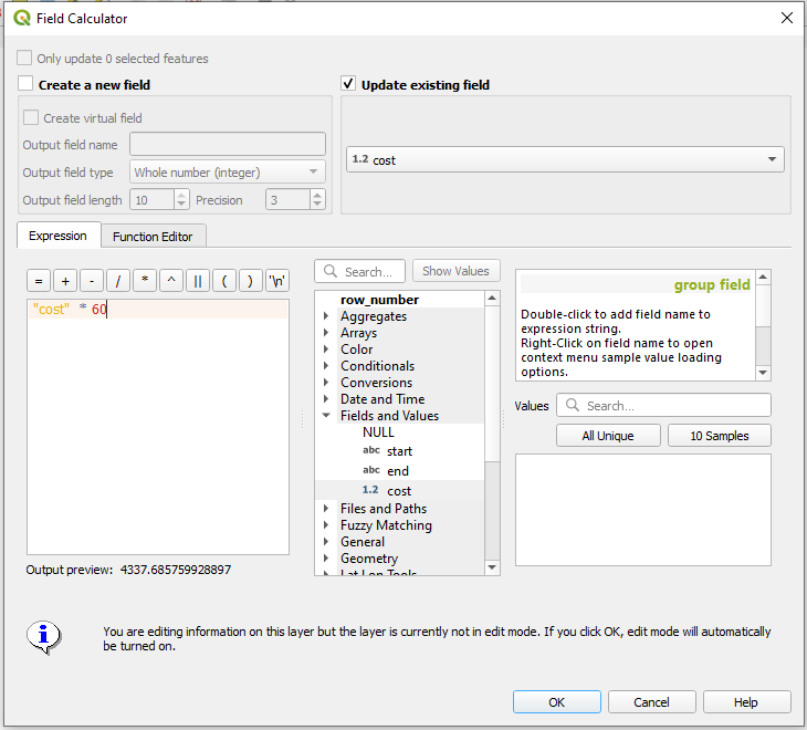
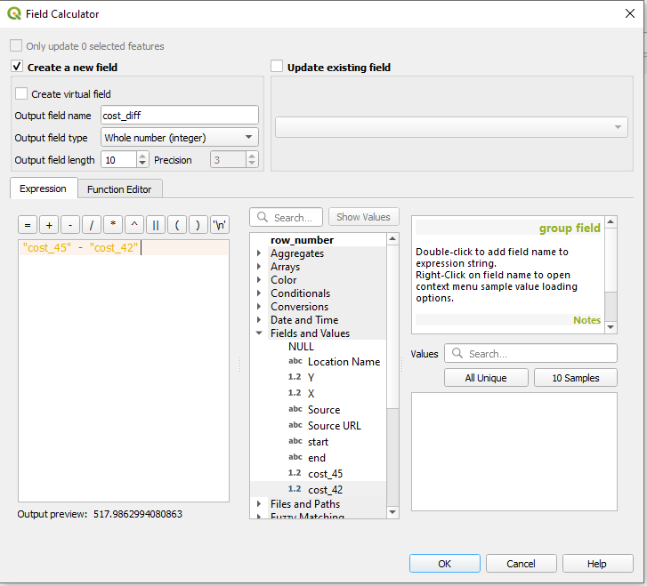
b. Create New Field. Open the attribute table of your Japanese_SLOC_training shapefile and navigate to the field calculator. It is located four icons from the right on the top of the attributes window. The Field Calculator window should appear.

Click “Create a new field.” Give the new field a name in the “Output field name” box. Choose Decimal number (real) from the Output field type. Keep the rest of settings as their default.
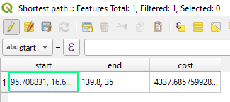
The expression box is were you will instruct QGIS to determine the lengths of every Japanese SLOC feature in the shapefile. To do so, enter the following expression $length * 60 You can also input these values by first navigating through the center window and double clicking the $length selection, then the * button atop the expression field and typing 60.
This expression will instruct QGIS to create a new field, generate a length statistic for every feature within the shapefile, and multiply every output by 60, thereby providing a nautical mile length for every feature.
Hit ok.
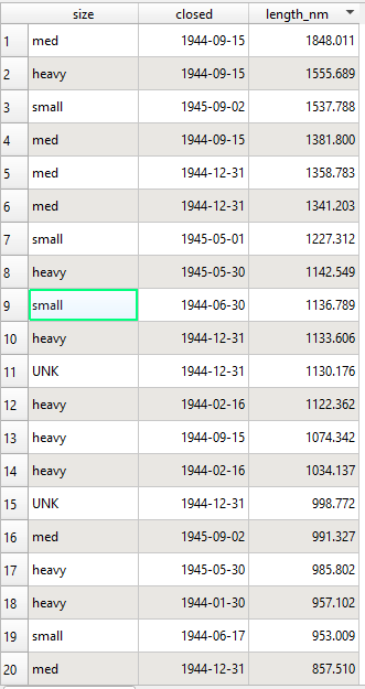
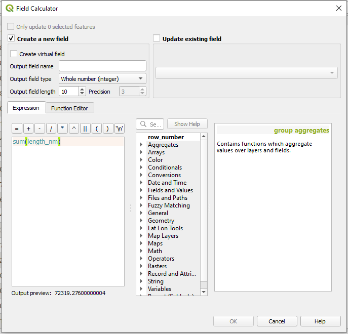
c. Calculate totals. Now that you’ve created some new historical data you can ask pose some questions related to it. What was the fullest extent of the Japanese shipping empire at the start of World War II? The field calculator can help to answer this question. In the expression window enter sum(length_nm)
If the expression is entered correctly it will automatically provide an answer. At start of the war, during the height of Japanese military expansion, the Japanese empire controlled a little over 72,319 nm of shipping across the Pacific.
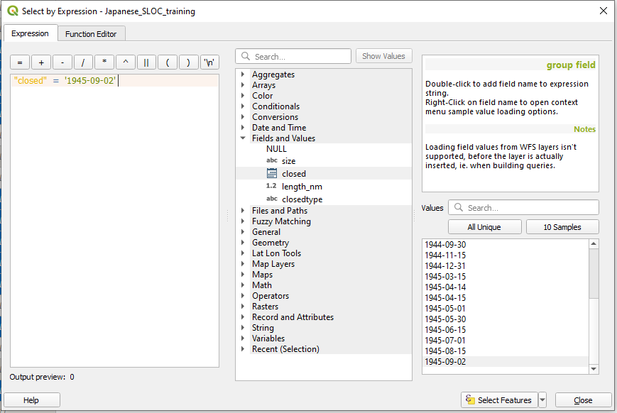
The Field Calculator can also be used on data which has been restricted via filters. Navigate to the shapefile’s filter function and enter the following expression “closed” = ‘1945/09/02’ This will limit the QGIS to displaying only those SLOCs which remained open on the eve of Japanese surrender. Repeat the same process from step 5c.
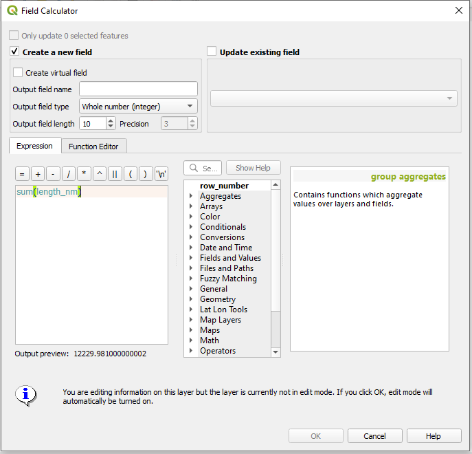
By the end of the war the Japanese empire maintained 12,229 nm of its original shipping network of 72,319 nm.
d. Update Shapefile. The Field Calculator can also be used to add qualitative data to existing shapefiles. To illustrate this function let us add some data to the SLOC shapefile.
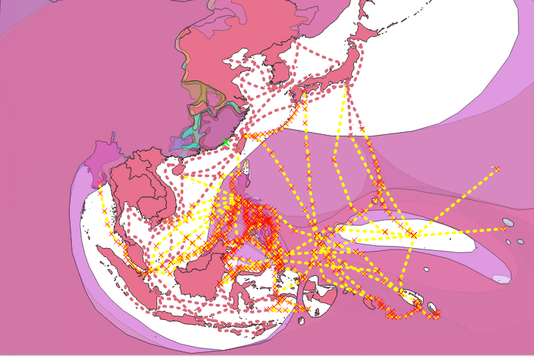
First remove any filters which may remain on your Allied zones of control shapefile. Preform a select by location to determine those SLOCs which intersect or overlap with the Allied line of control shapefile. This will identify those SLOCs which were directly interdicted by the Allied advance.
Consult part III if you need a refresher on select by location.
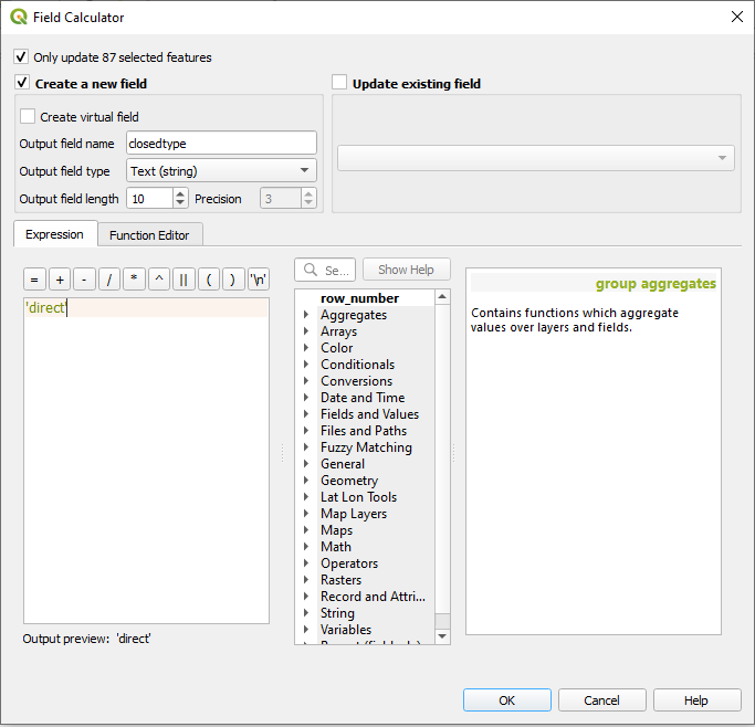
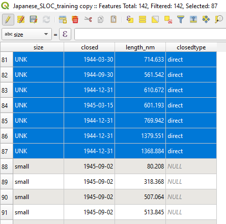
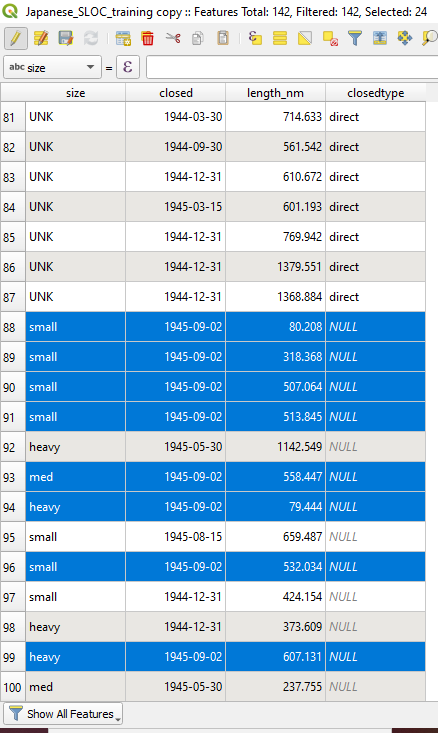
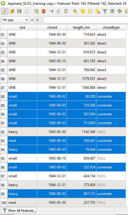
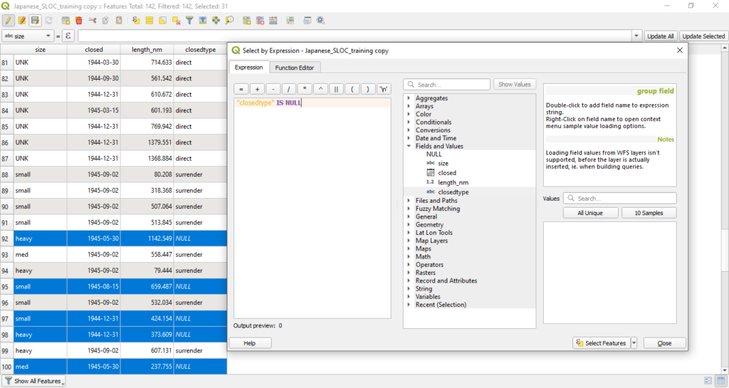
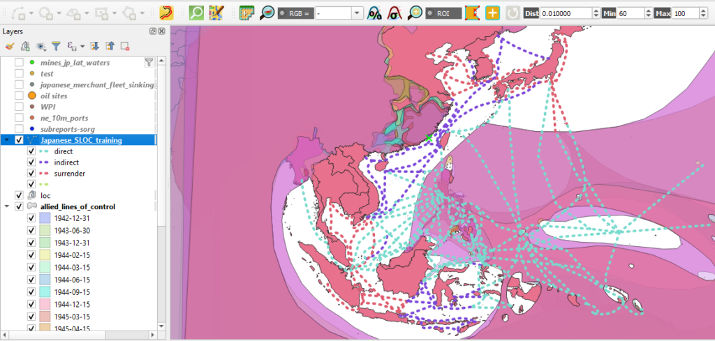
e. Create New Field and Populate Selected Features. Your select by location should return 87 features. These SLOCs are those which were directly cut by Allied occupation, or the isolation of Japanese shipping nodes or the continuous control of maritime space. With this knowledge in hand you can now attribute each feature by the manner in which it was interdicted.
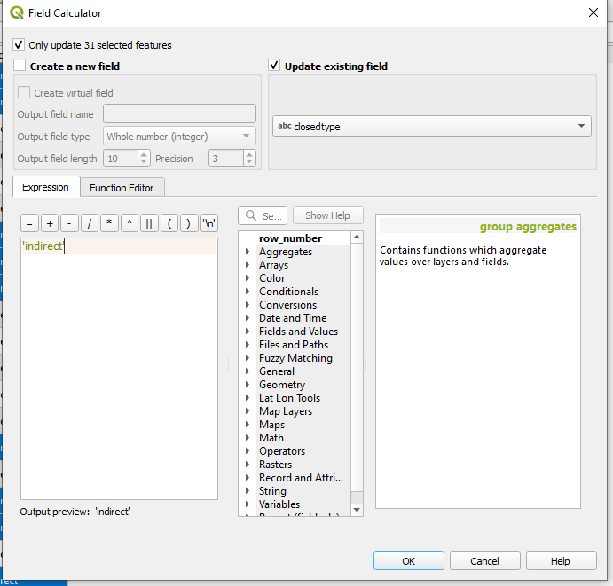
Navigate to the Field Calculator. Click the box which says “Only update 87 selected features.” Click Create a new field. Choose a name for the new field. Choose Text(string) and give it a generous field length, 10 should suffice. In the expression provide an attribute entry contained by single quotes, ‘direct’ for instance. This will instruct QGIS to create a new field and populate the 87 selected features with an attribute: direct.
Hit ok.
f. Continue attribution of new field by Select by Expression. You will likely notice that QGIS has now applied a ‘direct’ observation to 87 of the 142 features. Now, you will need to attribute the rest.
What about those SLOCs which were still active at the end of the war? You can select those using the “Select features using an expression” feature within the attribute window. Clicking it will open the Select by Expression window. In the expression box enter “closed” = ‘1945-09-02’ This will select only those SLOC features which were only closed upon the end of hostilities.
Hit select features, hit close. The expression should have selected 24 features.
g. Update attributes using field calculator. Now that you have identified those SLOCs which operated until the end of the war it is now time to attribute them. Reopen the Field Calculator. Click Only update 24 selected features. Click Update existing field. Choose closedtype from the dropdown menu. In the expression window enter a new field entry, ‘surrender’
Hit ok.

h. Select the remaining NULL rows using a Select by Expression. Now only those features which remain without a closedtype entry are those which were not directly interdicted by the Allies but did not remain open until the end of the war. Those features are currently listed as NULL. To attributed those features you can selected them via a Select by Expression using the expression “closetype” IS NULL The expression should select 31 features.
g. Complete field using Field Calculator. As you did with step 5g, finish attributing the new field using a new entry. ‘indirect’ should suffice.
Congratulations, you now have an original dataset derived some source material and improved with new spatial data and assessments.
Step 6: Network Analysis
QGIS also provides tools for users to preform network analysis. In a modern context, geospatial analysts working in military affairs use network analysis to aid in campaign planning, logistics, and targeting support. For digital digital military historians, network analysis can aid in answering similar questions about past military campaigns.
The SLOC data constitutes a network and can therefore be interrogated by QGIS’ network analysis tools. A word of caution, network analysis is a stickler for precision. If your network vertices are not perfectly snapped the tool will not identify possible routes even if they existed in reality. As such, for step six I would recommend that you download and load a prepared copy of the Japanese SLOC network, from here.
Also, if you do not have your file of Japanese occupied oil facilities you can download a copy here.
a. Load the necessary datasets into QGIS.
b. Navigate to Processing > Toolbox
c. Search for Network in the search toolbar. Click on Shortest path (point to point). Point to point will tell QGIS to discover the shortest or fastest route on a network between two manually chosen points.
d. Select your Japanese SLOC shapefile from the “Vector layer representing network” dropdown menu. Choose your start and end points from the icon next to the “Start point” and “End point” windows. When you click on either icon, the Shortest Path window will close and your icon will turn into a crosshair. Select your point using the crosshair and the Shortest Path (Point to Point)window will reappear. Repeat the process for the other end. Keep the rest of the defaults.
For this example we’ll choose the Ports of Rangoon and Tokyo, although any two points on the network will suffice.
Hit run.
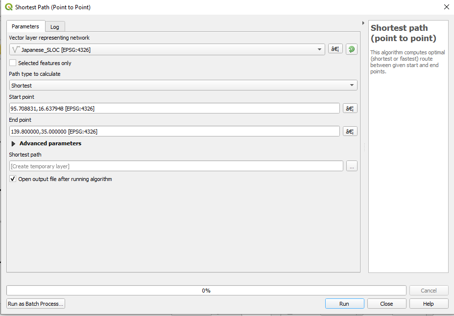
e. QGIS has auto determined the shortest route in your SLOC network between Rangoon and Tokyo. Right click on the newly created Shortest Path shapefile and open its attribute table. Note that QGIS created a temporary shapefile with three columns, a starting point, an end point (both decimal degrees), and a travel cost. The cost column displays the travel distance between the two points measured in degrees.
f. You can convert that fields value by using the field calculator. Open the calculator. Click on Update existing field. Choose cost from the dropdown menu. Enter “cost” * 60 into the expression window.
Hit ok.
Your cost column is now converted to nautical miles. The shortest route between Rangoon and Tokyo in the SLOC network was a little over 4,337 nautical miles.
g. QGIS will also allow you to use layer data as one or both of your start and end points. Search again in the Processing Toolbox for Network. Click on “Shortest path (layer to point).
h. Select your Japanese SLOC shapefile from the “Vector layer representing network” dropdown menu. “From the vector later with start points” select your oil sites data set. And, as you did earlier, select the port of Tokyo using the coordinate grabber. Keep the rest of the defaults.
Hit run.
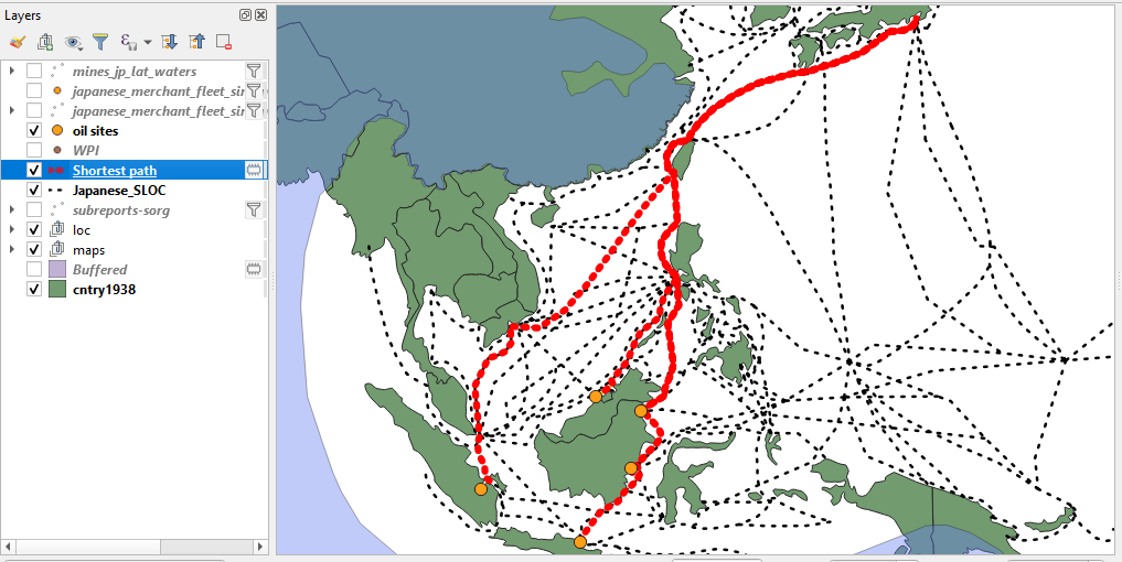
i. Using a select by expression you can create another set of estimates for comparative purposes. For instance, how was Japanese oil shipping impacted by the Allied advance into the Philippines?

First you will need to select those SLOCs which were closed after 15 Mar 1945. You can achieve this by setting a filter on your SLOC shapefile using the expression, “closed” > ‘1945-03-15’
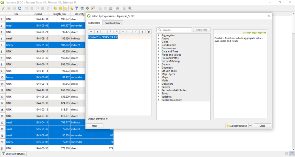

j. Open the Shortest Path (Layer to Point) tool. Use the same inputs as step 6h, although this time select the box next to “Selected features only.”
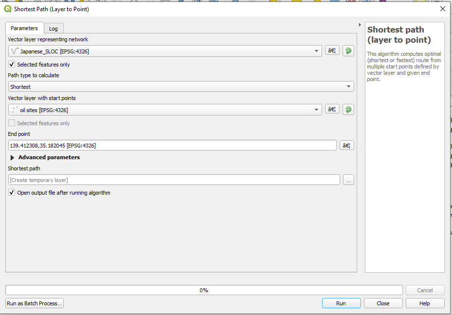
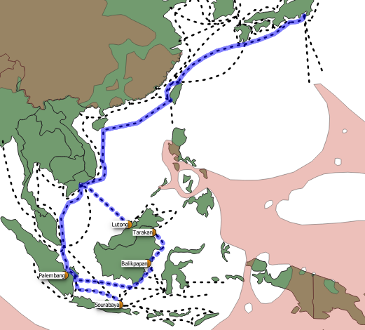
As you will likely observe the Japanese SLOC network was severely degraded in the early spring of 1945. Sites on the island of Borneo were significantly impacted. How might we measure the impact of this network degradation? One method would be to compare the travel costs of all five sites between the initial estimates and those from March 1945. This can be achieved using QGIS’s join function and the field calculator.
k. First you will want to convert the travel costs for your new estimates to nautical miles as you did with step 7f.
l. Next I would strongly recommend that you change the layer names for each Shortest Path shapefile. I would also recommend changing the names of each layer’s cost column. You’ll want to do this in order to differentiate them during later steps. You can change the layer name by opening the layer properties and navigating to the source tab. I would recommend applying a 42 or 45 suffix to either layer.
Similarly, you can change the field name by navigating to the fields tab and activating editing mode (by clicking the pencil icon).
Repeat the process for the other layer.
m. Time to join the data from one layer to another. Open the layer properties for your newly name Shortest path_42 layer and navigate to the Joins tab. the Add Vector Join window should appear. From the Join layer dropdown choose your newly named Shortest path_45 layer. For both the Join and Target field, select Location Name. Check the Joined Fields box and select “cost_45” from the list below. This will tell QGIS to only join that data which will be useful for you. Doing so will keep the output free from unnecessary redundancy. Check the box next to “Custom Field Name Prefix” and blank out the selection. This option is superfluous since you took the time to remain your field.
Hit ok.

n. Open the attribute field and observe that QGIS has applied the cost estimates from the 1942 estimate to the layer for the 1945 estimates. You will likely also observe several of the facilities endured significant blows to their connectivity to the port of Tokyo. QGIS’ field calculator can be used to preform some simple arithmetic to place these changes into context.

o. Open the Field Calculator. Check Create a new field. The the new field a name, “cost_diff” should suffice. Keep the rest of the defaults. In the expression window, enter the following expression “cost_45” – “cost_42” This will find the difference between the cost estimates from 1945 and 1942.
Hit ok.

p. Observe the cost difference provided by QGIS. The Allied invasion into the Philippines and related incursions into the South China Sea imposed a heavy cost upon Japanese shipping. In addition to lost tonnage and material, the Japanese empire lost vital routes between its occupied oil facilities in Indonesia and Malaysia and Japan. Sites on the eastern portion of Borneo and Java were especially impacted as their northerly routes were directly interdicted.
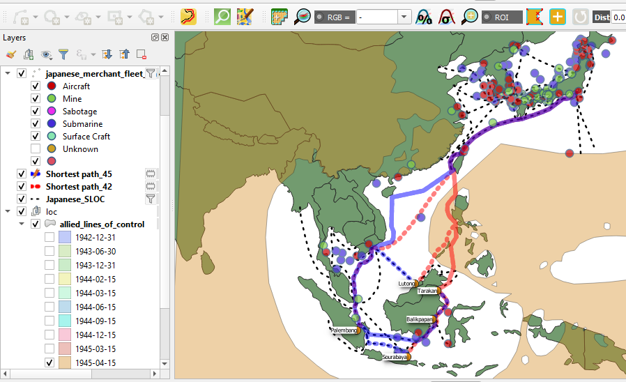
And with that, sadly Rebuilding a War must come to a close. I hope that this series of blogs as proven valuable to you in your practice of digital history. I would like to thank my colleagues at the Roy Rosenzweig Center for History and New Media for their assistance in copy editing and sanity checking these blogs. If you have any questions or comments please feel free to contact me at bbuck@gmu.edu. I am somewhat active on twitter @brandan_buck .
So long.
