The following is the second among a series of blog posts designed to capture the lessons learned during the creation of “Unrestricted: The Campaign to Sink the Japanese Merchant Fleet During World War II.” The aim of this series is to pass along these techniques for students and professors of digital history in general, and digital military history in particular.
The second blog in this series concerns the digitization of line and point features. This lesson will teach you how to digitize a sea lines of communication (SLOC) using QGIS’ digitization and snapping tools. This blog will also teach you how to use utilize contemporary spatial data for the digitization of historic information. Additionally, you will learn how to combine information from multiple sources into a single dataset. This blog will also cover proper data attribution and reinforce the georectification skills learned in part I. Finally, you will learn how to create a point dataset using a CSV file.
Getting Started:
This blog series will assume that the reader has set up QGIS, and possesses a basic knowledge of how the tool works. (If not, QGIS can be downloaded here. An introduction to QGIS can be found here.) For a basic rundown on GIS data types and other essentials useful for digital humanists see this excellent resource.
The maps which you will digitize are from The Reports of General MacArthur. Also, this tutorial will make use of material from “Choke Hold: The Attack on Japanese Oil in World War II” and contemporary port data, the World Port Index (WPI) made available from the National Geospatial-Intelligence Agency.
You will also need a base layer with which to rectify our map. Given the scale of this project a simple shapefile of international boundaries, either from the present or the period. Either will suffice although the current shapefile, while anachronistic, contains more accurate geometries. The landmarks which you will use you consist of shoreline features and other international boundaries defined by rivers and other natural landmarks which have remained largely unchanged and are accurate enough for our purposes.
*Note: This tutorial was generated using QGIS 3.10 in the spring of 2021. Future iterations of QGIS may contain a different interface, toolbar configuration, or other cosmetic changes. Nevertheless, the functionality of the tools and concepts of this tutorial will remain pertinent.
Step 1: Create (or Load Previous) Project
a. Create a new QGIS project. Launch QGIS.
b. Project -> New
c. Name the new project.
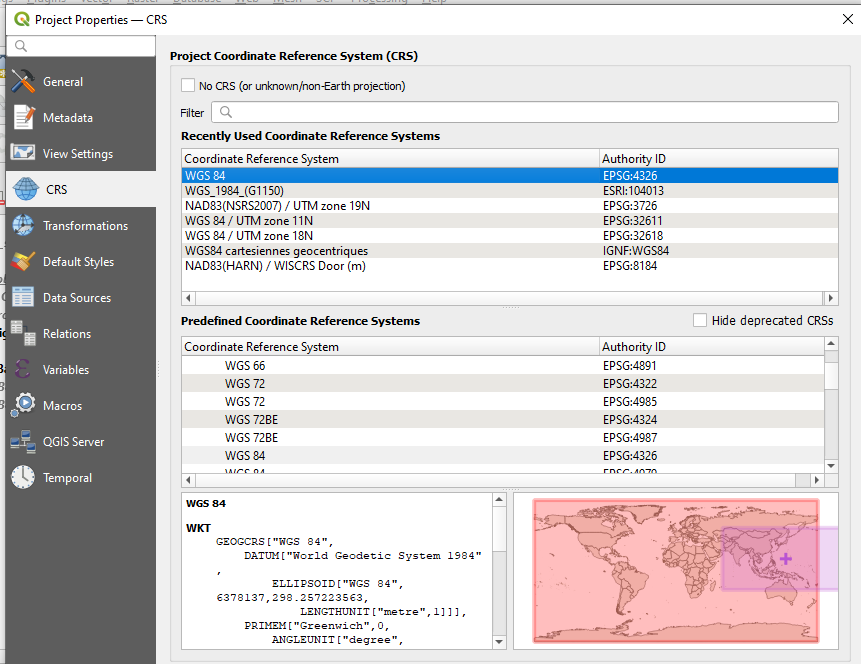
d. For this tutorial you will always use WGS 84 ESPG: 4326 as the Coordinate Reference Systems (CRS) or Spatial Reference System (SRS). To set the CRS, go to Project -> Properties, select “CRS” on the left panel. WGS 84 should be the first choice. If you don’t see it, filter for “WGS 84” and it should populate. Select it and hit ok.
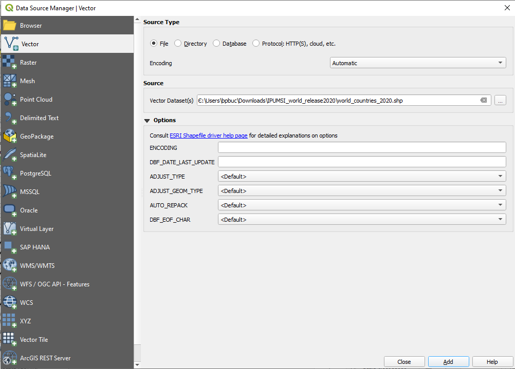
e. Add the boundary shapefile, Layer -> Add Layer -> Add Vector Layer
f. Browse to the location of the boundary shapefile, select the .shp file, select open
g. Select Add, then Close
h. Save the project
*Note on Coordinate Reference Systems. Traditional maps are a 2d representation of a 3d reality. As such, compromises must be made in order to make maps legible. Coordinate Reference Systems are a means of doing so. They define “how the two-dimensional, projected map in your GIS relates to real places on the earth.” All CRS types make compromises due to the limitations inherent to their role. WGS 84 is the mostly widely used CRS available. It is the standard for the U.S. Defense Department and is used in GPS systems worldwide. However there are examples where it can be of limited use, particularly for regions nearer of the poles of the Earth. However, given the scale of this project it will be more than adequate.

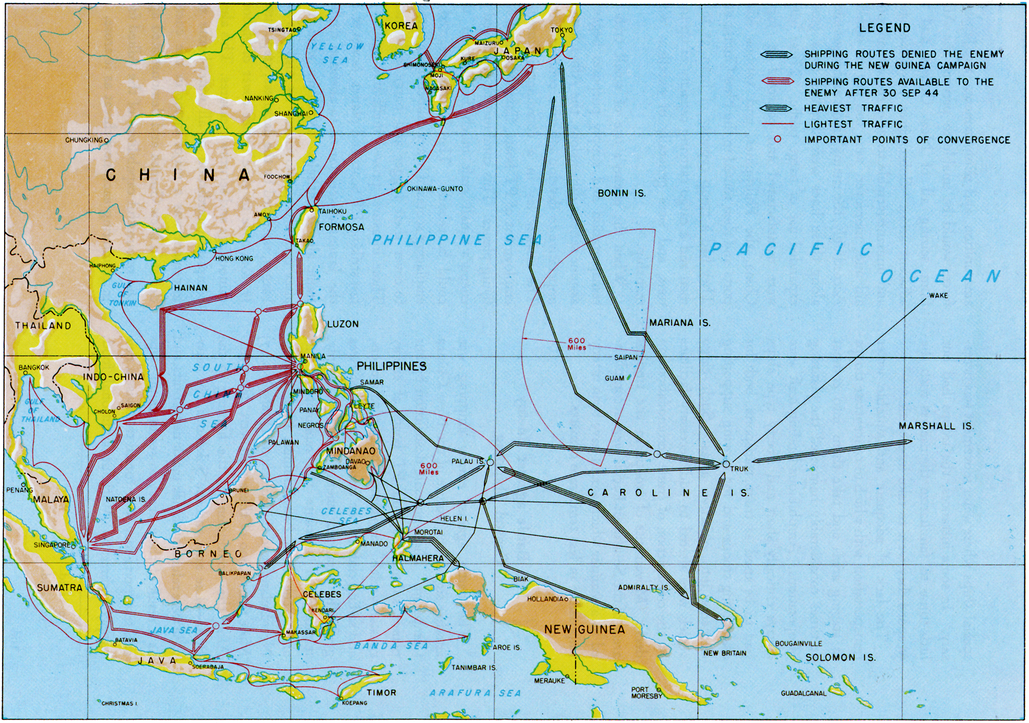
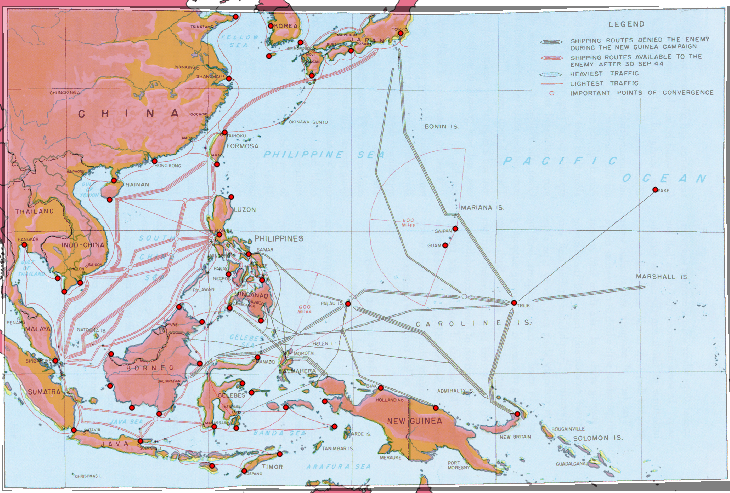
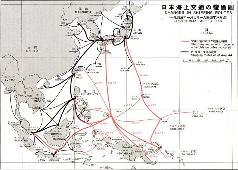
Georectify the map. As with part I, this blog will require the georectification of historic maps for the purpose of feature digitization. This tutorial will first make use of a map from the MacArthur report entitled, “Enemy Shipping Routes Destroyed during the New Guinea Campaign.”
To proceed with this tutorial, georectify the map using your boundary base layer. If you need a refresher on georectification, please consult part I. No worries, I’ll wait for you!
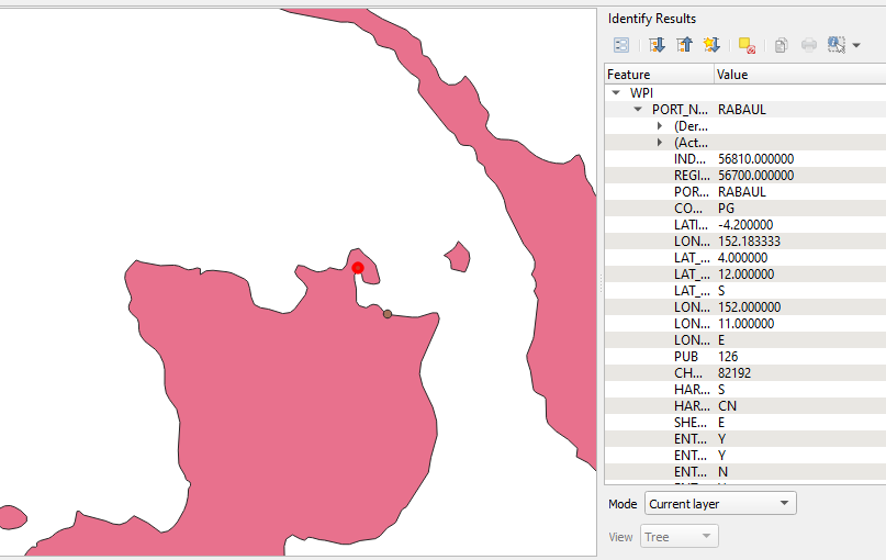
For portions of the map in the central Pacific such as Truk and Wake Island, the WPI data can serve to aid in georectification.
*Note: Strictly speaking using contemporary data for projects such as this may be anachronistic. However, significant features such as ports, particularly major ones, may still yield useful spatial data for historians. For instance, the composition of the Rabaul Port may have changed significantly since World War II, but its location has not. So, despite WPI being a modern dataset, it can still yield valuable spatial data.
Digitizing Features on the Map.
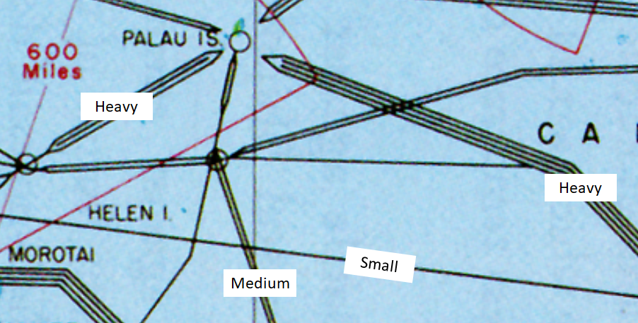
As with part I your goal here is to turn the analog information from the map into digital information in the form of a shapefile. The map depicts the location, traffic level, and date of interdiction for the Japanese empire’s shipping network during World War II. Each lane is weighted according to its relative level of traffic. For this tutorial simple three tier system will suffice, small, medium and heavy. Small for SLOCs depicted by one line, medium for two lines, and heavy with those symbolized by three or four lines.
The SLOCs are also colorized according to their operating status as of 30 September 1944, black for closed, red for open. Set this information aside for now. Interdiction dates will be addressed during the next installment of this blog.
Step 1: Load WPI shapefile into the project.
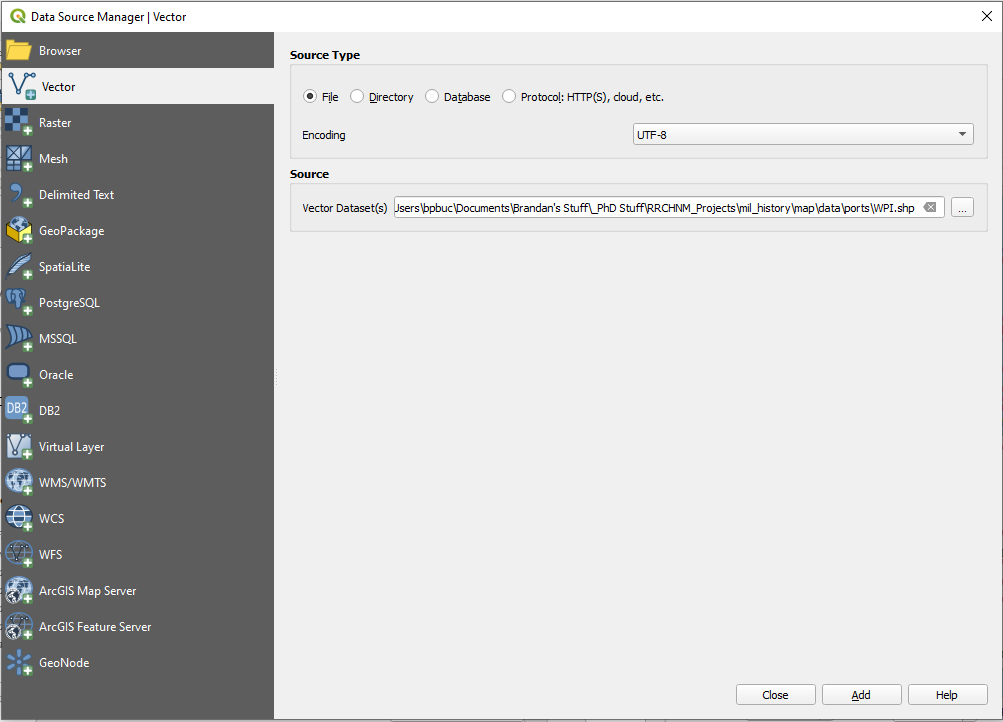
a. Navigate to Add Layer -> Add Vector Layer
b. Use the “…” button to navigate to the file location where you saved your copy of the WPI shapefile
Hit Add
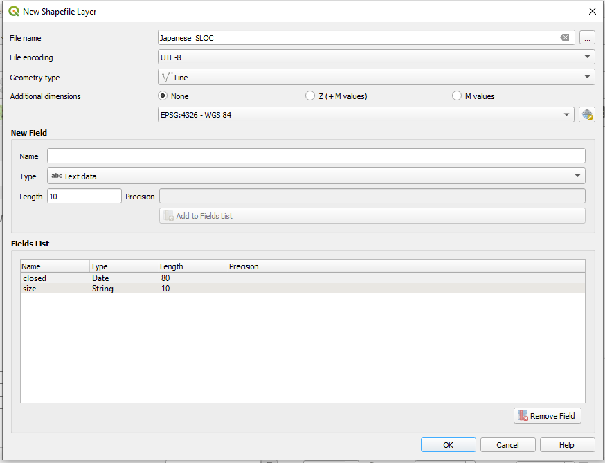
Step 2: Create a Line Shapefile. Navigate to Layer -> Create Layer -> New Shapefile Layer
a. Give the shapefile a name and choose a file path from the “…” button. Choose “Polygon” from the Geometry type dropdown menu and make sure “ESPG: 4326 – WGS 84” is selected.
The bottom half of the window is for creating fields within the new shapefile. For this digitization project our goal will be to capture information from the map and reflect it within the shapefile’s attributes. To do so we will need two columns, one for the size of the sea lane and another for when it was interdicted by the Allies. Select “Date” from the “Type” dropdown menu for the date column. Click “Add to Fields List.” Next, select “Text Data” for the size field. A field length of 10 should suffice.
Note: Proper attribution will allow you greater flexibility in your analysis and map creation in QGIS. It will also afford you opportunities to create interactive maps in programs such as R Studio.
Hit ok.
Step 2: Begin digitization. As with part I I would recommend starting in the South Pacific where the Japanese SLOCs were simplest. Throughout this digitization process your goal will be to replicate the complexity of the SLOCs depicted on the map. To achieve this you will use the snapping tool to anchor your lines to major points of convergence and harbors. Using the snapping tool combined with the contemporary WPI dataset will speed the digitization process along while making for a cleaner dataset.
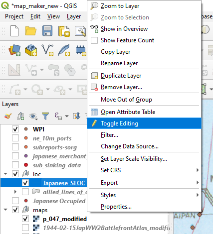
a. Right click on the line shapefile in the QGIS layers window, select “Toggle Editing.”
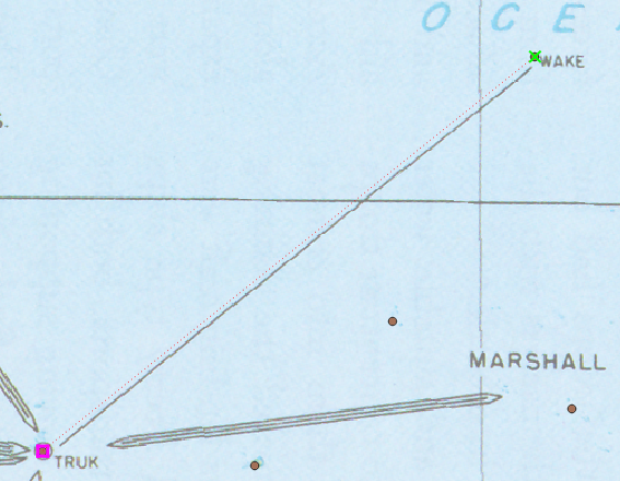
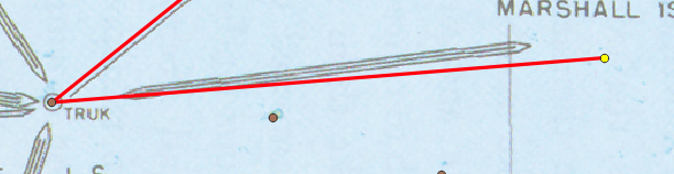
b. Navigate to the Digitization Toolbar, find and click the icon for “Add Line Feature” and the Snapping Tool. Click on the contemporary port facility over the island of Wake, click and then right click on the port facility over the Truk Atoll (known now as Chuuk Lagoon).

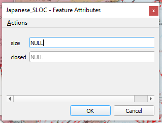
c. The “Feature Attributes” window will appear. Note that the SLOC depicted is symbolized on our rectified map by a single line. This is the smallest of the possible sizes.
Hit ok.

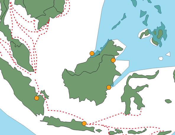
c. Congratulations, you’ve made your first line feature! Next, digitize the heavy SLOC between Truk and the Marshall Islands. The map depicts a general shipping lane between a discreet point, Truk Atoll and a collection of islands, the Marshalls. For an anchor point, the current port facility of Kwajalein in the Kwajalein Atoll will serve as a suitable terminus.
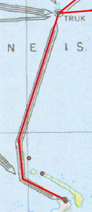
d. Next, digitize the SLOC south from Truk to New Britain. Be sure to use the snapping tool to anchor your first point to Truk, drop two vertices along the path of the SLOC, turn on the snapping tool and anchor the terminus of the SLOC to the port of Rabaul.
e. Next, connect the port of Rabaul to the Palau Islands. Start the new SLOC on the vertex that is northwest of Rabaul. As before, use the snapping tool to hook it onto the existing vertex. Digitize this SLOC while paying attention to not only the lane’s geography but also its overlaps with other lanes. Place vertices at the locations where this SLOC intersects with others. Doing so will allow you to more efficiently build the rest of the shipping network while maintaining a greater degree of accuracy. Between our starting point and the end point, the Palau islands this new SLOC should have four vertices.
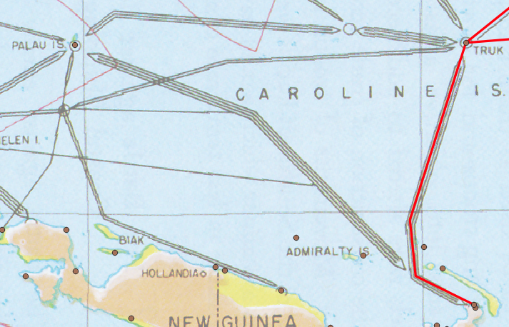

f. Time to fly solo again! Complete the rest of the shipping network between the Palau Islands south to the island of Biak and southeast to New Guinea. As you do be sure to digitize with the overall network in mind, applying vertices where SLOCs overlap. Also, be sure to properly attribute the SLOC sizes as you go. This is not the kind of tedious work that you want to do later.
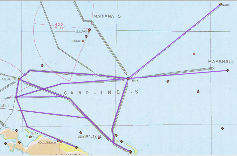
g. Now that you have the hand of the basics it is time to digitize the rest of the map. Apply the same principles as before to the rest of the network. For major shipping hubs which are located in the vicinity of numerous port facilities, pick a single point of convergence and use it to snap your points to. See the examples below.
Step 3: Additional Georectification, Digitization, and Deconfliction
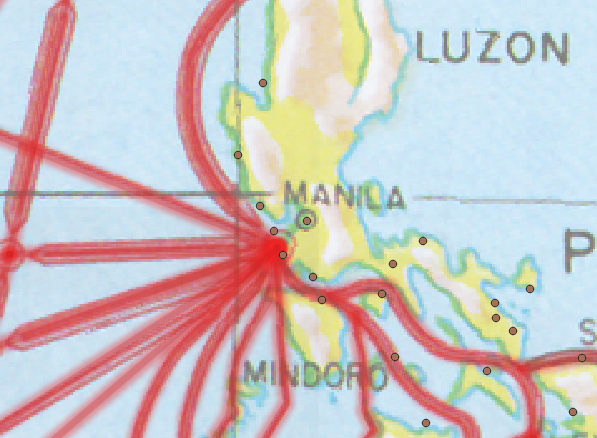
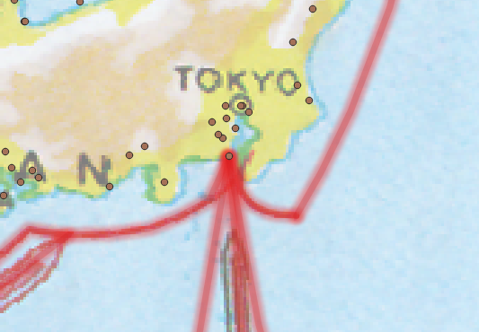
You may notice that the SLOCs on the edges of the Pacific theatre are cut off, particularly around northern China and Korea. The Reports of General MacArthur contains another map of Japanese shipping lanes with has valuable geographic and temporal data. It contains several prominent SLOCs which do not appear on the map that you georectified earlier. This map, “Changes in Shipping Routes” contains routes which should be reflected in our new dataset.
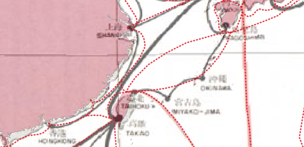
a. Georectify the new map. Since the portions of interested are localized to the Yellow Sea, Sea of Japan, around the Port of Rabaul, and the Bay of Bengal, you can limit your georectification points to those locations. For good measure it would also be a good idea to rectify Palau, Saipan, and the Truk Atoll.
b. Digitize additional features. This is one of those moments when GIS becomes an art rather than a science. There are significant differences between these two maps. Some of these differences are merely aesthetic. See the example below.
However the “Changes in Shipping Routes” map depicts several main arteries not shown in the earlier campaign maps. Examples include a SLOC between Truk and the Japanese home islands, and a route between Taiwan and Palau. Additionally, this map depicts smaller routes between Japan, Korea and northern China. Lastly, the new map depicts SLOCS around New Britain and the Solomon Islands. Digitize these new features while deconflicting the routes to the best of your judgement.
Also, it is not entirely clear this this map’s SLOCs are symbolized by traffic size. For the “size” column in your shapefile mark these new features as “UNK.”
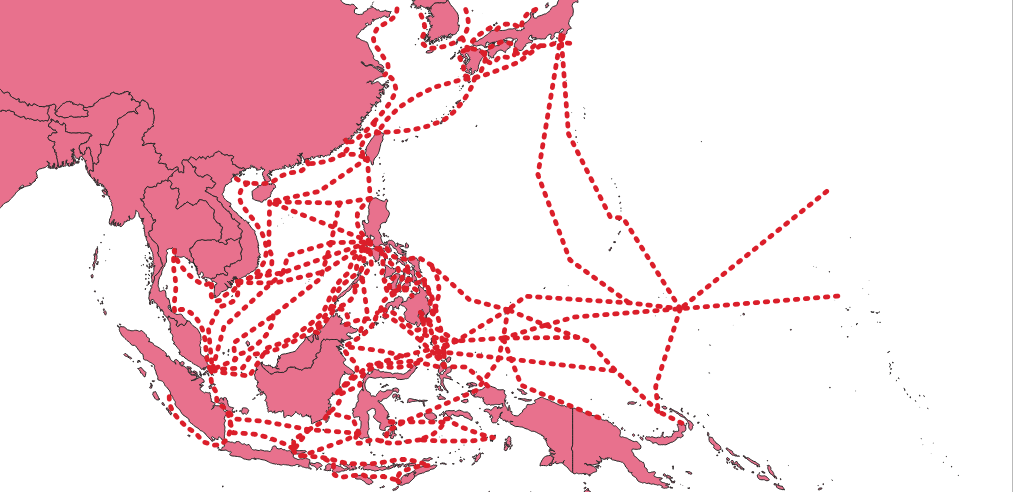
Upon completion, your results may look similar to those below.

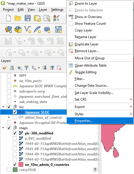
Symbolize Your Data: Since you properly attributed all of the features (you did keep up with that right?) you can now symbolize the SLOCs by the size of their traffic.
a. Right click on your line shapefile and navigate to “Properties.”
b. Choose “Categorized” from the dropdown menu
c. Choose “size” from the “Value” dropdown menu
d. Choose a symbol from the “Symbol” dropdown menu.
e. Hit classify.
Hit ok.
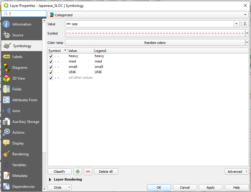
Your SLOCs are now symbolized according to their traffic size. You can also now turn off different SLOCs according to their size. This feature will prove invaluable in your analysis and visualization of the dataset, both of which will be covered in part III.

Digitization via CSV File:
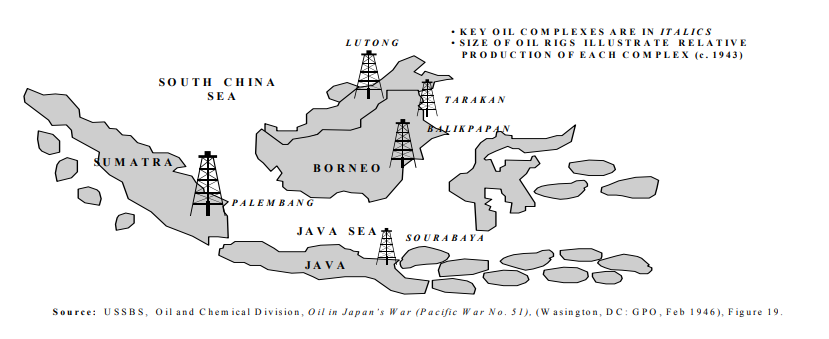
Now it is time to learn another trick of the trade, creating a dataset from scratch via a CSV file. To add some complexity to your map you are going to digitize the location of major Japanese held oil production facilities in the Netherlands East Indies. The source of this information will be from an Air University thesis entitled, Chokehold: The Attack on Japanese Oil During World War II by Stephen L. Wolborsky.
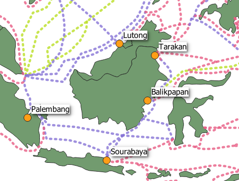
Scroll to page 18 and you will see a map which depicts five oil production sites. Palembang on the island of Sumatra, Lutong, Tarakan, and Balikpapan on the island of Borneo, and finally, Sourabaya on the island of Java.
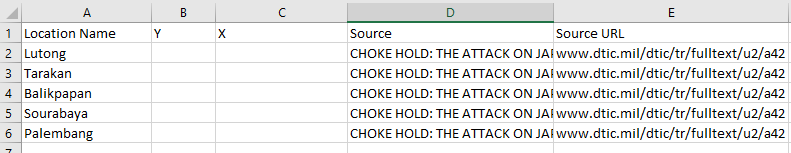
Step 1: Create a new CSV file
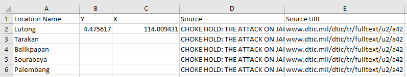
Step 2: Attribute the CSV.
a. Create the following column headings: “Location Name,” “Y,” “X,” “Source,” “Source URL.”
b. Populate the Source fields with “CHOKE HOLD: THE ATTACK ON JAPANESE OIL IN WORLD WAR II”
c. Populate the Source URL fields with “www.dtic.mil/dtic/tr/fulltext/u2/a425684.pdf”
d. Populate “Lutong,” “Tarakan,” “Balikpapan” and, “Sourabaya” in the Location Name column,
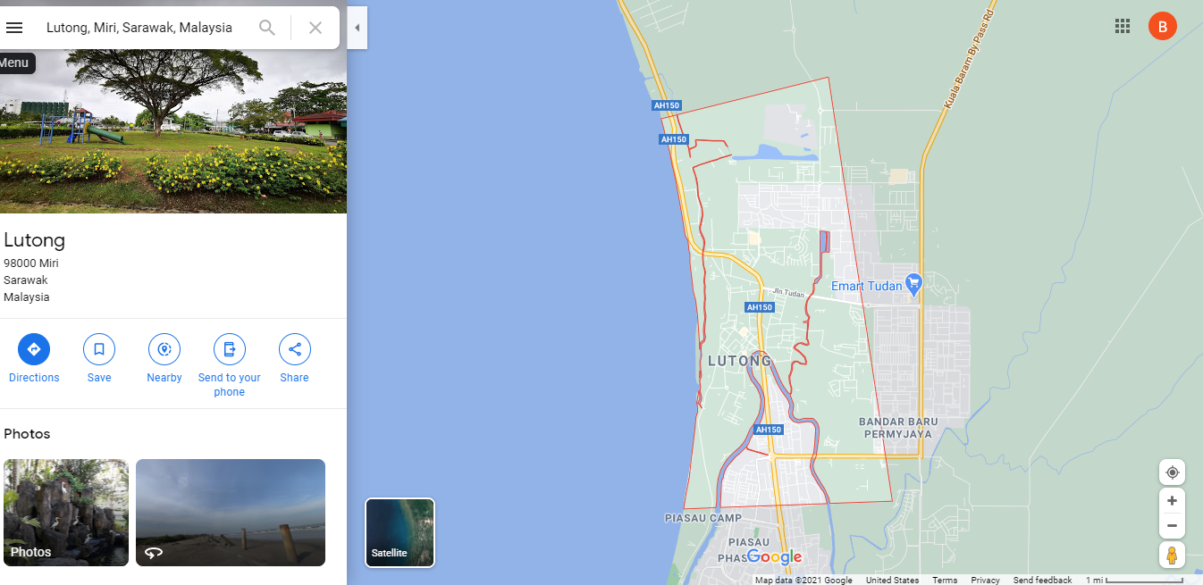
Step 3: Gather the spatial data. The X column will be for each facilities’ “easting” or longitudinal coordinate, and the Y column will be for each facilities’ “northing” or latitudinal coordinate. To find the spatial data for these locations you’ll consult the fount of all knowledge: Google.
Our goal here is to merely represent these locations on a map. As such, locational information down to the city level will suffice.
a. A simple Google search on the first location will turn up the city of Lutong in the state of Sarawak, Malaysia.
b. If you right click over “Lutong” Google will provide the spatial coordinates in the form of decimal degrees. 114.00892 is the X coordinate, 4.46757 is the Y coordinate.
c. Click on the coordinates to copy them to your clipboard.
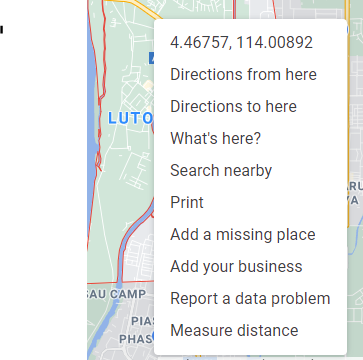
d. Enter 114.00892 into the X column on the Lutong row, enter 4.46757 into the Y column on the Lutong row.
e. One down, four to go. Complete your open source investigation until all five locations have their Y and X columns completed. Save your CSV when completed.
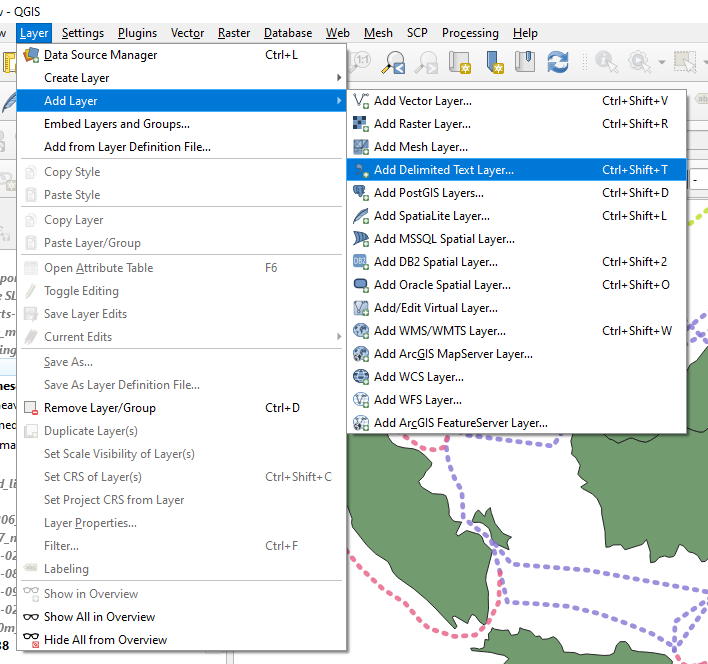
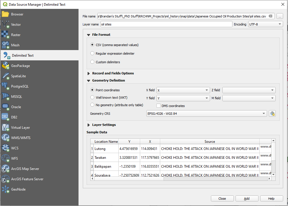
f. Add the CSV to your map. Navigate to Layer -> Add Delimited Text Layer
g. Navigate to your CSV file using the “…” button. Ensure that “CSV (comma separated values)” is checked. Make sure that “DMS coordinates” is unchecked. QGIS should auto detect the correct coordinate columns. If not, the “X Field” is X and the “Y Field” is Y. Ensure that the “Geometry CRS” shows as “ESPG: 4326 – WGS 84.”
Hit Add
Wrap Up:
You may be wondering, “whatever happened to that ‘Closed’ column?” Good question! You may have also noticed that both maps that you rectified had temporal information within them. You’ve got a sharp eye! The SLOC maps within the The Reports of General MacArthur contained dates which indicated when certain SLOCs were cut off by Allied military action. However, as we will discover in part III, their estimates are not as precise as the analysis that you can make using other datasets.
For that information you’re going to need to dig deeper. In part III you’ll complete this SLOC dataset using sinking data from Japanese Naval and Merchant Shipping Losses During World War II by All Causes and the Submarine Operations Research Group (SORG). The information in each of the maps you work with today can be improved upon using sinking and operational data.
That, and so much more, will be covered in the next installment of Rebuilding a War.
Cliffhanger!