The following is the third among a series of blog posts designed to capture the lessons learned during the creation of “Unrestricted: The Campaign to Sink the Japanese Merchant Fleet During World War II.” The aim of this series is to pass along these techniques for students and professors of digital history in general, and digital military history in particular.
The third blog in this series concerns the analysis of spatial data within QGIS. This tutorial will teach you how to perform basic spatial analysis using QGIS’ symbolization tools, query, filter and selection tools.
Getting Started:
This blog series will assume that the reader has set up QGIS, and possesses a basic knowledge of how the tool works. (If not, QGIS can be downloaded here. An introduction to QGIS can be found here.) For a basic rundown on GIS data types and other essentials useful for digital humanists see this excellent resource.
This blog will make use of four datasets.
The first is a dataset of Japanese merchant vessels sunk by the Allies derived from the Japanese Naval and Merchant Shipping Losses During World War II by All Causes. This dataset contains information on all Japanese merchant fleet vessels sunk by the Allies over 500 tons. The dataset was built in 1947 by a joint Army-Navy panel from wartime records confirmed by a multitude of intelligence sources. However, it does contain some spatial errors, typos, and other anomalies. You can learn more about the data and its history by visiting the navy.mil website. A simplified, cleaned, and QGIS ready version can be found here.
Next is the Submarine Operations Research Group (SORG). Unlike the other data, it contains other information besides sinkings. It contains a litany of operational details related to U.S. submarine attacks during the war. It also contains sinking information for vessels under 500 tons. Due to its operational origins, SORG data has some accuracy issues, particularly on the result of individual submarine attacks. The number of sinkings were greatly overestimated due to the fog of war and absence of intelligence confirmation available at the time. For more on the dataset’s history and composition visit the Historic Navy Ships Association web site. A QGIS ready version of this dataset can be found here.
Next are Japanese Sea Lines of Communication digitized from the Reports of General MacArthur, Vol 1 (as outlined in Part II). A digitized version of that dataset can be found here.
The last dataset is one which depicts Allied zones of control digitized from Atlas of the World Battle Fronts in Semimonthly Phases to August 15 1945. That dataset can be located here.
You will also need a base layer to orientate yourself. Given the scale of this project a simple shapefile of international boundaries, either from the present or the period. Either will suffice for this blog as it only concerns analysis and not the construction of period maps.
*Note: This tutorial was generated using QGIS 3.10 in the spring of 2021. Future iterations of QGIS may contain a different interface, toolbar configuration, or other cosmetic changes. Nevertheless, the functionality of the tools and concepts of this tutorial will remain pertinent.
Step 1: Create (or Load Previous) Project
a. Create a new QGIS project. Launch QGIS.
b. Project -> New
c. Name the new project.
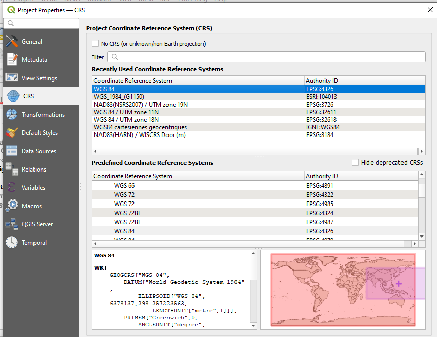
d. For the first part of this tutorial you will use WGS 84 ESPG: 4326 as the Coordinate Reference Systems (CRS) or Spatial Reference System (SRS). To set the CRS, go to Project -> Properties, select “CRS” on the left panel. WGS 84 should be the first choice. If you don’t see it, filter for “WGS 84” and it should populate. Select it and hit ok.
e. Add the boundary shapefile, Layer -> Add Layer -> Add Vector Layer
f. Browse to the location of the boundary shapefile, select the .shp file, select open
g. Select Add, then Close
*Note on Coordinate Reference Systems. Traditional maps are a 2d representation of a 3d reality. As such, compromises must be made in order to make maps legible. Coordinate Reference Systems are a means of doing so. They define “how the two-dimensional, projected map in your GIS relates to real places on the earth.” All CRS types make compromises due to the limitations inherent to their role. WGS 84 is the mostly widely used CRS available. It is the standard for the U.S. Defense Department and is used in GPS systems worldwide. However there are examples where it can be of limited use, particularly for regions nearer of the poles of the Earth. However, given the scale of this project it will be more than adequate.
h. Add the “Japanese_SLOC_training,” “japanese_merchant_fleet_sinkings_simplified_v6,” “subreports-sorg,” and “allied_lines_of_control” datasets by repeating e through g.
Step 2: Familiarize Yourself with the Data
a. Right click on japanese_merchant_fleet_sinkings_simplified_v6 (here after referred to as sinkings data) in your layers panel and select “open attributes panel.”
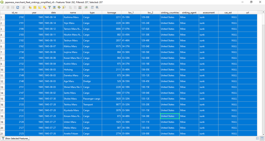
A window which depicts the file’s attribute data should open. The dataset is comprised of 2,192 Japanese merchant vessels (those over 500 tons) sunk by the Allies during the course of the war. The columns represent different aspects of each sinking event. “id_no” is a simple numerical identifier for the sunk vessel ordered chronologically. “year” is the year that the vessel was sunk. “date” the date that the vessel was sunk, arranged YYYY-MM-DD. “name” is the name of the vessel. “type” is the vessel’s type. “tonnage” is the approximate tonnage of the vessel sunk. “loc_1” and “loc_2” are the locational information for the sinking, northing and easting respectively. “sinking_countries” is the primary Allied nation which was responsible for the sinking event. “sinking_agent” is the primary means of the vessel’s sinking, Aircraft, Sabotage, Submarine, Surface Craft, or Mines. “cas_est” contains casualty estimates not present in the original dataset. These estimates were gathered primarily from sources such as combinedfleet.com and other heritage websites. “url” directs to the websites where those estimates were gathered. You may observe that not every casualty estimate has a corresponding URL field. This aspect of the dataset is an on going endeavor.
Once you are comfortable with the dataset, close the attribute panel
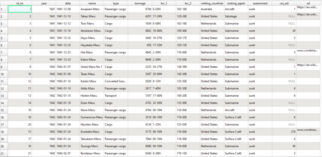
Japanese Naval and Merchant Shipping Losses – WWII (navy.mil).
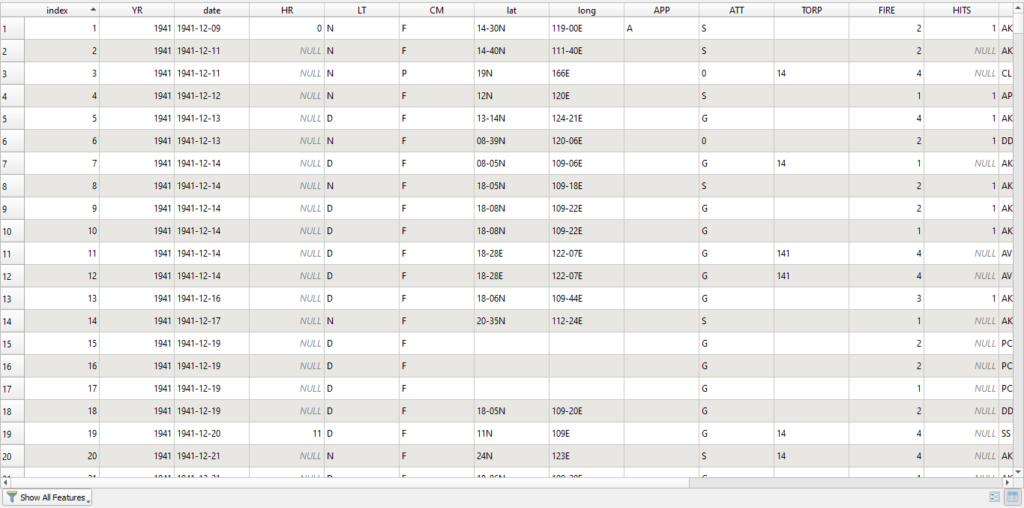
b. Right click on subreports-sorg in your layers panel and select “open attributes panel.”
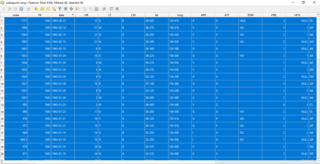
A window which depicts the file’s attribute data should open. The Submarine Operations Research Group data set host 6,168 rows which contain a variety operational information.
From the HNSA website:
“Data entries in the SORG spreadsheet are: date (month/day/year), hour, light condition, operational command (headquarters), latitude, longitude, type of approach and attack, torpedo model, torpedoes fired, hits, target type, result, estimated target tonnage, submarine hull number, and patrol number. “
Once you are comfortable with the dataset, close the attribute panel
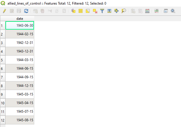
c. Right click on “allied_lines_of_control” shapefile in your layers panel and select “open attributes panel.”
A window which depicts the file’s attribute data should open. This shapefile contains only one column, a date field which depicts the date of the extent of the Allied advance on that date as reflected from maps within The Atlas of the World Battle Fronts in Semimonthly Phases to August 15 1945.
Once you are comfortable with the dataset, close the attribute panel
d. Right click on “Japanese_SLOC_training” shapefile in your layers panel and select “open attributes panel.”
A window which depicts the file’s attribute data should open. This shapefile contains only one column, a String field which contains the traffic size of each SLOC as noted in the Reports of General MacArthur, Vol 1.
Once you are comfortable with the dataset, close the attribute panel
Step 3: Proximity Analysis:
Now that you are familiarized with the datasets it is time to learn how to analyze them in QGIS. To begin you will resume your work with the Japanese SLOCs from Part II. To recap, your goal here will be to use the sinking datasets to determine when each SLOC was successfully interdicted by the Allies. A properly attributed SLOC layer will afford you greater flexibility when making maps in QGIS and can serve as a means of creating dynamic maps in programs such as RStudio.
Before you begin, assume that you know nothing about World War II in the Pacific theater. How could you use QGIS’ tools to determine the course of events in the Pacific using these datasets? To get the broad strokes of the campaign you can use QGIS’ symbolization tool.
a. Right click on your sinkings data shapefile in your layers panel and select “properties.”
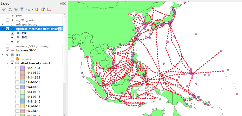
c. Symbolize Data by Year: Navigate to symbology. From the dropdown menu on the top, choose “Categorized.” From the Value dropdown choose “Year.” From the Symbol dropdown menu choose a symbol. Next to the Color Ramp dropdown menu, click on the small arrow iron , choose a color ramp. I would recommend one with discrete colors such as “Spectral.” You can invert the color ramp if you so choose by selecting “invert color ramp.” Hit classify at the bottom of the window. Since this is a dense dataset it may be helpful to make the icons slightly transparent. Select “Layer Rendering” at the bottom of the window. It will open a submenu. Dial the Opacity down to about 80%. You can also adjust each categorized dot manually by clicking on its icon under the “Symbol” column*. You can also adjust all the categorized symbols by clicking on the “Symbol” dropdown menu.
*Note, if you have issues with color differentiation you can adjust your symbolization by shape instead. For an in depth look at QGIS’ symbology function, click here.
After you have adjusted the symbology to your liking and have sufficiently categorized the data by year, hit ok.
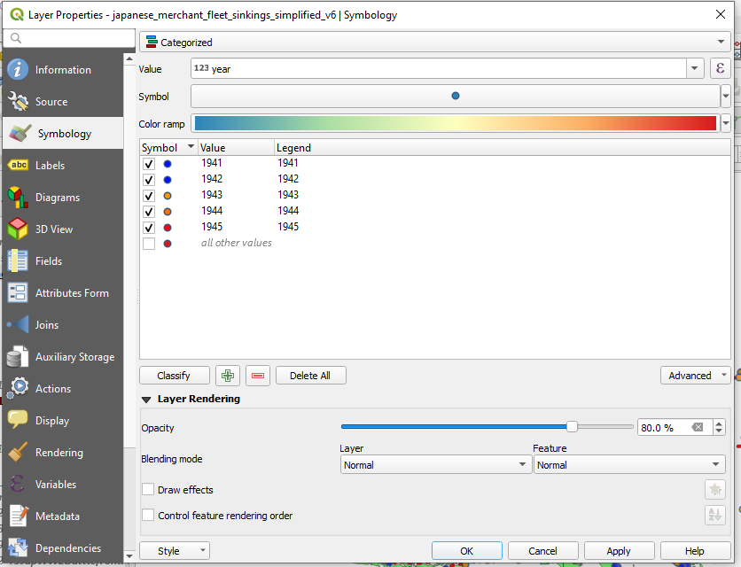
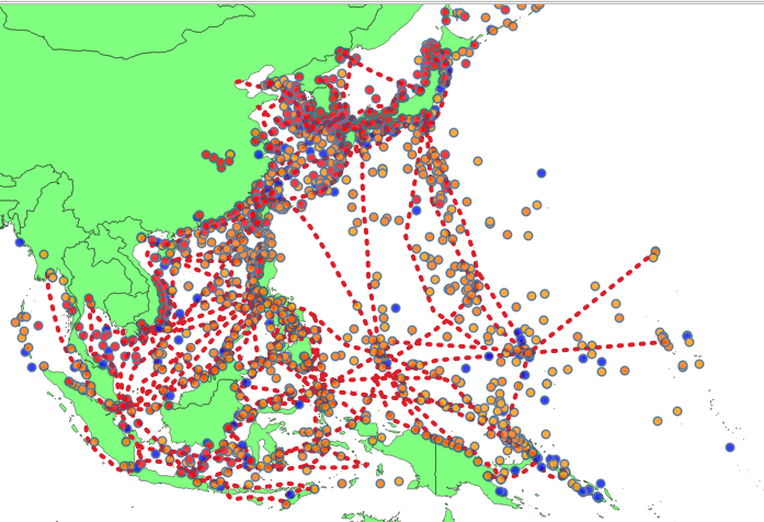
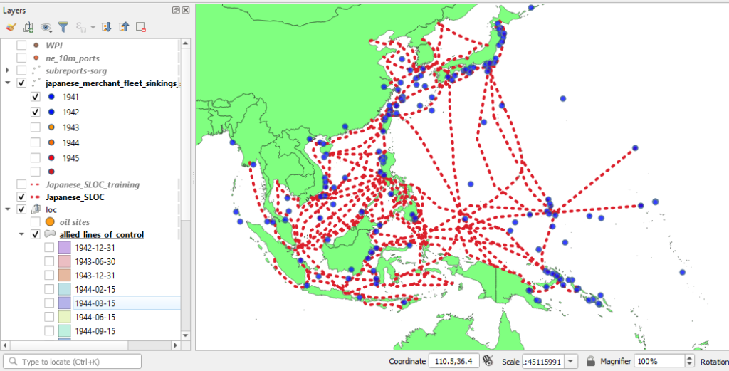
You will likely notice that the red and dark orange circles are orientated to the west and north. This is because the Allies advanced from the south through New Guinea and into the Philippines (General MacArthur) and from the east (Admiral Nimitz). QGIS’ symbology function has also afforded you the ability to turn your data off and on by category, and in this case here, by year.
d. Filter By Year: Now that you have a rough idea of the course of the campaign you can now isolate portions of the data into more discrete chunks. You can also symbolize your data by sinking agent to gain a more textured understanding of the campaign in order to complete your analysis. Categorizing your data by this column and afford a better sense of the events of the campaign and the its components.
In order to do so you’ll need to isolate your data for the first year of the campaign, 1942 (plus December 1941). To to so, you will make use of QGIS’ filter function. Filter will allow you to apply SQL expressions to shapefiles in order to limit the data displayed.
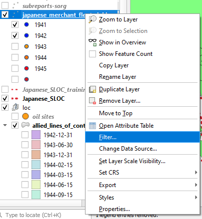
Right click on your sinkings data navigate to and click “Filter.”
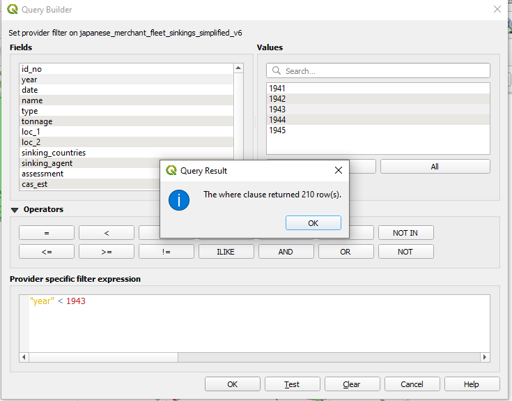
A window titled “Query Builder” will appear. In the “Fields” pane double click year, in the operators double click the greater than sign “>” Next, under “Values” click all. All of the year values should populate in the Values window. Double click 1943.
You should have an expression which reads: “year” < 1943 This will tell QGIS to only display those vessels which were sunk prior to 1943. Hit Test. You should be prompted with a window which says “The where clause returned 210 row(s).”
Hit ok on the Query Result window.
Hit ok on the Query Builder window.
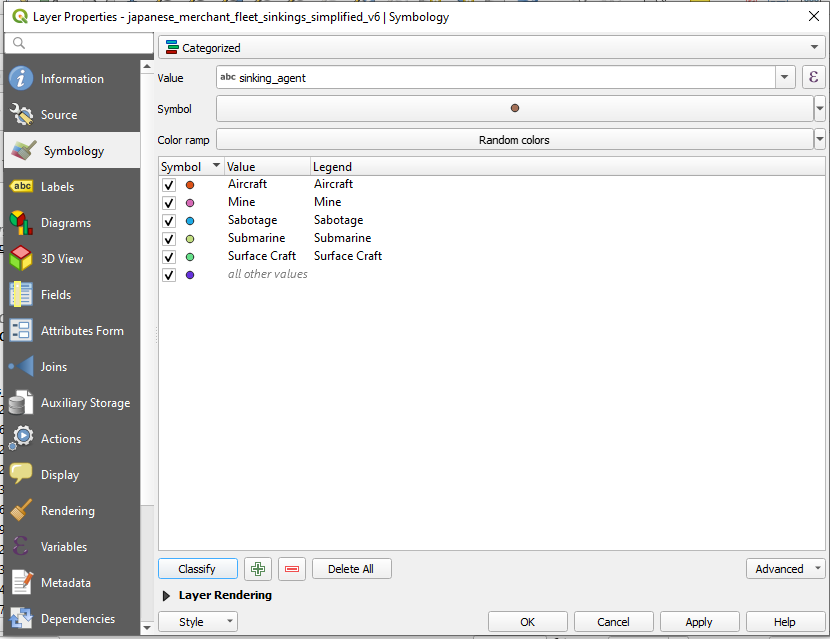
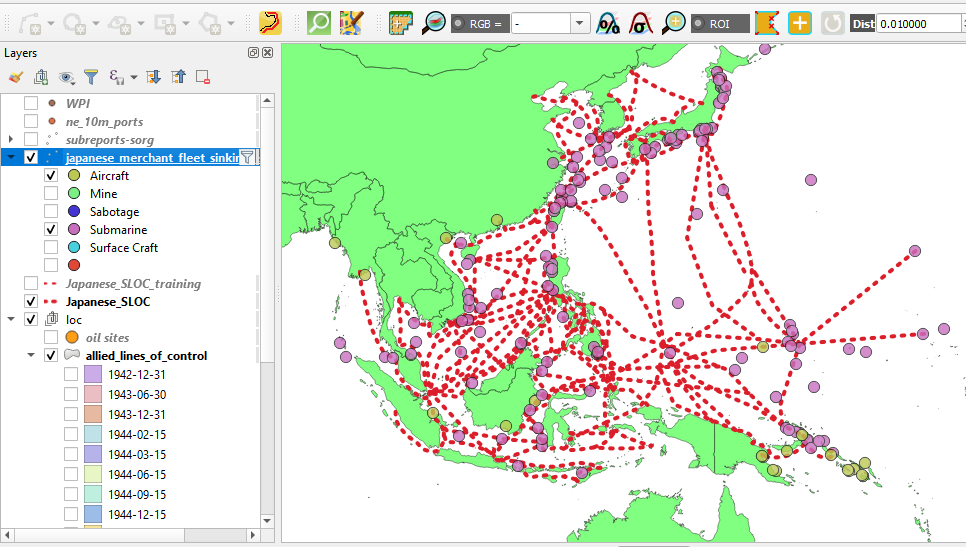
e. Symbolize Data by Sinking Agent: Now that you have a more manageable amount of data you can now symbolize your sinking events by sinking agent. To do so, simply repeat the same processes from from Step 3c instead choose “sinking_agent” in the “Value” dropdown menu.
As with your “year” symbolization you can toggle your sinking agent categories using your Layers window. You may notice that there are relatively few vessels which were sunk via mines, sabotage, or surface craft. This phase of the campaign was dominated by submarines and aircraft as MacArthur’s army crawled up the South Pacific and Allied submarines attacked strategic targets well behind Japanese lines. You may also notice that those vessels sunk by Allied aircraft were situated the edges of the Japanese perimeter, particularly in the South Pacific.
f. Compare Sinking Data Points to Allied Zone of Control Shapefile: Since you have have a shapefile which depicts the Allied advance across the Pacific it can also be used to determine when particular Japanese SLOCs were interdicted. To do so, you will compare the spatial footprints of your sinking data, and allied_lines_of_control shapefiles in order to bracket the approximate dates when various Japanese SLOCs were interdicted. These dates which then be added to your Japanese_SLOC_training shapefile.
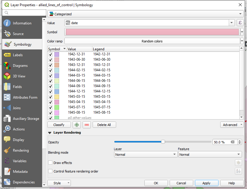
As with your sinking data, your Allied zone of control shapefile can be symbolized according to category. As you did with Step 3c, symbolize your Allied zone of control shapefile by selecting date from the “Value” drop down menu. You will also want to pick an opacity level around 50% as the features overlaps within this shapefile.
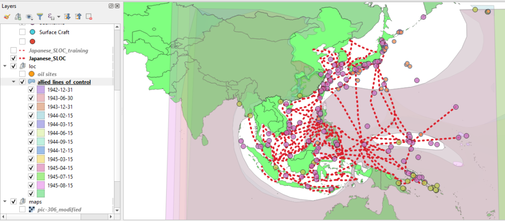
Take a minute to toggle through your different categories chronologically. As mentioned earlier, you will likely notice that the Allies advanced from the south and east. And, indeed the first substantive advances were made by MacArthur in 1943. If you compare the overlap between your SLOC shapefile and the first three categories of your allied_lines_of_control shapefile it is apparent that at some point between the start of the war and 31 December 1943 the Allies successfully interdicted their first three SLOCs, highlighted below.
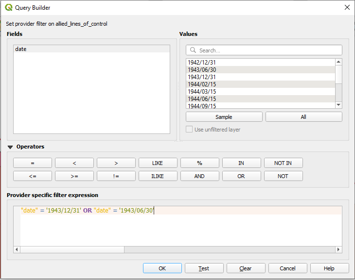
You can double check our working using QGIS’ ‘Select by Location’ tool. First, you will need to place a Filter on your allied_lines_of_control shapefile in order to isolate the early phases of the campaign. Right click on the shapefile and select filter and enter the following expression: “date” = ‘1943/12/31’ OR “date” = ‘1943/06/30’ This will isolate only those two phases of the campaign from the shapefile.
Hit ok.
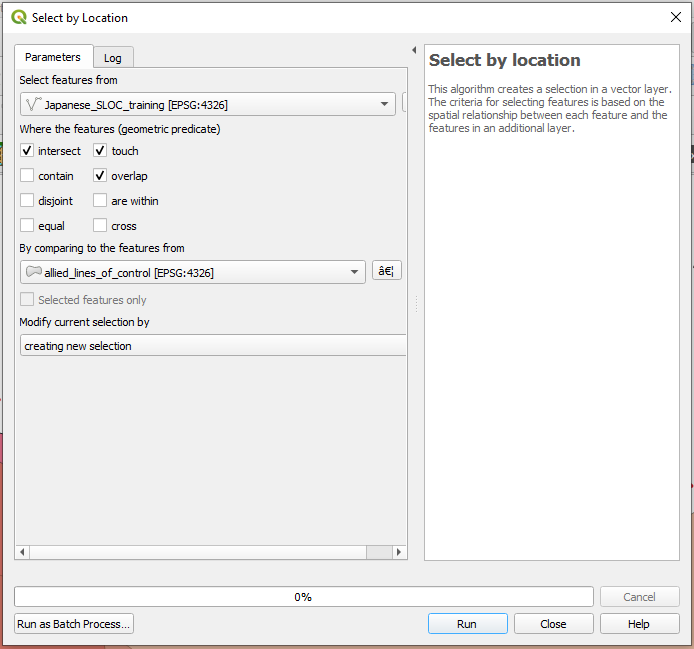
Next, navigate to Vector > Research Tools > Select by Location. The Select by Location window will appear.
From the “Select feature from” dropdown window select your Japanese SLOC shapefile. Next, from the selections under the “Where the features (geometric predicate)” check intersect, touch, overlap. Finally, from the dropdown “By comparing to the features from” choose your Allied zones of control shapefile. This will tell QGIS to find those SLOCs which overlap with the Allied zone of control on 30 Jun 1943 or 31 Dec 1943.
Hit run.
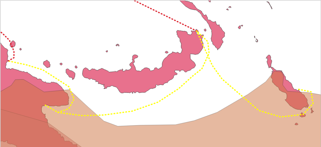
g. Compare the identified SLOCs with your sinking data. Now that you’ve identified three SLOCs of interest it is time to refine the timeline of their interdiction. It is safe to assume that these were cut at some point between the start of the war and 31 December 1943 as the shipping nodes which comprised them were occupied by that date. With that knowledge in mind, you will now use QGIS’ Selection tool to determine more refined estimates.
First you will want to remove any filters you have placed upon either of your sinking datasets. Now that you have a spatially refined search area you should open up your temporal search, otherwise you may come up with an incorrect estimate.
Next, navigate to the “Select Features Tool.” Click on the down arrow tab next to the icon and select “Select Features by Polygon.”
You will use this tool to identify the sinking events from both datasets with the immediate proximity of each of the three SLOCs in question. To do so, each of your sinking datasets will have to be selected in your Layers window. Pick one, highlight in your layers window. Next trace the general area around one of these SLOCs by left clicking vertices and then right click to close the selection polygon.
Repeat the process for the other dataset.
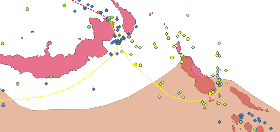
Now it is time to investigate your selection results. Right click the sinking data shapefile in your Layer window and right click and select “Open Attribute Table.” At bottom of the attribute table window choose “Show Selected Features” from the menu located on the lower left. This will only show you the 18 returns selected from your selection performed earlier. QGIS allows you to sort the attributes by clicking on the data headings. Hitting the date feature will allow you to arrange the data by date in either ascending or descending order.
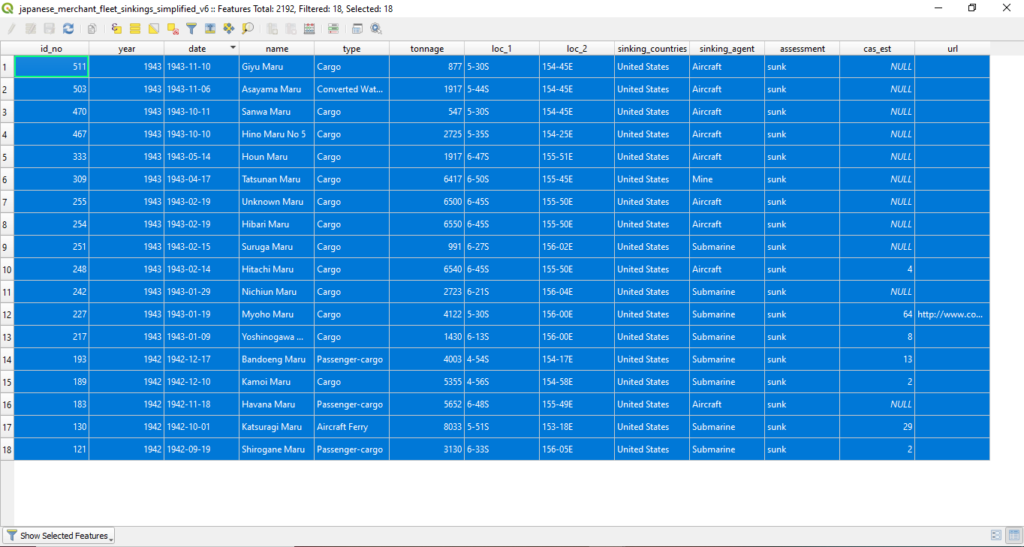
The final vessel sunk by the Allies in this eastern most SLOC was the a cargo vessel Giyu Maru on 10 November 1943. You can isolate this single event by creating a new selection by clicking on the “1” icon all the way to the left. To check your work you can click “Zoom map to the selected rows”

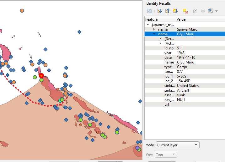
Repeat the same process for the SORG dataset. The final record in the same area is from 19 Feb 1943. This means that the SLOC was likely closed on 10 November 1943 with the final sinking recorded in the sinkings data dataset.
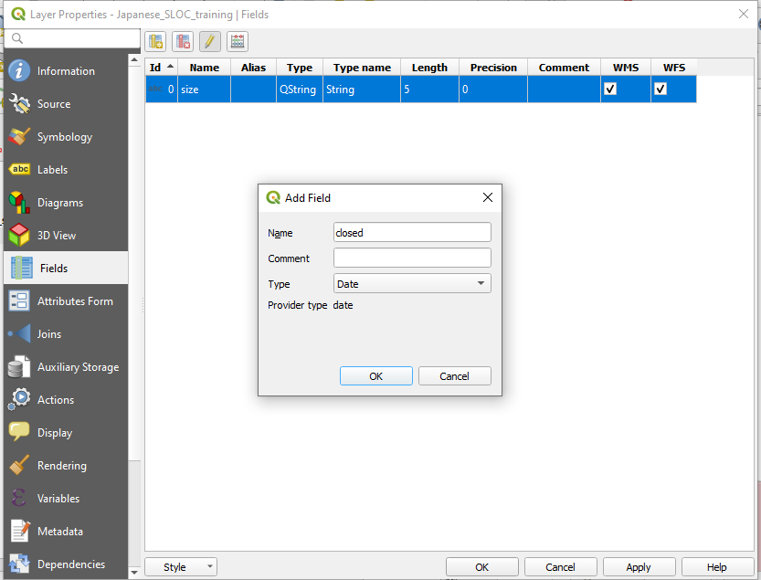
Now that you have identified an interdiction date you can add a new column to your Japanese_SLOC_training shapefile. To do so, right click on the file in your Layers panel and select “Properties.” When the Layer Properties window appears select “Fields” from the panel on the left. Click the “Add Field” button. The Add Field window will appear. Choose name for the new field and select “Date” from the dropdown menu.
Hit ok and hit ok.
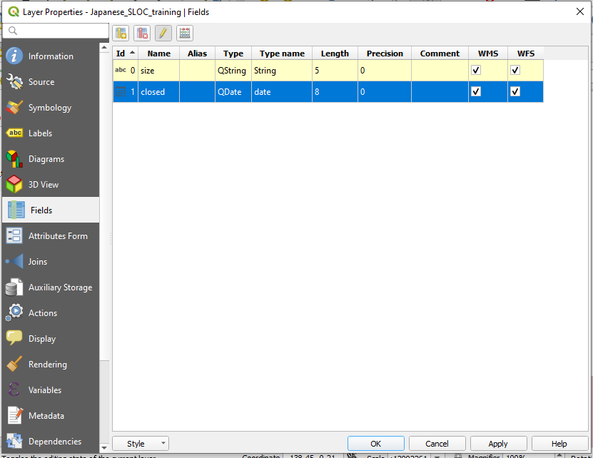
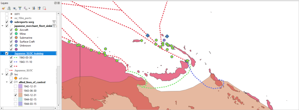
Now that you have added a new field to the shapefile you can now populate it with a closed date. Right click on your Japanese_SLOC_training shapefile in the Layers panel and select toggle editing. Ensure that the SLOC is selected and enter 1943-11-10 in the new column. Be sure to save your edits!

Your first batch of SLOCs should look similar to the the images below. Three SLOCs with two interdiction dates, 1943-11-10 and 1943-08-30.
Now that you’ve got the hang of it is time to fly solo again! Using the techniques you learned above determine the rest of the interdiction dates for the Japanese SLOC network. By the end of your analysis you will likely have a few left over. Not to worry! A number of Japanese SLOCs were not interdicted by direct occupation or encirclement, but rather Allied air pressure and network collapse. A little over a 1/3 of Japanese shipping was interdicted in this fashion. See the South China Sea Raid as such an example.
To determine these interdiction dates you can use the filter function and selection tool to bracket estimates.
Finally, you’ll likely notice that some SLOCs remained active until the end of the war. The Allies sank vessels around the Japanese home islands, the Yellow Sea, the Gulf of Thailand, and the Java Sea until the end of hostilities on 15 August 1945. For these attribute them as 1945-09-02, the official end surrender of the Japanese empire.

Step 4: Buffers and Select By Location:
a. Buffers on Polygons. One basic function of QGIS is the buffer creation tool. The tool allows you to create spatial buffers around existing shapefiles. The buffer can then be used to pose spatial queries predicated upon particular historic questions. In a modern context, spatial buffers can be used to pose a number of questions related to military affairs. Examples include determining coverage of air-defense systems, range and potential impact areas of indirect weapons, building models of blast areas, etc. Similar queries can be posed for historic military activity.
A simple question might be, what percentage of U.S. mine attacks occurred in Japanese coastal waters?
To answer it you will first have to create a buffer around your the Japan feature within your borders shapefile.
But there is a slight problem…
The Japanese spatial feature in current shapefiles is apocryphal. And the feature within the “cntry1938” shapefile, while it does include a unified and occupied Korea, it does it include the Kuril Islands and the southern portion of Sakhalin as part of Japan. So, in order to accurately answer this question you’ll need to build your own (reasonably) accurate representation of Japan circa World War II.
Or you could just skip ahead and download a copy here. Either or, I won’t judge.
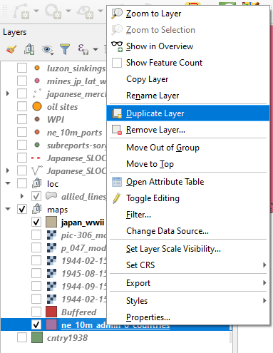
b. Create a duplicate of your contemporary borders shapefile by right clicking on it and creating a duplicate.
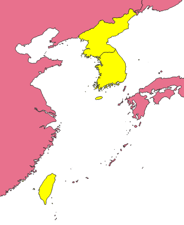
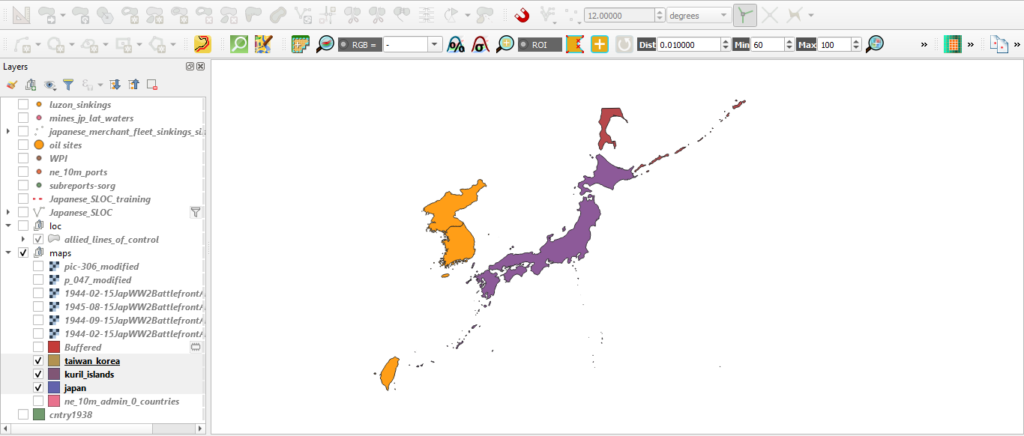
c. First you will need to harvest the geometries from modern North and South Korea as well as Taiwan (formerly known as Formosa). Highlight the copy in your Layers panel and select these three entities while holding down the ctrl key in order to select them all. Right click on the copy and export them as a new shapefile.
d. Remove excess territory. The modern political borders of these three entities are not exactly the same as they were when part of the Japanese state during World War II. You can use period maps such as this Rand McNally example from 1930 to check your work. For instance the Kinmen Islands are currently part of the Republic of China(Taiwan) but were not controlled by the former Japanese empire. You’ll need to remove these features from your new export.
Right click on your Korea / Taiwan export and toggle editing. Navigate to your Advanced Digitizing Toolbar and click the Delete Part tool. Now click on the Kinmen Islands.

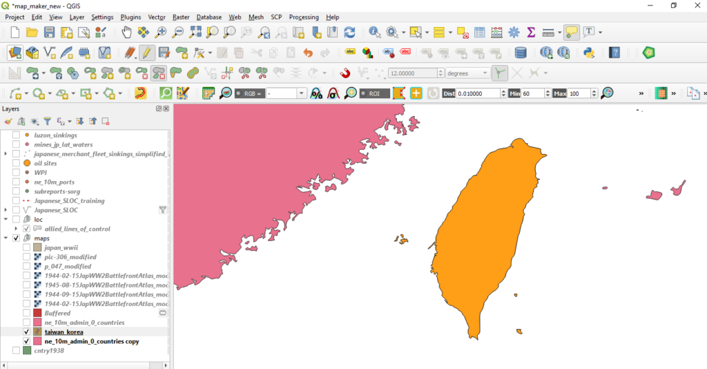
Be sure to save your edits!
e. Harvest geometries of the Kuril Islands and the southern portion of Sakhalin. You will need to perform a similar task for these territories currently administered by the Russian Federation. Select Russia from your contemporary borders shapefile and export it as new shapefile.
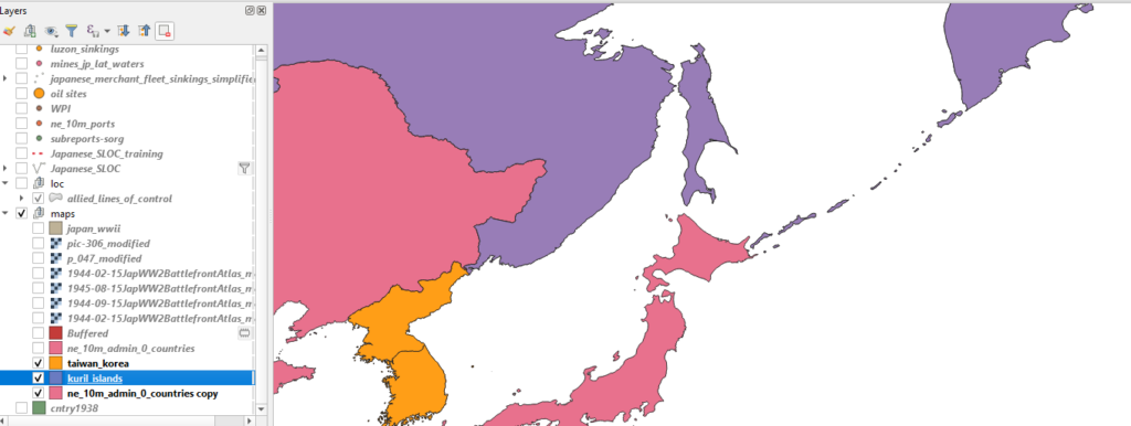
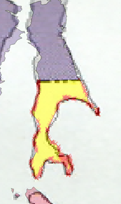
f. Right click on new Russia shapefile and toggle editing. Navigate to your Advanced Digitizing Toolbar* and its Split Feature tool. Use one of the period maps that you rectified from part I to serve as a guide for splitting the current island of Sakhalin. Click on the Split Feature tool, click on one side of the island and right click on the other along the border seen in your rectified image.
*Note: If you need a refresher on the Advanced Digitization Toolbar, revisit Part I.
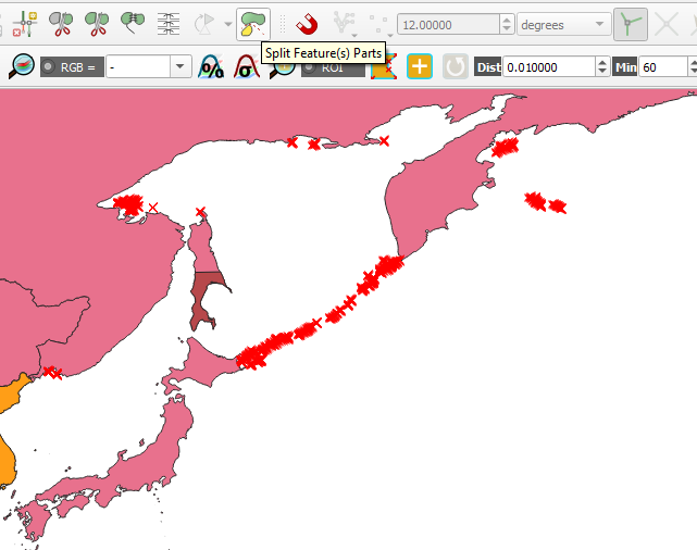
g. Next, use the Split Feature(s) Parts to isolate Kuril Islands. This tool will remove all the isolated entities in the shapefile into discrete features.
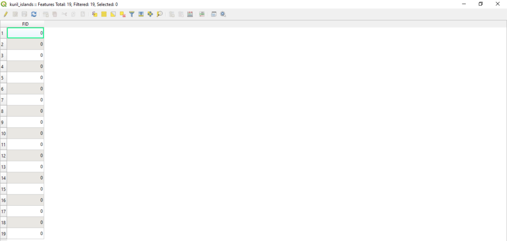
f. Use the Selection Tool to select all of the Kuril Islands and the southern portion of Sakhalin. Invert the select and delete all of the excess geometries. You should now have 19 features within this shapefile.
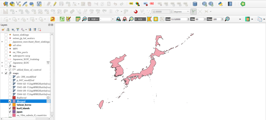
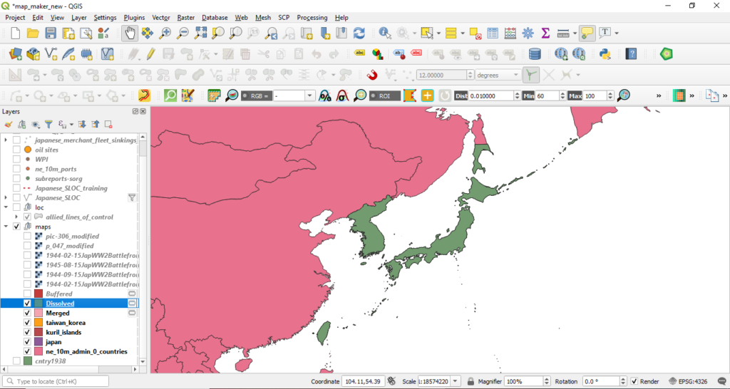
h. Merge the separate layers. As you did earlier with the Koreas and Taiwan, export a Japan shapefile from your contemporary boundaries shapefile. You should now have three shapefiles, one depicting contemporary North and South Korea and Taiwan, one with current Russian territories formerly governed by Japan and the current Japanese home islands.
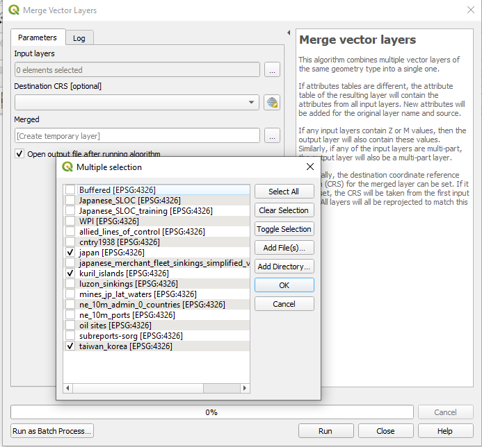
Now you will need to merge these layers. Navigate to Vector > Data Management Tools > Merge Vector Layers.
The Merge Vector Layers window should appear. Under “Input Layers” select your thee inputs.
Hit ok.
Hit run.
i. Dissolve the anachronistic boundaries. Now you will need to remove the boundary between the modern Koreas. Navigate to Vector > Geoprocessing Tools > Dissolve. Choose the “Merged” shapefile from the Input dropdown.
Hit Run.
You know have a shapefile which depicts Japan’s political boundaries circa WWII. The new Dissolved is only a temporary file. You will want to export it as a permanent file.
Have you saved recently?
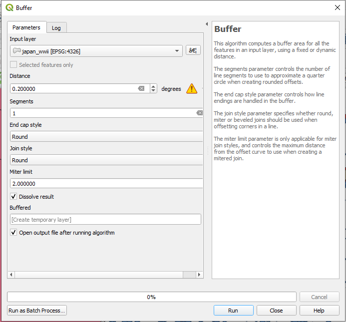
j. Create a buffer for your new Japan shapefile. First, navigate to Vector > Geoprocessing Tools > Buffer. When the Buffer window appears, choose your new Japan country shapefile from the Input dropdown menu. For the Distance input you will need to do some simple conversion. QGIS’ Buffer tool uses distance units based upon the coordinate reference system in use. Since WGS84 is determined using degrees, QGIS will only allow you to use degrees to create buffers.
Nautical miles are the most common measurement unit used for measuring distance over water. Coastal waters are usually defined as maritime territory within 12 nautical miles land. Since QGIS will only you to use degrees, you’ll need to determine the degrees equivalent to 12 nautical miles.
There are 60 nautical miles within 1 degree. Therefore, 0.2 degrees is equal to 12 nautical miles.
Enter 0.20 in the “Distance” bar. Enter 1 into the segment bar. Keep the rest of the entries as their defaults.
Click run.

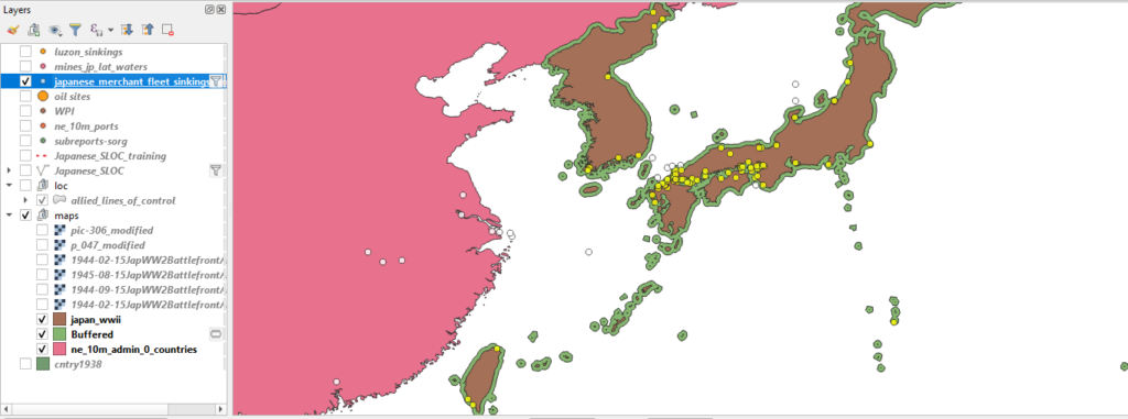
You should now have a temporary shapefile entitled “Buffered” which depicts a 12 nautical mile ring around the entirety of your created Japan WWII shapefile.
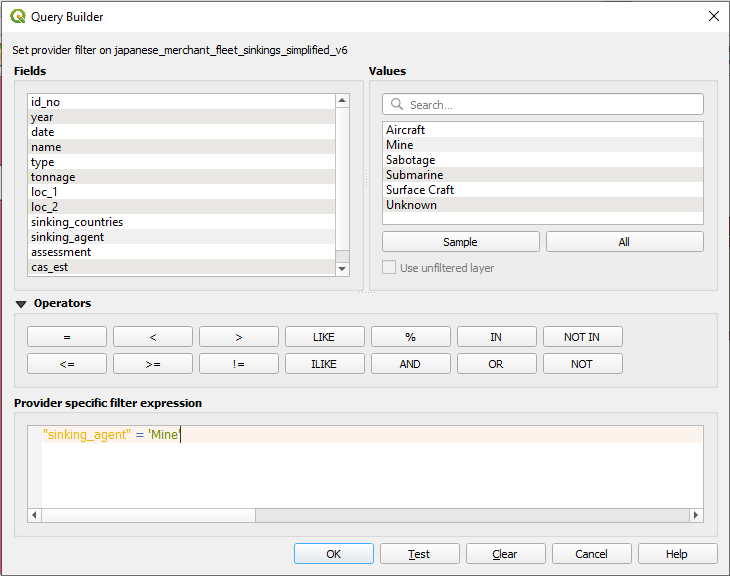
k. Set a filter within your sinkings shapefile to select out only vessels which were sunk with mines. To start your spatial query you will need to set a filter on your sinkings shapefile. Since your historical question focuses on the effectiveness of the Allied mining campaign you will need to isolate those vessels sunk via mine in the sinkings data shapefile.
l. Perform the Select by Location. Navigate to Vector > Research Tools > Select by Location. The Select by Location window will appear. For the “Select features from” dropdown menu, select your sinkings shapefile. From the “Where the features (geometric predicate)” check intersect, touch, and are within. From the “By comparing to the features from” drop down menu choose “Buffered.”
Hit Run.
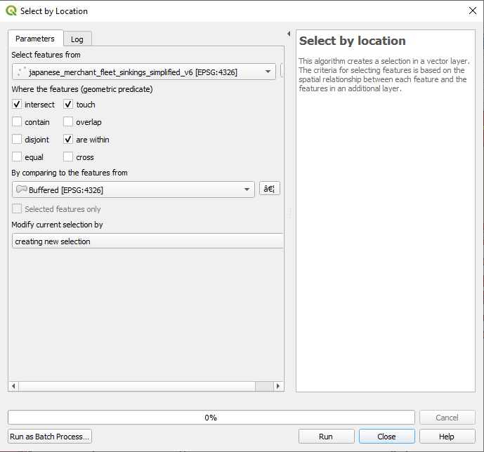
You should receive a return of 207 of 267 features. Roughly 77% of all Japanese merchant vessels sunk by mines were sunk within the coastal waters of the Japanese home islands and its colonies in Taiwan and Korea.
And with that, sadly, we must bid farewell. This concludes Part III of rebuilding a war. We will pick up the analysis lesson in Part IV which is currently under construction. If you’ve found any of this information helpful, confusing, or emotionally distressing please feel free to contact the me at bbuck@gmu.edu
See ya soon, happy DHing.
